ERM Decarbonisation Lending Platform
Client: ERM: Environmental Resources Management
Year: 2023
︎ The full project is password protected.
Please email calum.hale@gmail.com for more details.
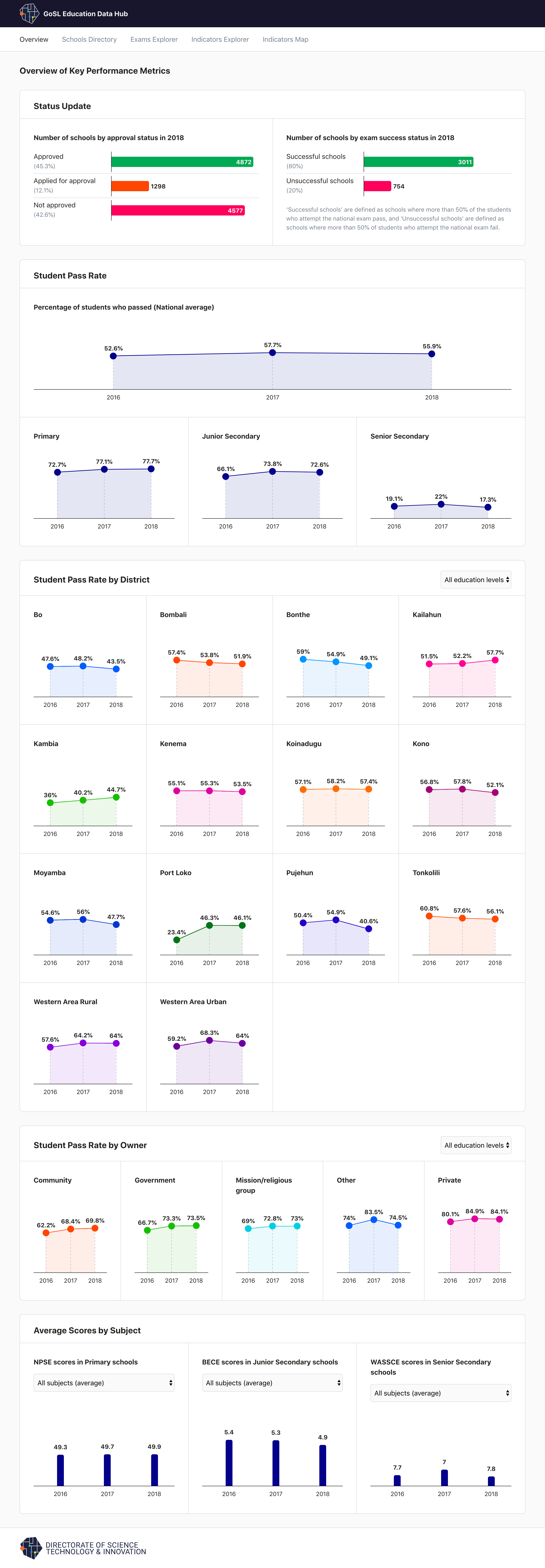
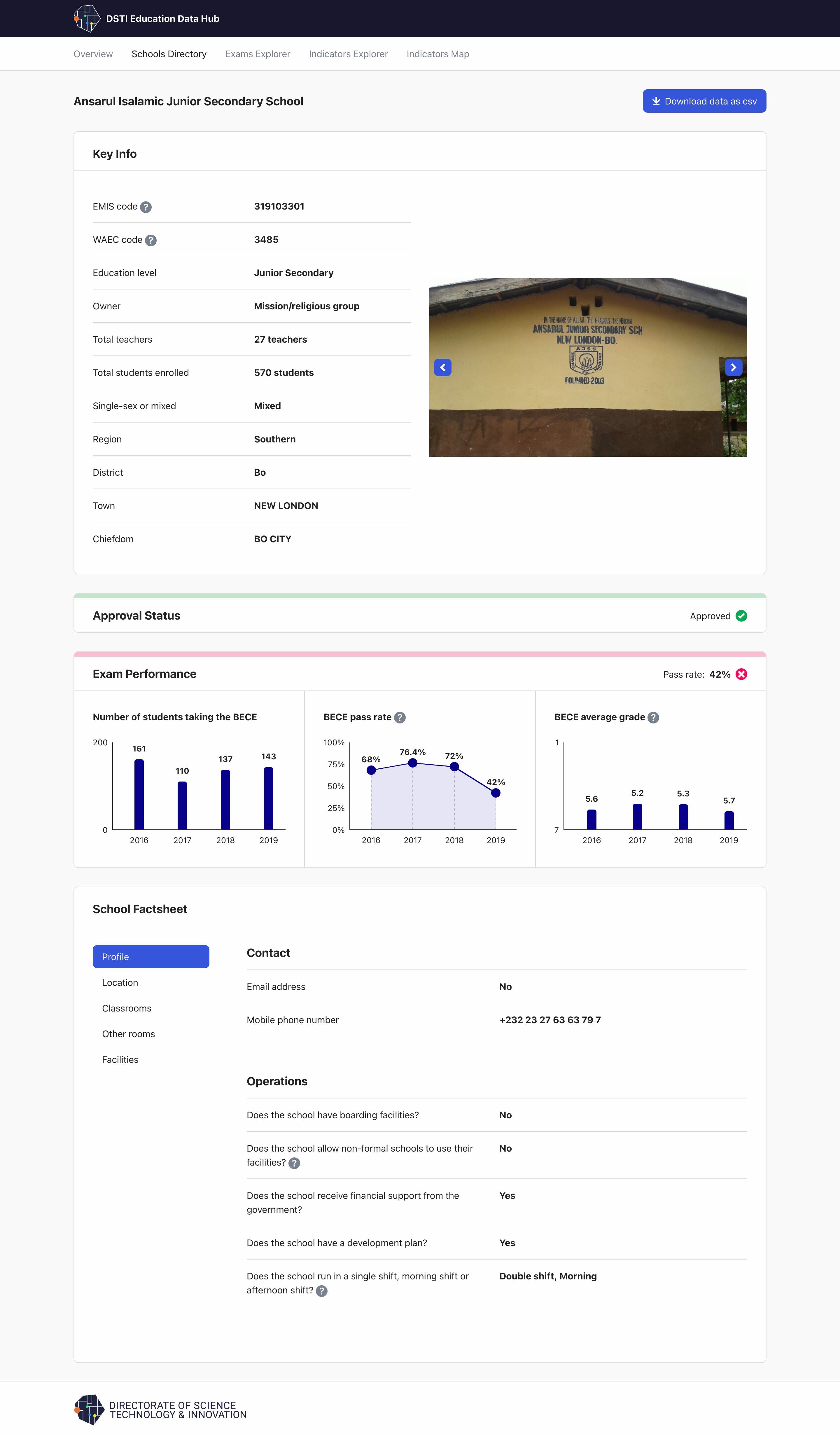
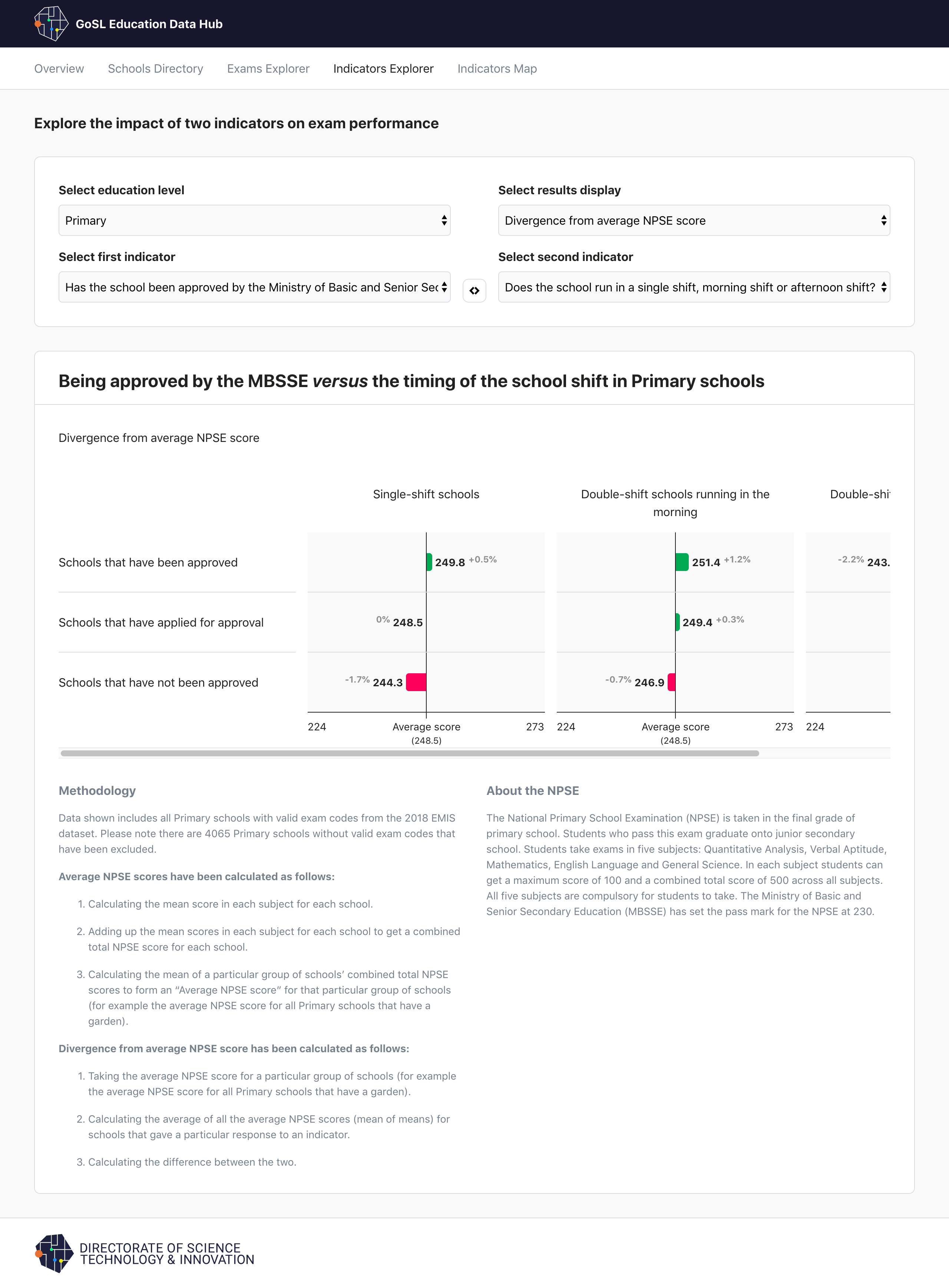
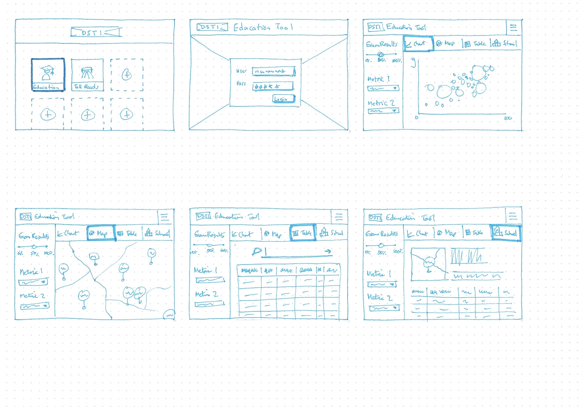
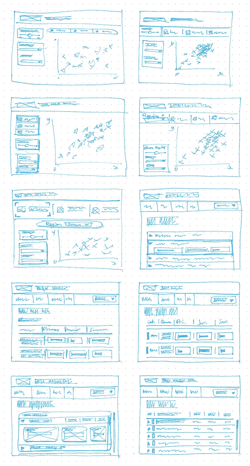
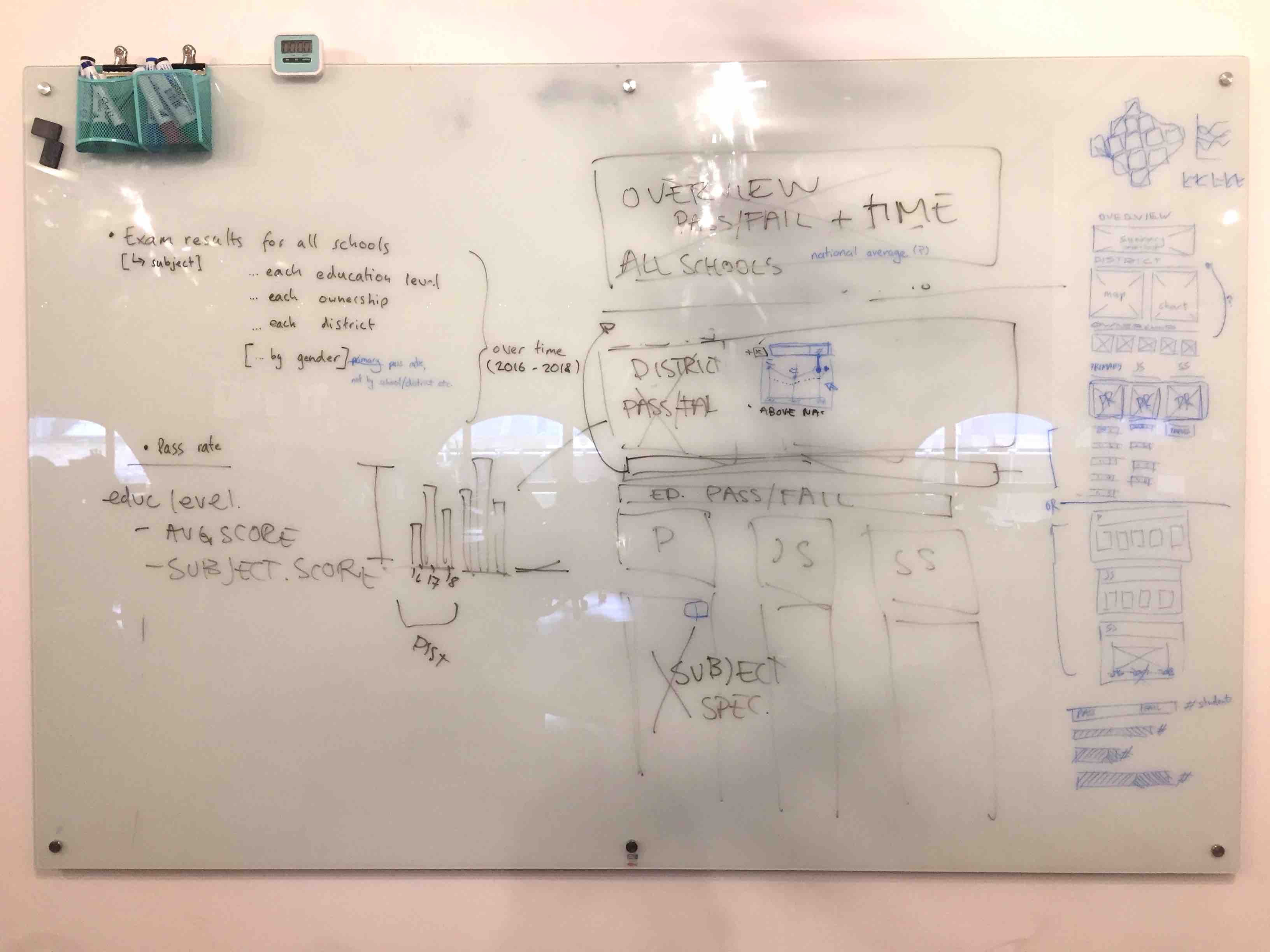
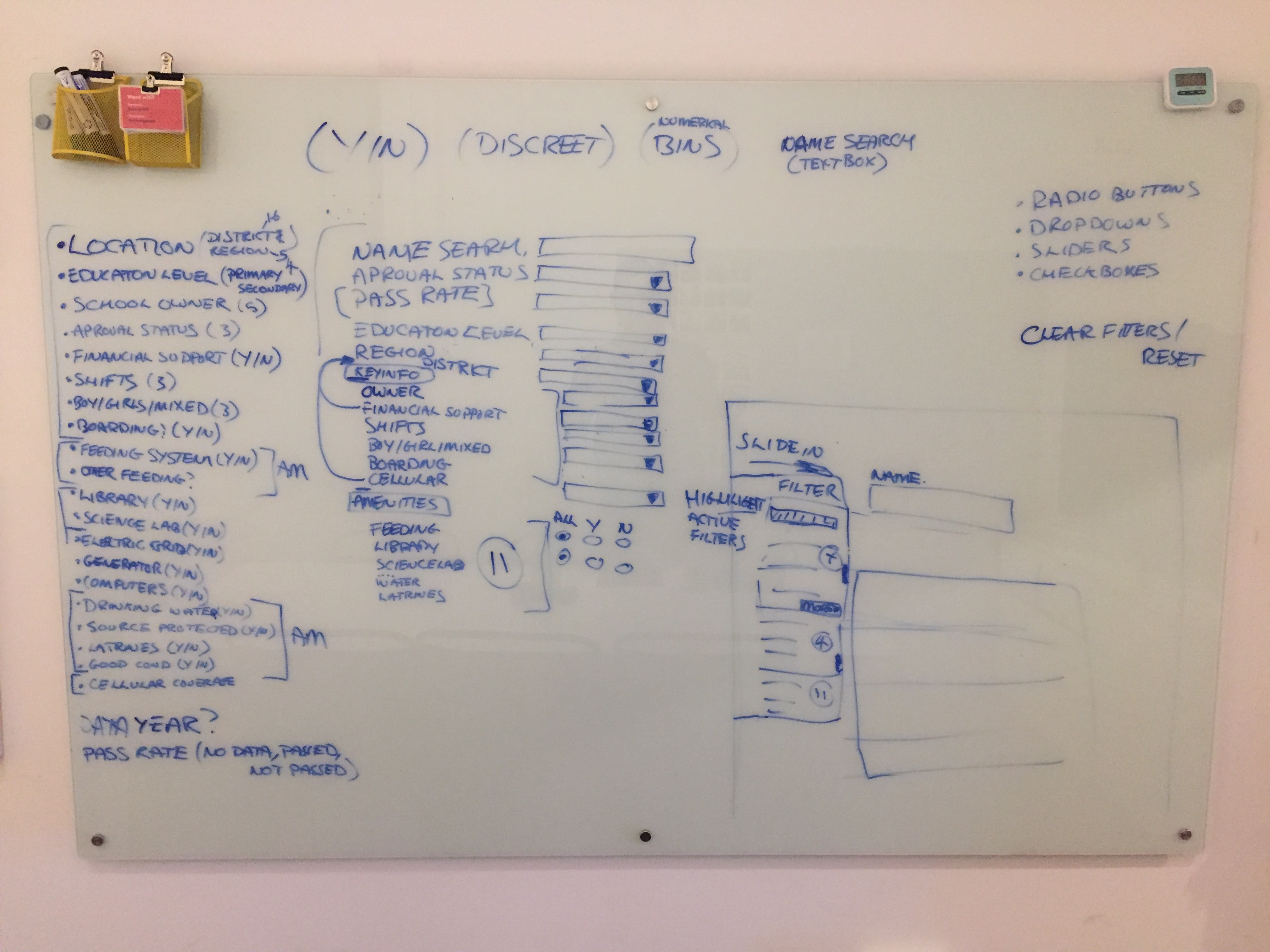
Sierra Leone Education Data Hub
Client: Sierra Leone Directorate of Science, Technology and Innovation (DSTI)
Year: 2019–2020
Designer: Calum Hale
Data Engineer: Isabel Beard
Developer: Richard Pullinger
Art Director: Kate Ashton
Creative Direction: Duncan Swain
︎ Interactive Data Hub
Brief
The Sierra Leone government came to us with the challenge to create a data explorer for all of the education data they had. This could then be used by ministers to check the performance of schools, and also by citizens to see how the schools their children go to are doing.
Outcome
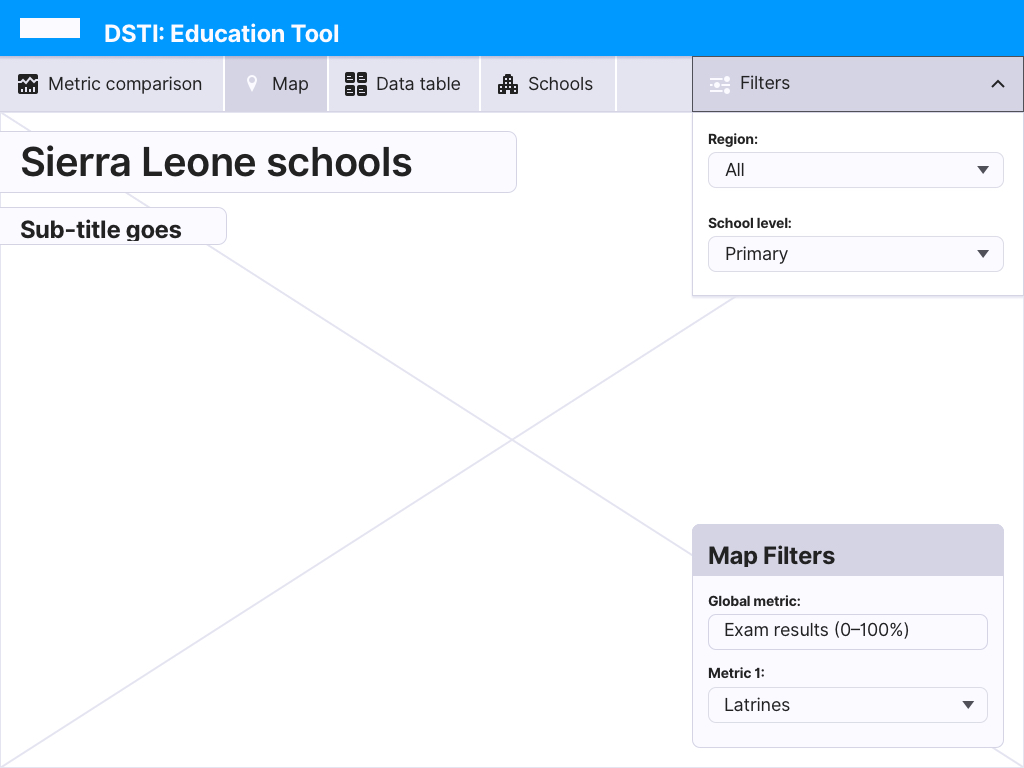
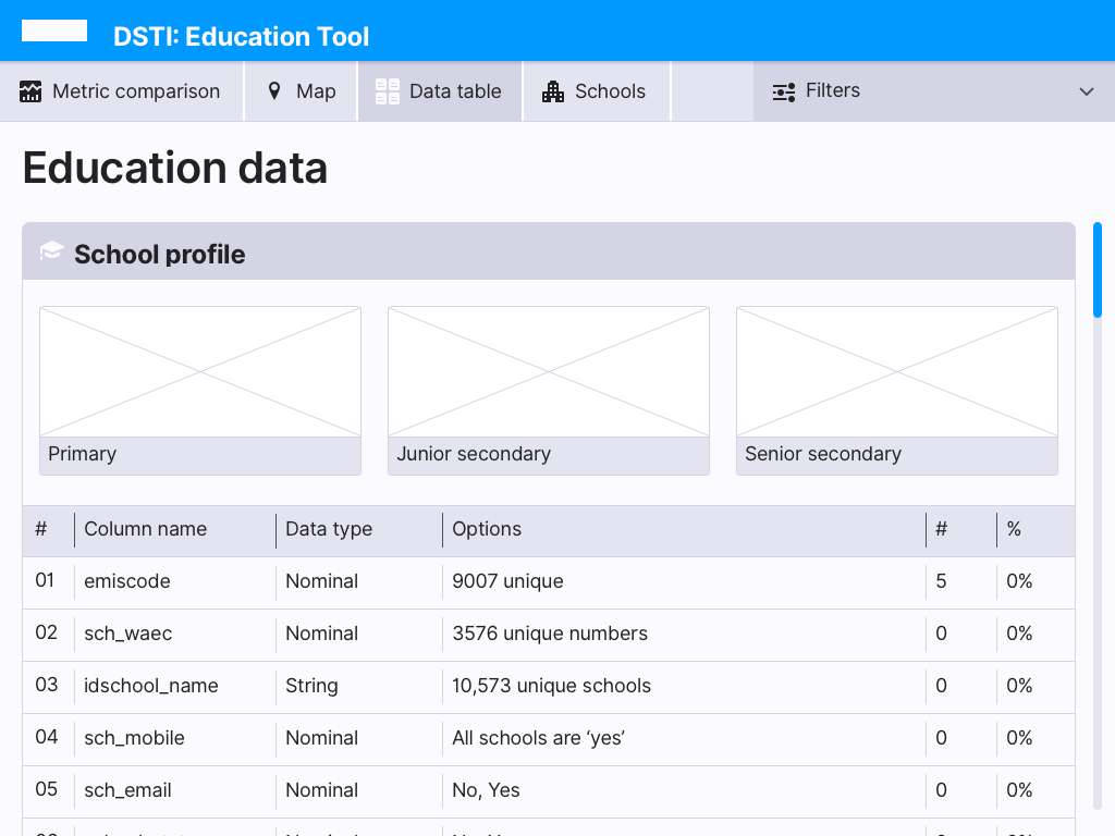
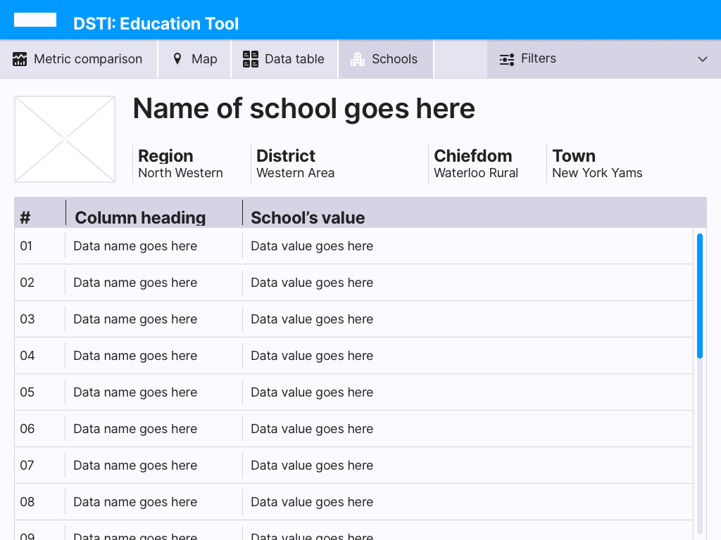
We created an online tool that let the user see the school results from a country-wide view down to the district level. This tool allowed schools to be compared against measures of performance as defined by the government, with some of these measures also being able to be plotted geographically.
My contribution
I worked with the team to define the user experience and information architecture before creating the wireframes. As new data came in we had to update and adapt the wireframes. I then created the look & feel for the visual design of the UI, iterating and collaborating with the Design Director, Kate, who worked on the overall DSTI branding in parallel.
The Sierra Leone government came to us with the challenge to create a data explorer for all of the education data they had. This could then be used by ministers to check the performance of schools, and also by citizens to see how the schools their children go to are doing.
Outcome
We created an online tool that let the user see the school results from a country-wide view down to the district level. This tool allowed schools to be compared against measures of performance as defined by the government, with some of these measures also being able to be plotted geographically.
My contribution
I worked with the team to define the user experience and information architecture before creating the wireframes. As new data came in we had to update and adapt the wireframes. I then created the look & feel for the visual design of the UI, iterating and collaborating with the Design Director, Kate, who worked on the overall DSTI branding in parallel.

Visual Design


App Styleguide for Dev


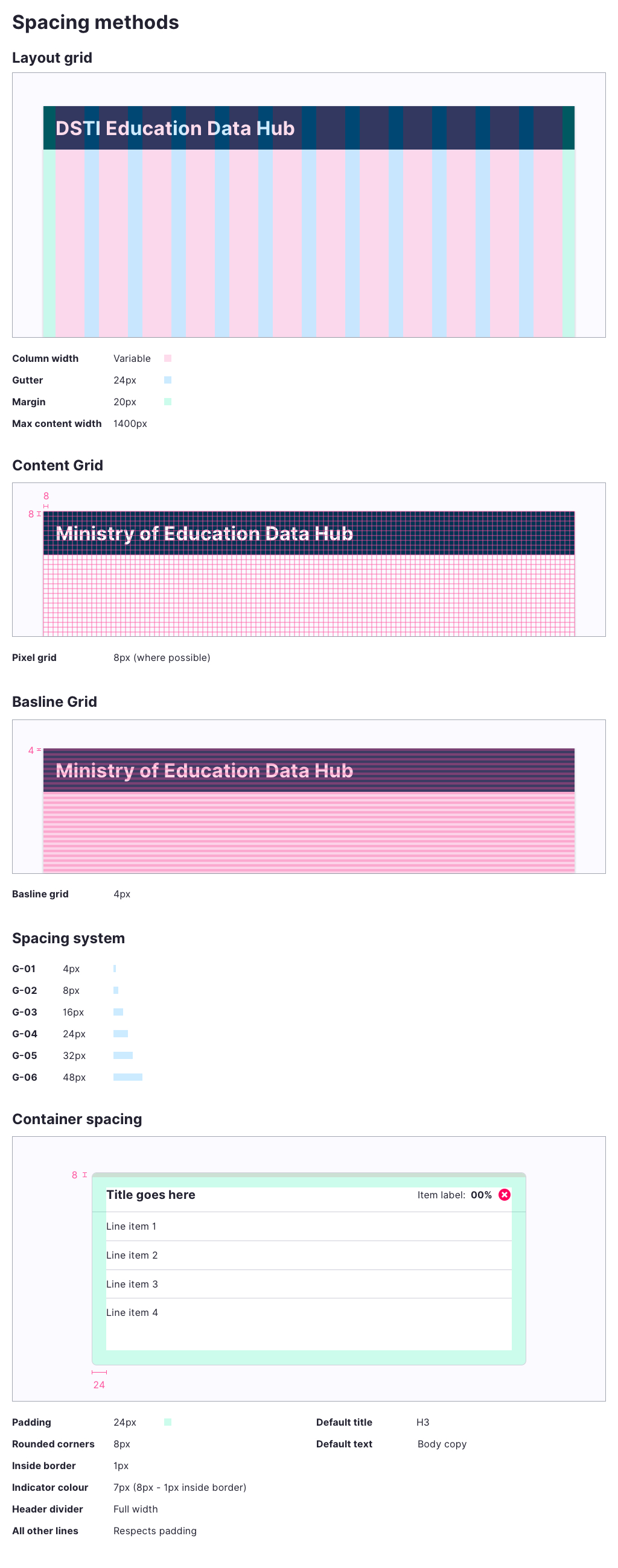
UX Design

Transport for London: Traffic Accident Interactive DataViz
Client: HABITAT III, The United Nations Conference on Housing and Sustainable Urban Development
Year: 2016
Design/Art Direction by: Calum Hale
Web/UI Development by: Lucia Kocincova
︎ Explore the interactive web app here:
https://lucyia.github.io/tfl-accidents/
This interactive visualisation aims to display traffic accident information as kept by Transport for London for the year 2015. The traffic incidents are plotted geographically on the map, colour coded by severity, and there are some interactive summary statistics in the left panel.
Interactive elements highlight on hover, and can be clicked to filter the selection. The supplementary information is broken down by vehicle type, by the age-range of the people involved in the incidents and also by the London borough in which the incident occurred.
This project was created as part of a submission for the 'Habitat III' conference's "call for submissions" as part of 'cityvis.io' Lucia and I also got the chance to talk about our project at the second 'DataViz London' Meetup on 05 October 2016.
 Home page with a left filter panel and a right panel introducing the site
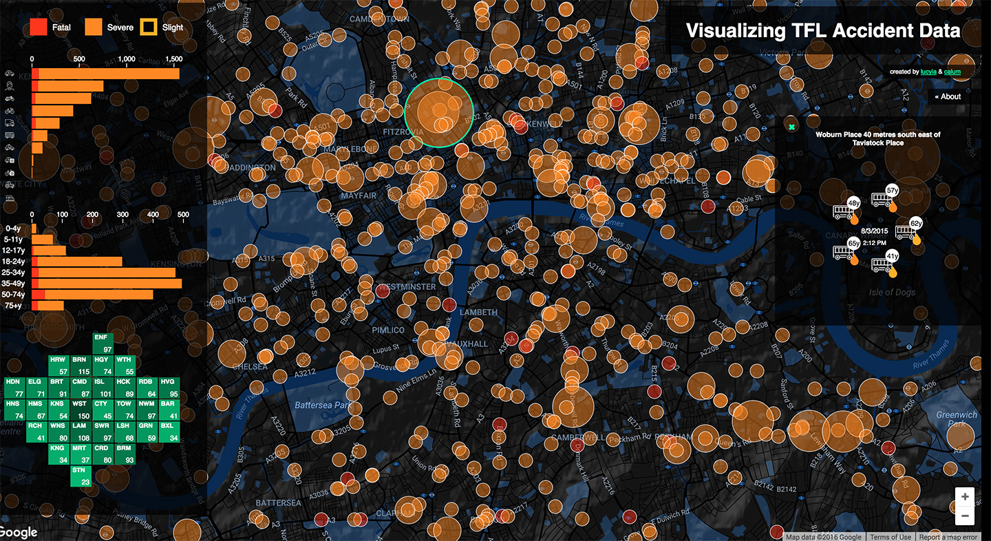 Selecting a node shows the details of the incident
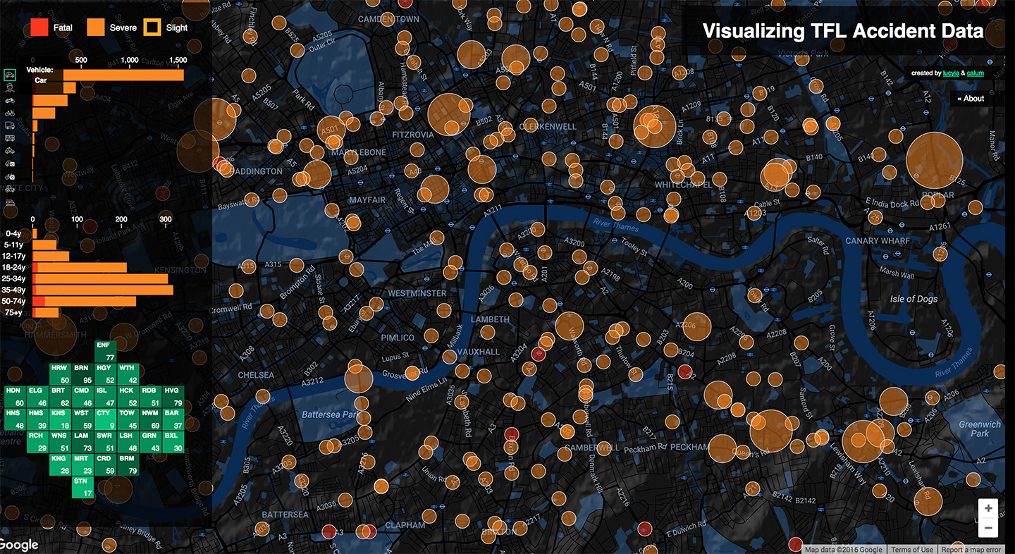 The user can filter by vehicle, in this case showing on incidents involving cars
 Filtering by age-range
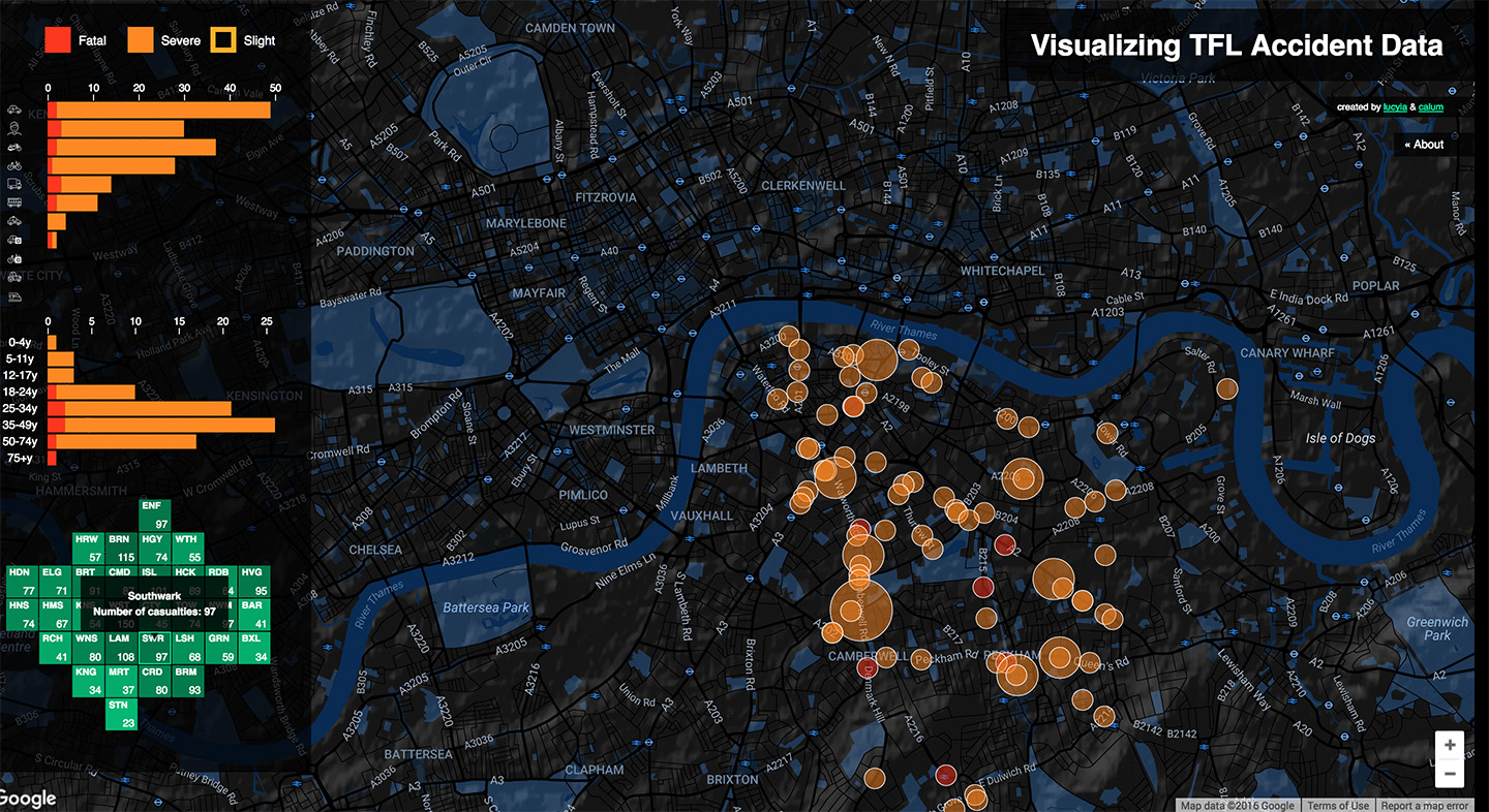 Filtering by London borough
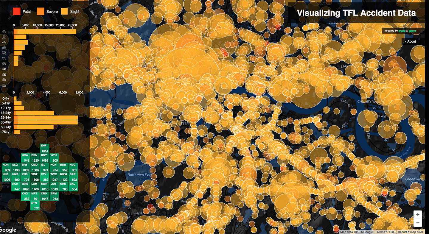 Showing all incident severity types (’slight’ injuries aren’t displayed by default)
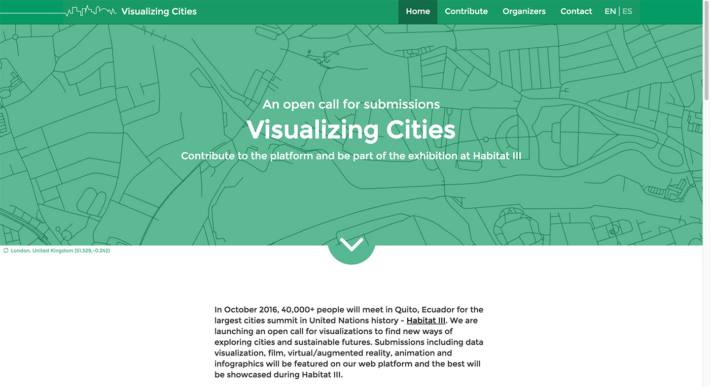 The home page of the Habitat III ‘Visualizing Cities’ call for submission page
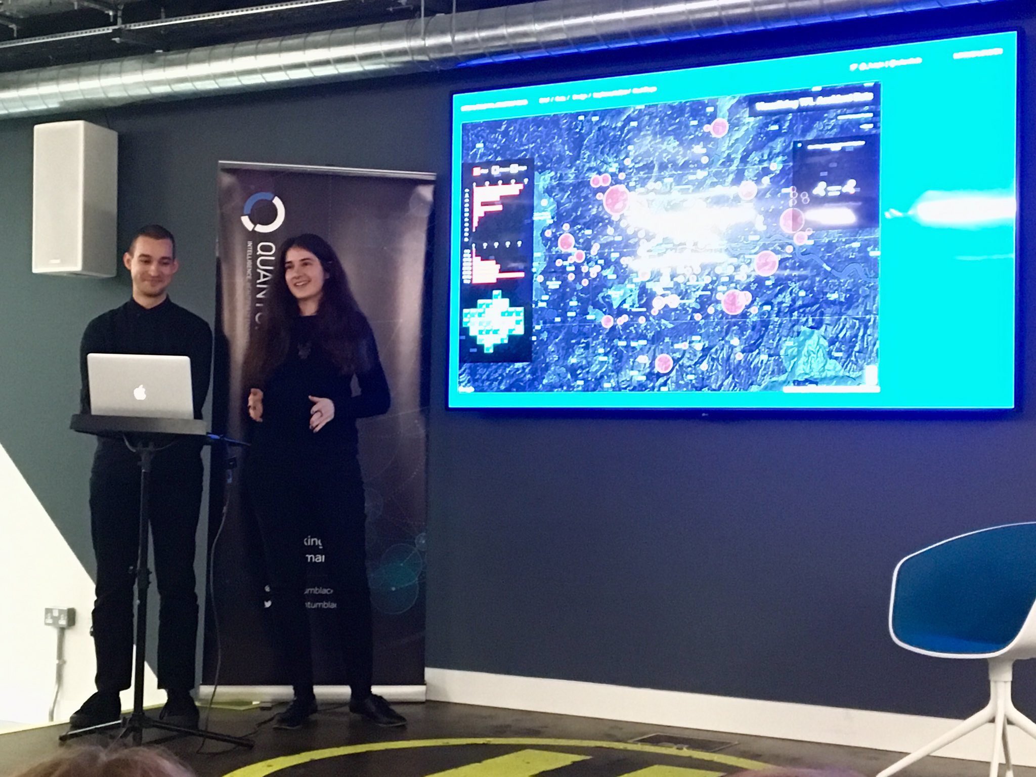 Luciya and I presenting our work at DataVis London Meetup
 Fast Moving Consumer Goods: Brand Portfolio Tool
Designed at QuantumBlack
Year: 2014
UX Designer: Matt Miller
Visual Designer: Calum Hale
Creative Direction: Yves Boussemart
-
All data anonymised
Design © QuantumBlack Visual Analytics Ltd.
Brief
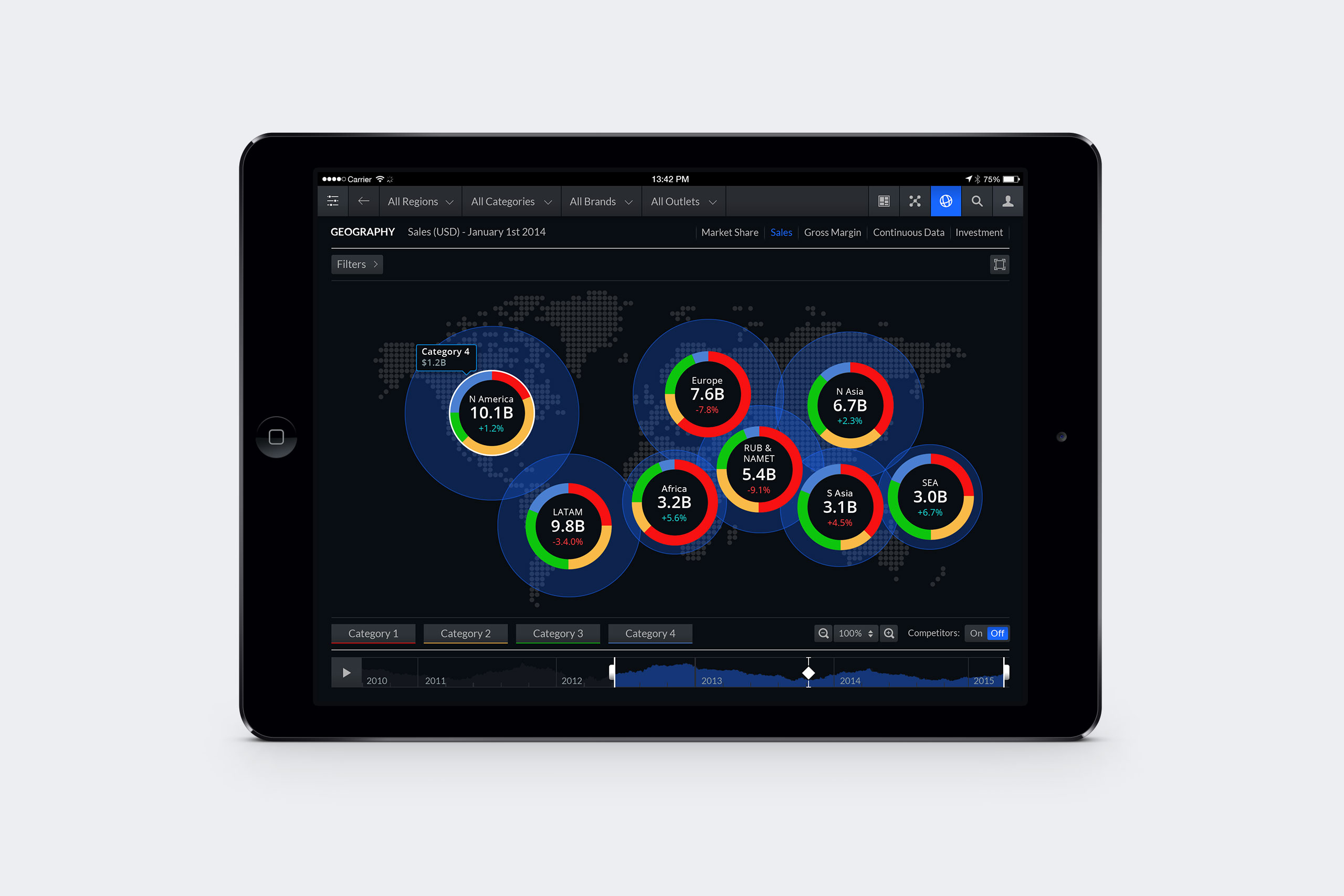
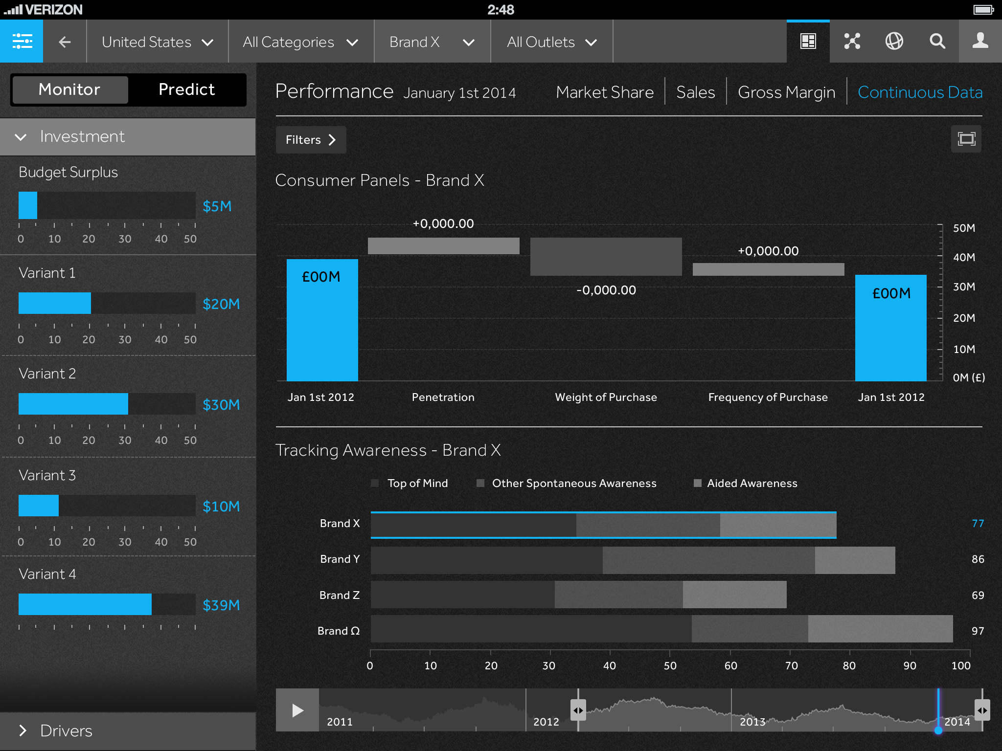
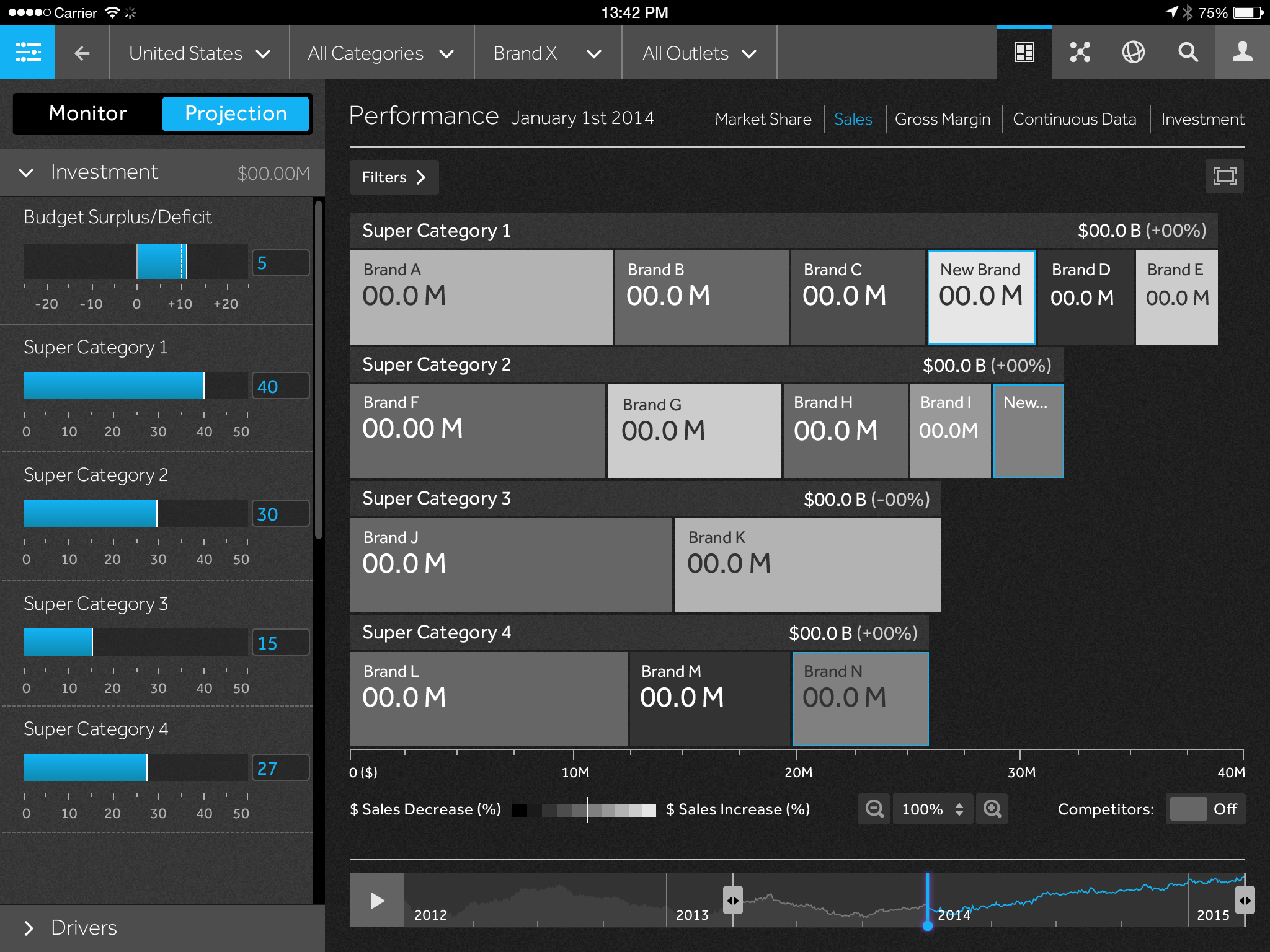
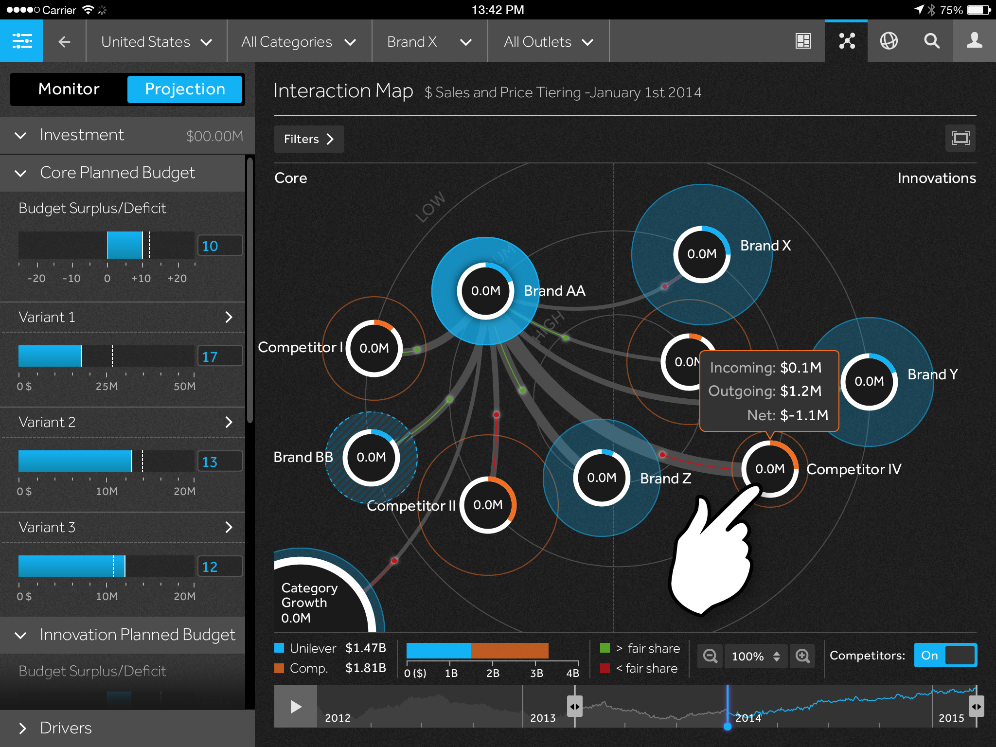
A leading fast-moving consumer goods (FMCG) company need to be able to track its portfolio of products against sales and market share, while also predicting what would happen in the future if they released new products into the market.
Outcome
We designed and built an app that allowed a brand manager to see how their products were performing across world markets. The app included a scenario tool where the user could change metrics such as ‘advertising spend’ and see the predicted impact, driven by data science, on its future sales.
My Contribution
Working under the Creative Director, I documented detailed user journeys to ensure the user didn’t get lost in the portfolio. Then working alongside senior visual designers, I helped create the look and feel for the app. I also oversaw the build of the application working with our development team.
Visual Design
![]() Worldwide overview
Worldwide overview
![]() Viewing the performance of a particular brand category
Viewing the performance of a particular brand category
![]() Viewing the sales value vs. target over time for a particular brand
Viewing the sales value vs. target over time for a particular brand
![]() An interaction map showing how sales shift between brands over time, including new brand launches
An interaction map showing how sales shift between brands over time, including new brand launches
![]() Waterfall chart showing the gross margin for a specific brand
Waterfall chart showing the gross margin for a specific brand
![]() Tree map showing market share for a product category
Tree map showing market share for a product category
![]() Charts showing sales value increase/decrease compared to total sales
Charts showing sales value increase/decrease compared to total sales
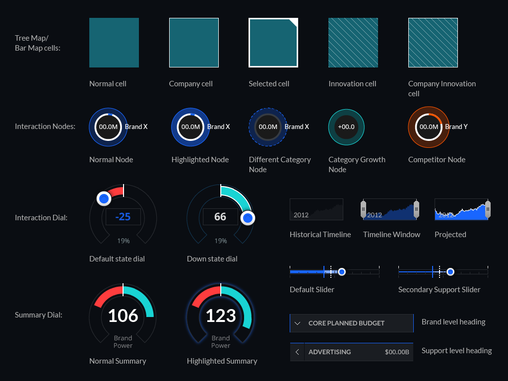
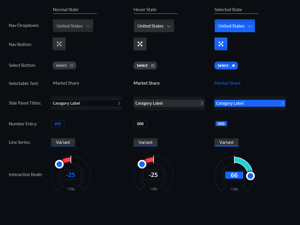
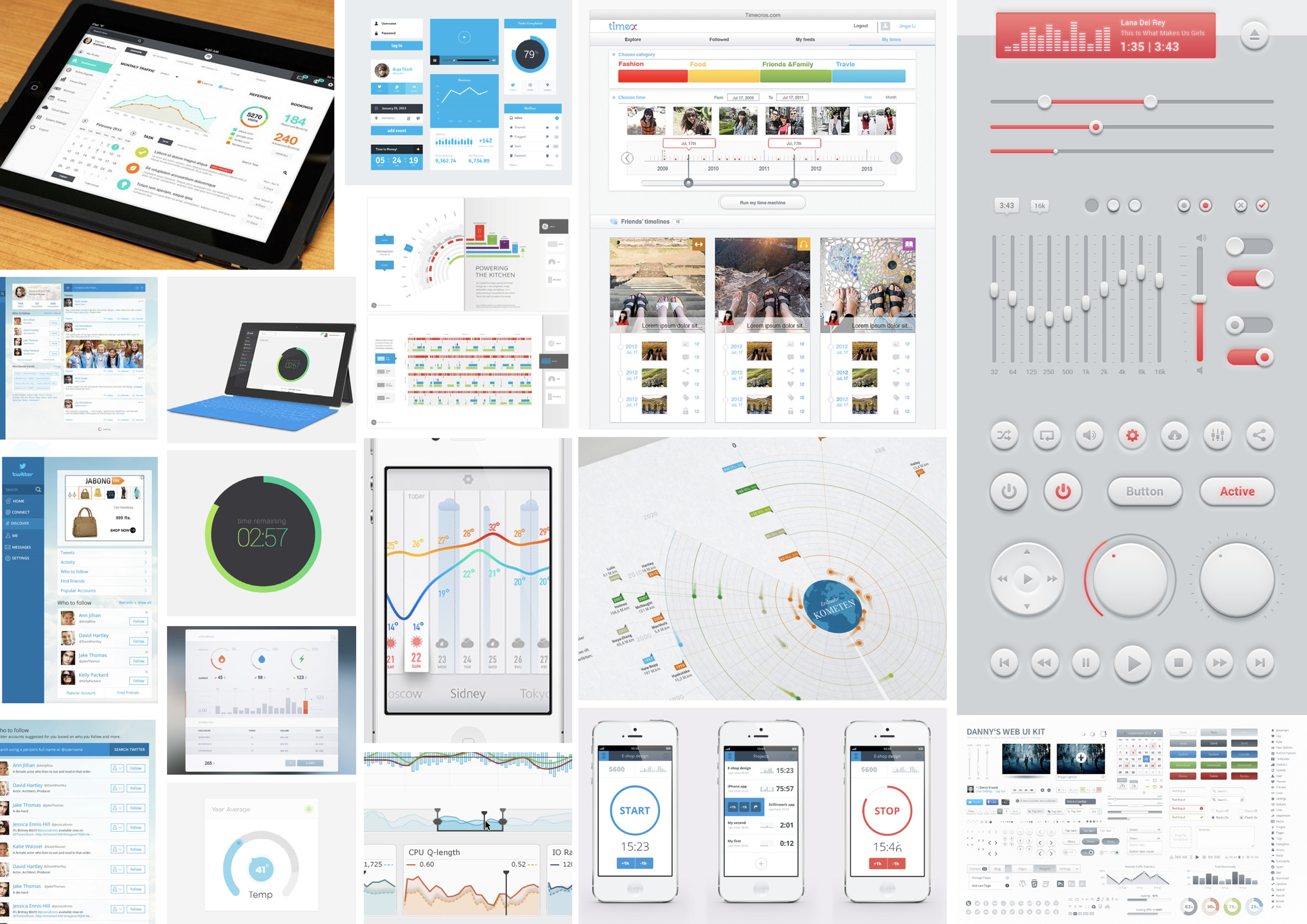
Visual Design Reference for Dev
![]()
![]()
High-fidelity wireframes for key pages
![]()
![]()
![]()
![]()
Aesthetic moodboards
![]()
![]()
![]()
![]()
Moodboards for dark, light and dark+light UI aesthetics
 Worldwide overview
 Viewing the performance of a particular brand category
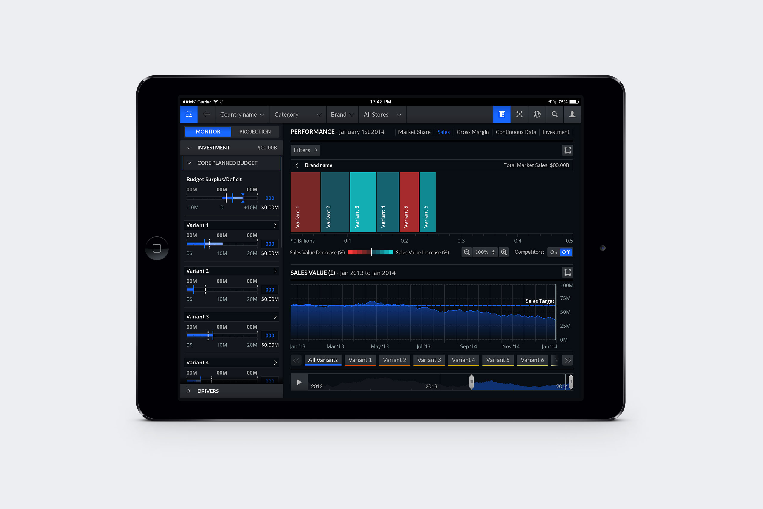 Viewing the sales value vs. target over time for a particular brand
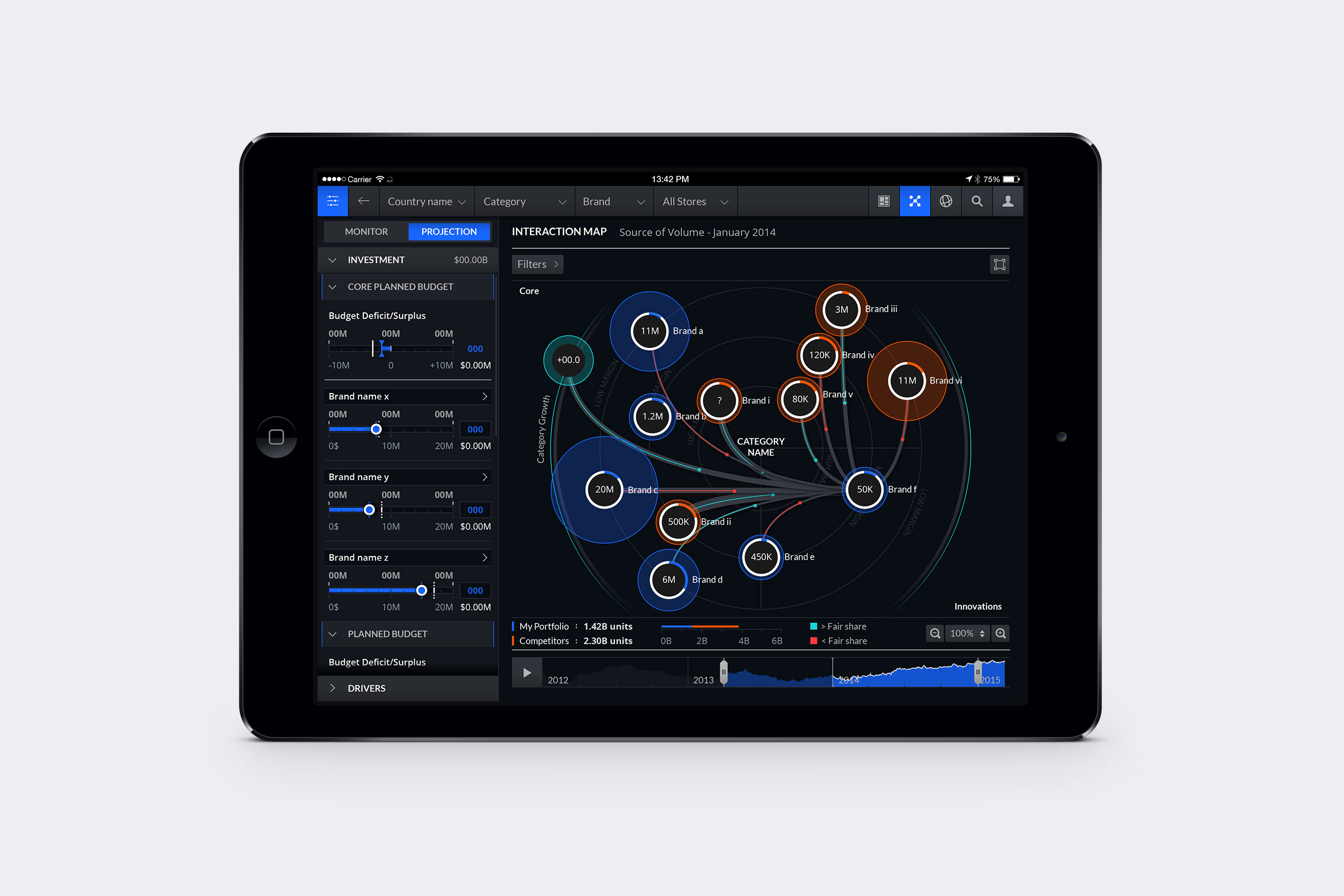 An interaction map showing how sales shift between brands over time, including new brand launches
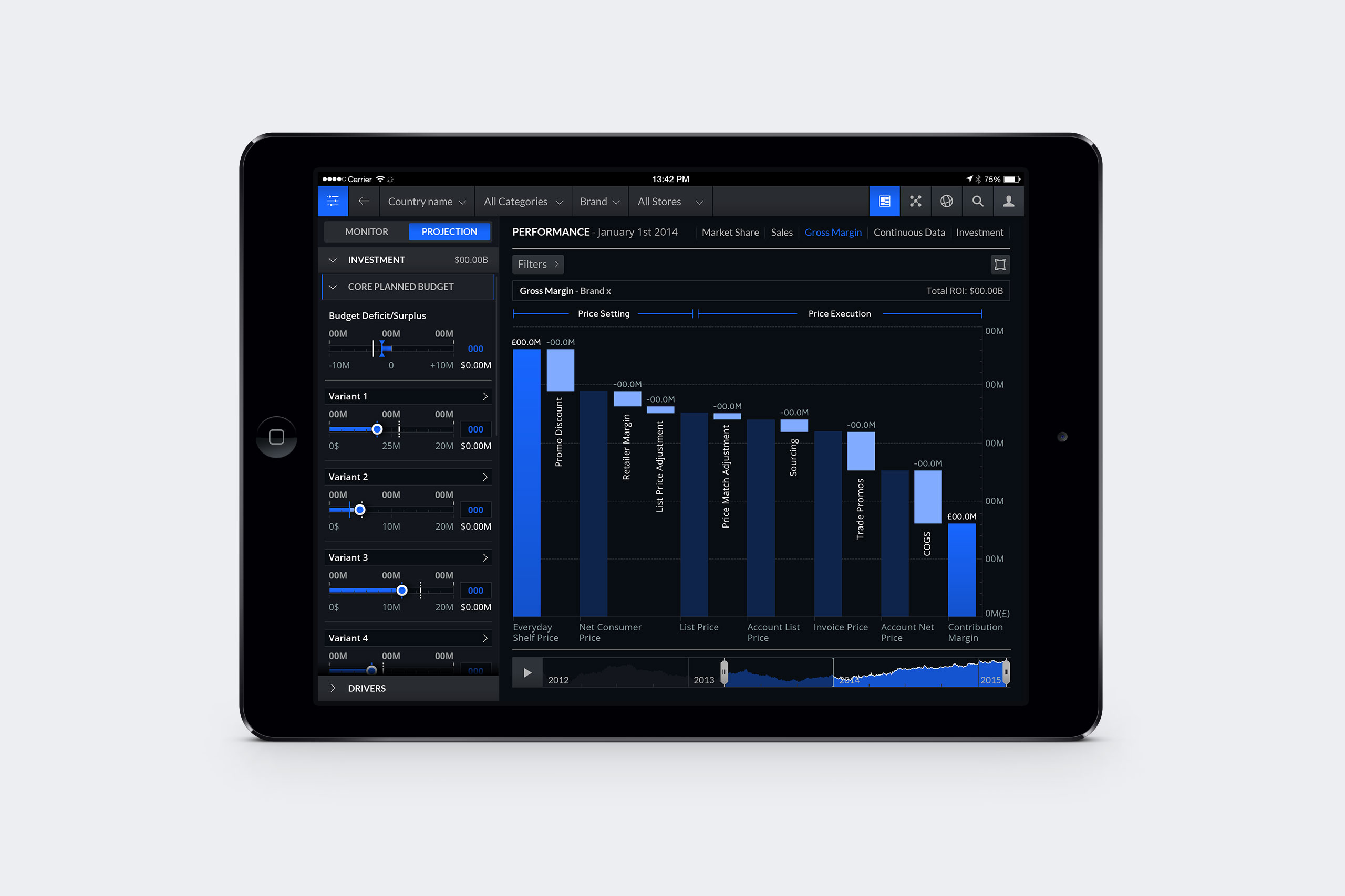 Waterfall chart showing the gross margin for a specific brand
 Tree map showing market share for a product category
 Charts showing sales value increase/decrease compared to total sales
Visual Design Reference for Dev
High-fidelity wireframes for key pages

Aesthetic moodboards

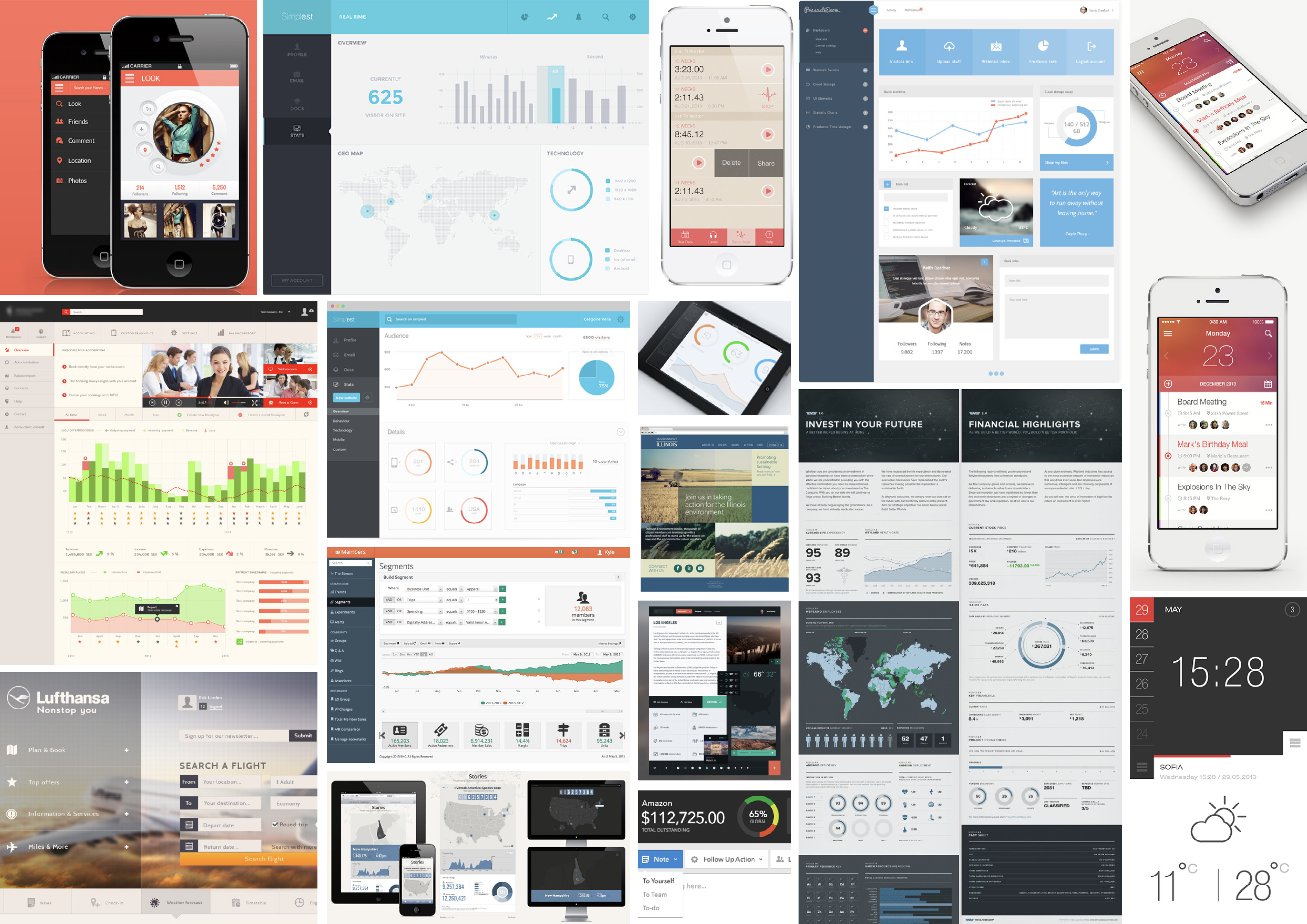
Moodboards for dark, light and dark+light UI aesthetics
Multiple Sclerosis: Drug Performance iPad App
Designed at QuantumBlack
Year: 2015
Lead Designer: Calum Hale
Creative Direction: Yves Boussemart
Design © QuantumBlack Visual Analytics Ltd.
All data anonymised
Brief
A large pharmaceutical company were attending a medical conference in Europe and wanted to demonstrate their Research & Development capabilities. We were tasked with creating an app to showcase the effectiveness of their Multiple Sclerosis drugs.
Outcome
The web app we designed allowed the user to explore data for three clinical trials, measuring three drugs and a control. The data viz solution had three axes so the user could see a ‘surface’ of performance, the highest being the best performing. Via the UI, the user can explore how different sizes and combinations of lesions in the brain lead to a certain percentage of brain volume loss. The graph could also be rotated to only show two metrics.
My Contribution
As the lead designer, I came up with visual concepts for representing the data, defined the filter options and also created the look and feel of the user interface. I demonstrated the app in person on the client’s stand at the European medical conference.
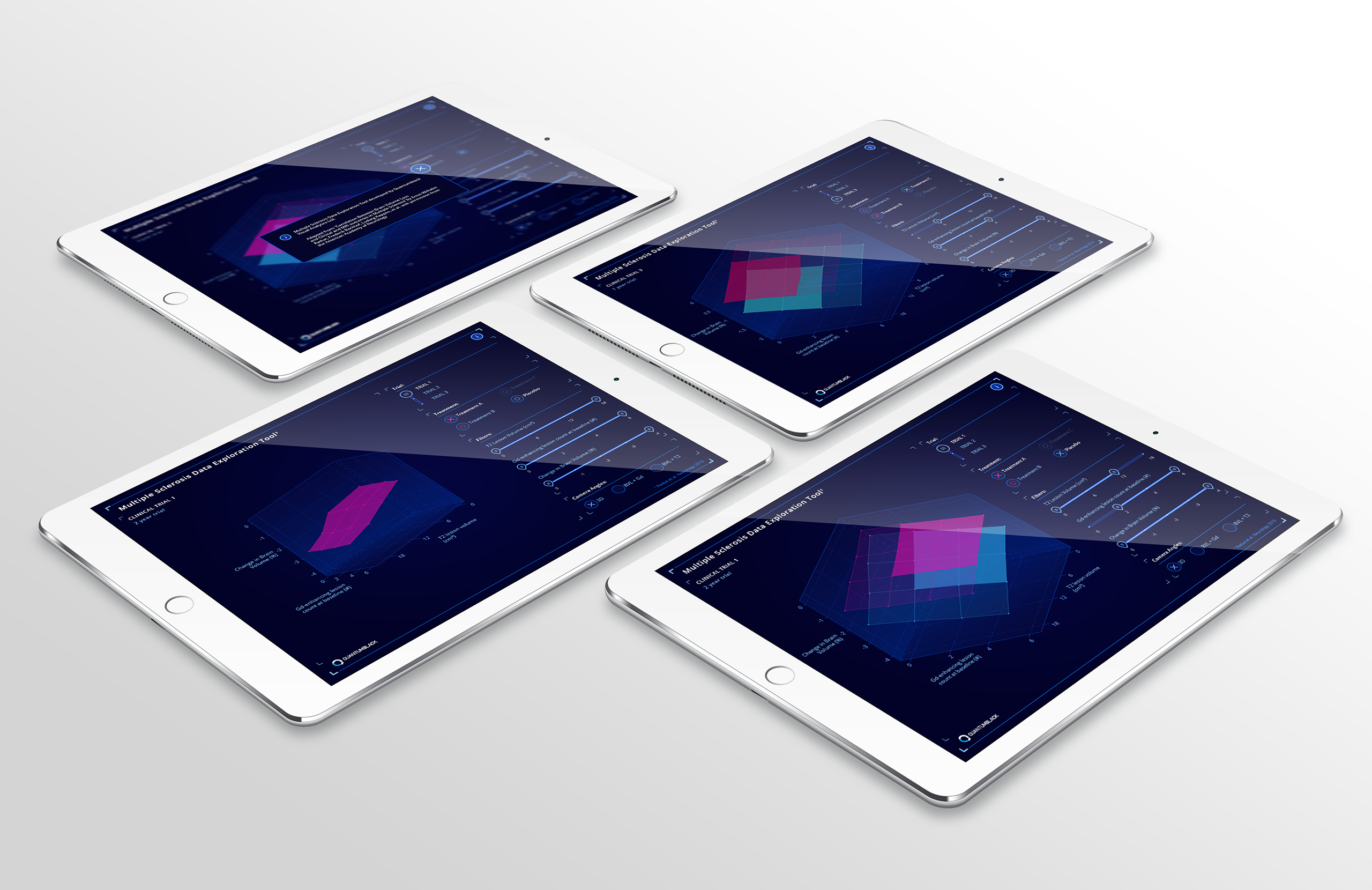 View of the MS app in various interaction states
 View showing selected plane segments
 Views showing comparisons between different drugs’ performance
 View showing how the chart can be rotated to show only two dimensions instead of three
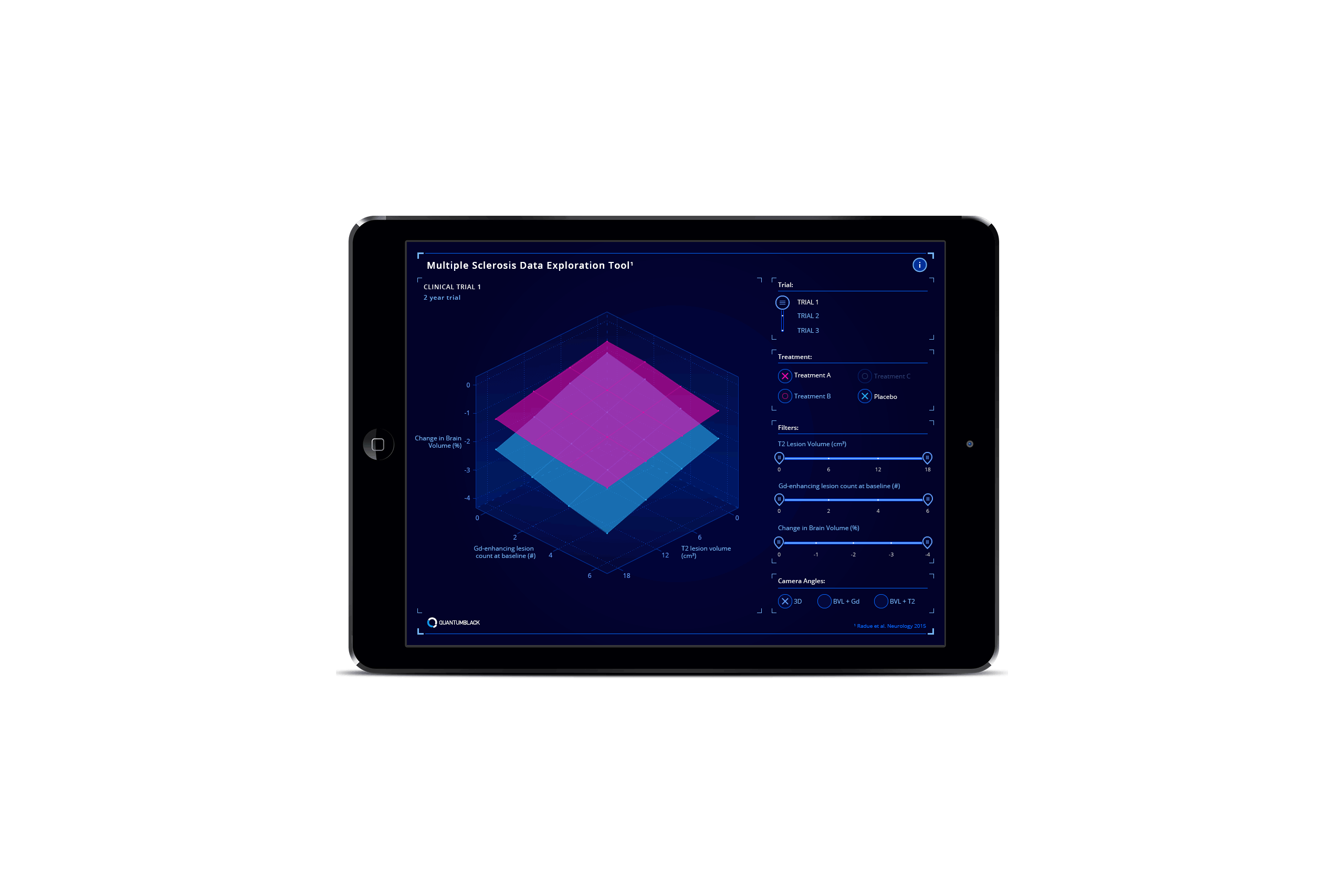 Animation showing how interacting with the sliders allows the user to selectively compare surface plane sectors
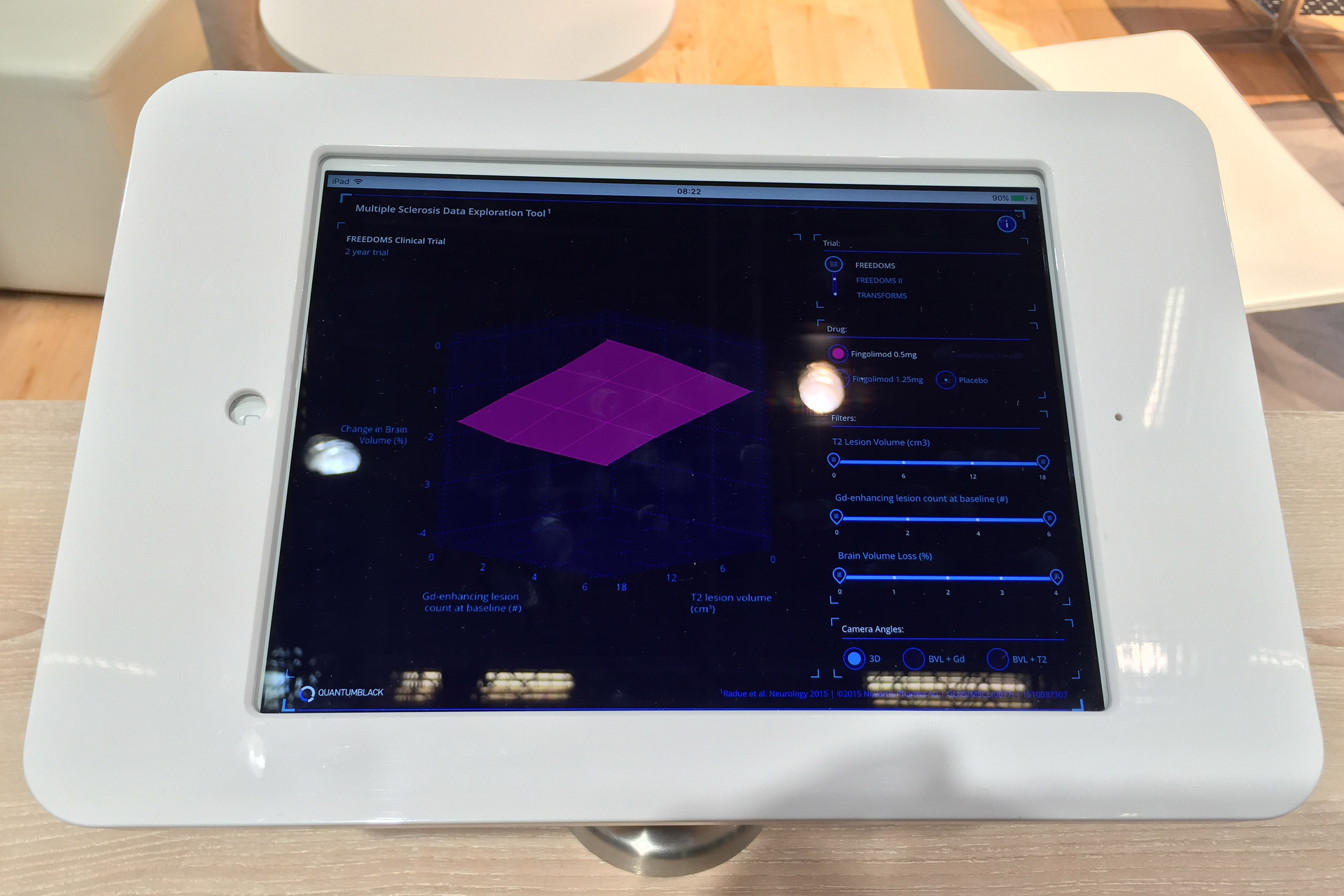 The app in situ on the client’s stand at the medical conference in Barcelona