Bill Gates’ Presentation at the Global Fund, 2019
Client: Bill & Melinda Gates Foundation
Design & Illustration: Calum Hale
Art Direction & Illustration: Kate Ashton
Motion Graphics: Sam Burton
Data Engineer & geospatial plotting: Scott Reilly
Creative Director: Duncan Swain
︎ Watch the speech on YouTube
︎ Read the transcript on the GatesNotes blog
Brief
Speaking for the Bill & Melinda Gates Foundation at ‘The Global Fund to Fight AIDS, Tuberculosis and Malaria’ replenishment conference, Bill Gates needed to tell the story of how the Fund’s investment has improved healthcare around the world.
Solution
We worked with the speech writer at the Foundation to identify the key story points that needed visualising. We then storyboarded the presentation alongside the script, before designing the information graphics themselves. These were then turned into animations for the final presentation.
My contribution
I designed the data visualisation devices and worked with an animator to translate these into motion graphics. As part of the team I helped conceptualise different device types, before executing the final solutions in Adobe Illustrator.
Bill Gates speaking at the Global Fund’s Sixth Replenishment Conference
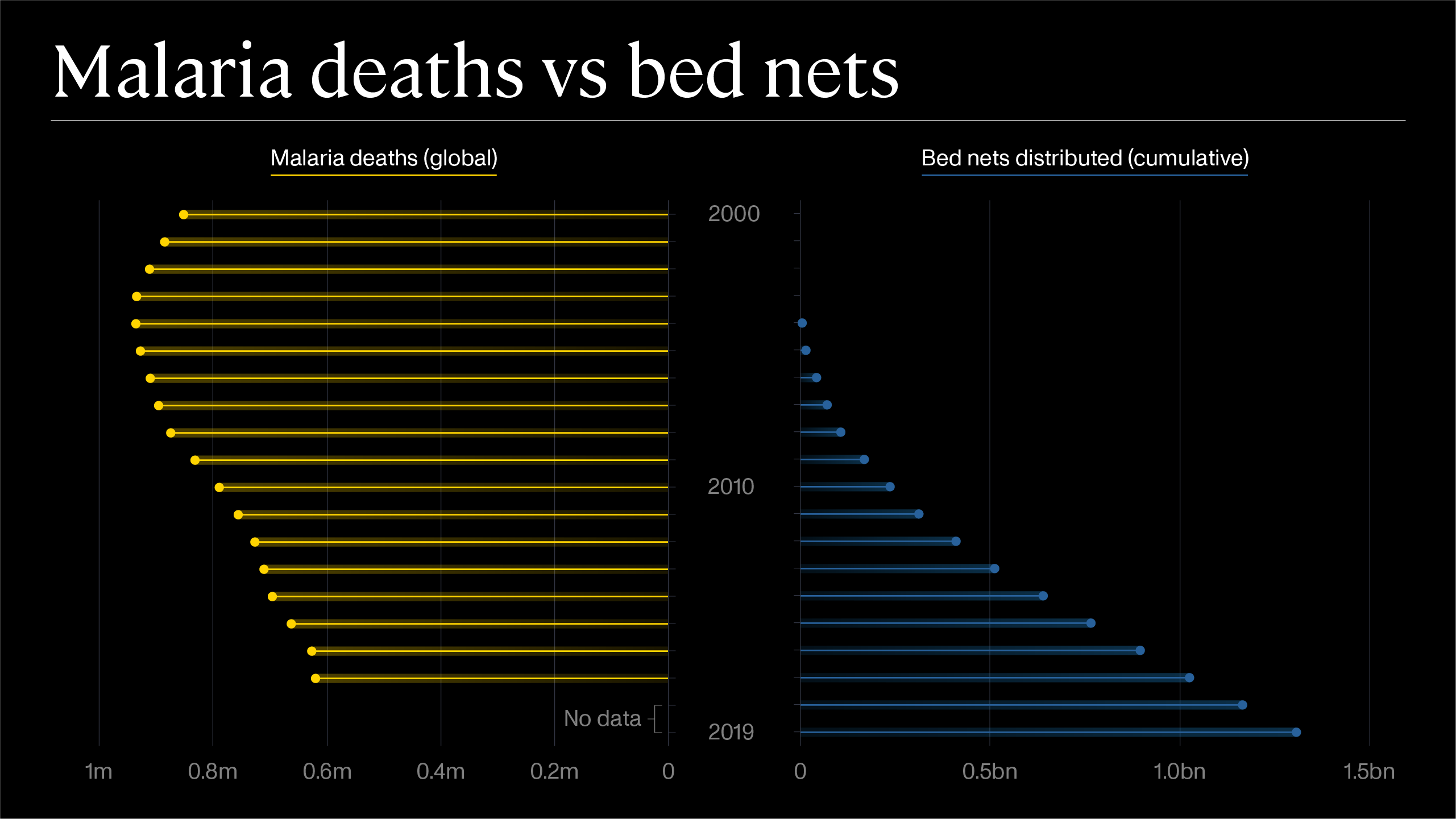 Data visualization showing the decrease in Malaria deaths vs the increase in bed nets distributed from 2000–2019
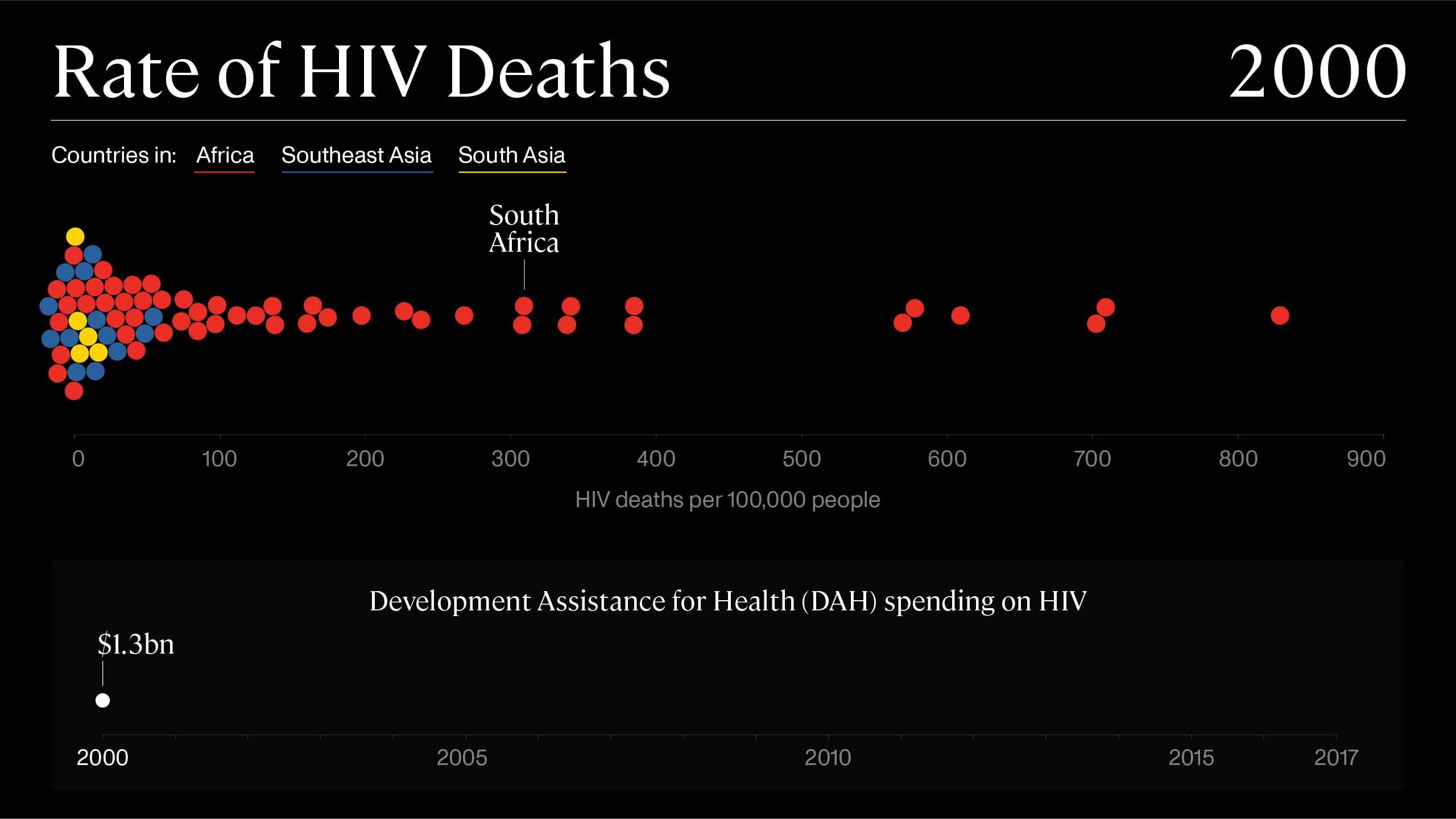
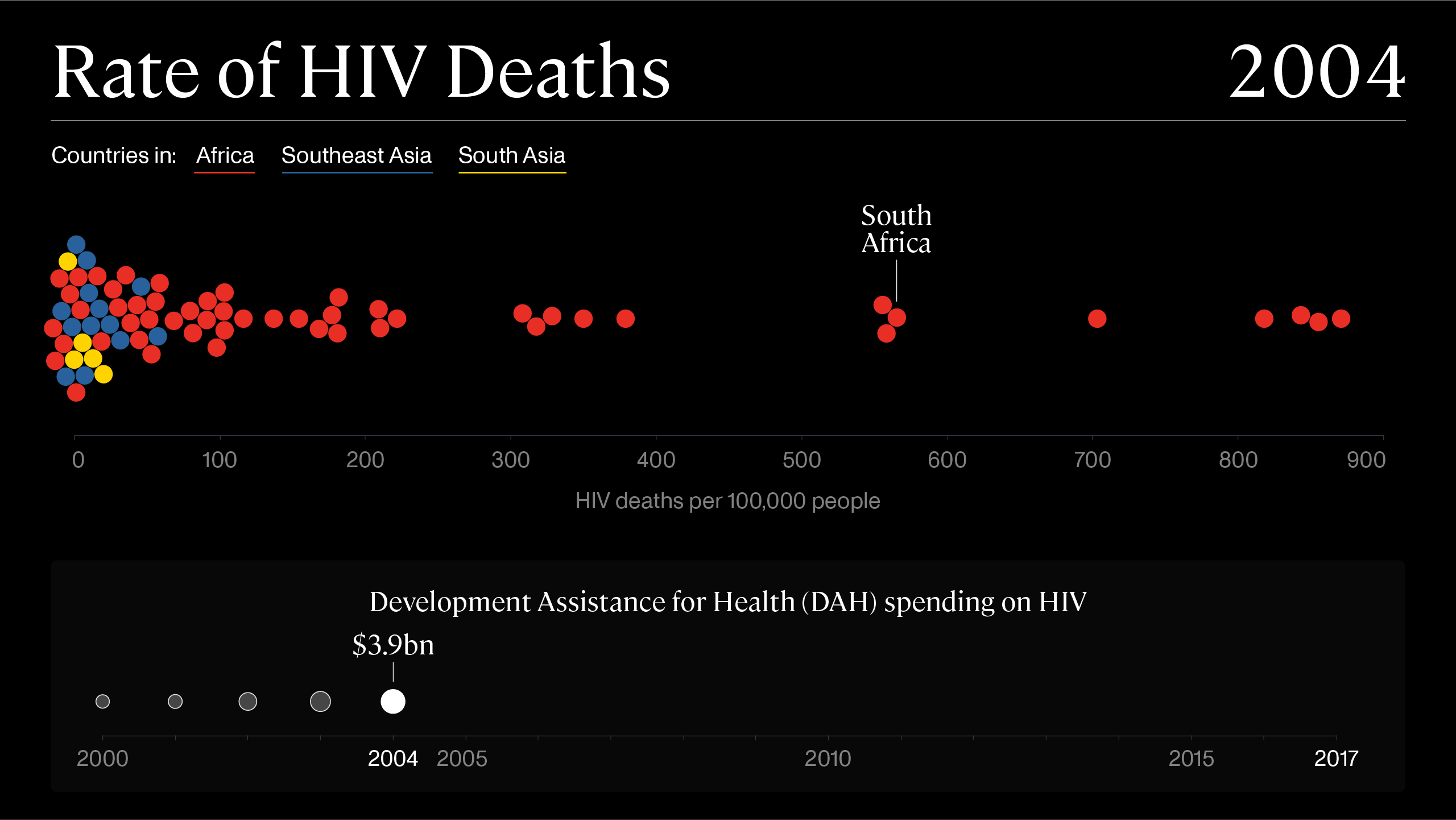
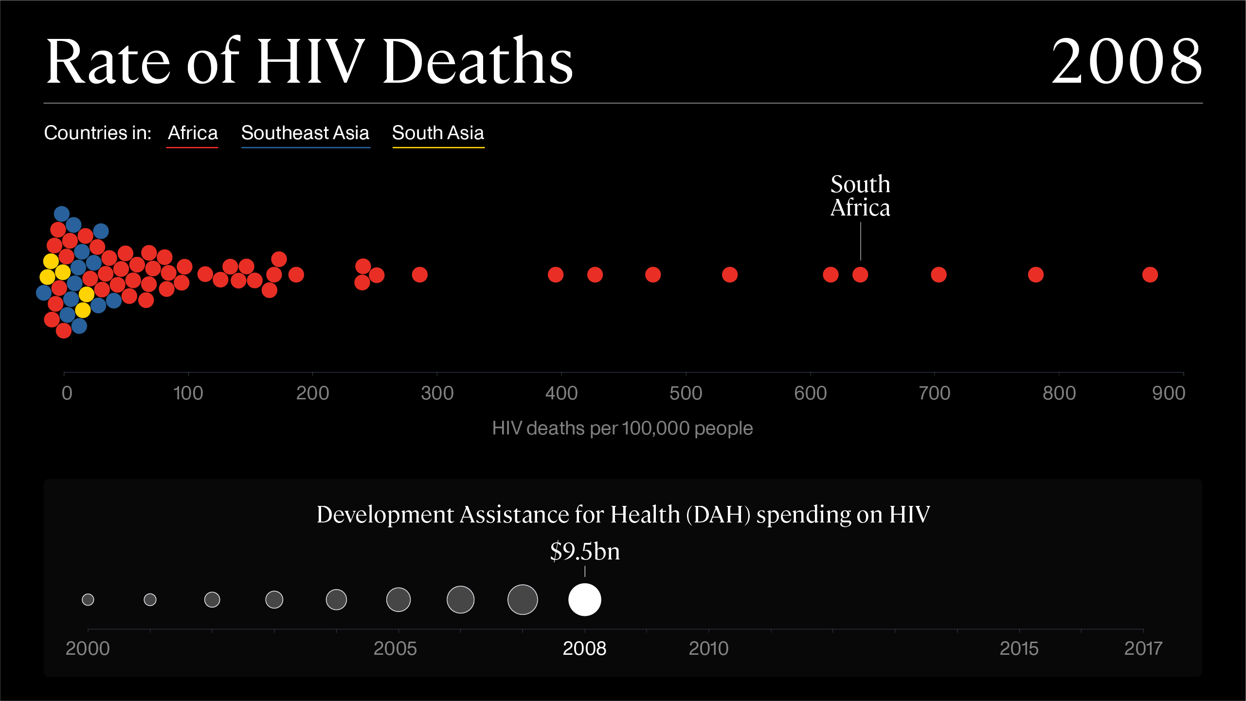
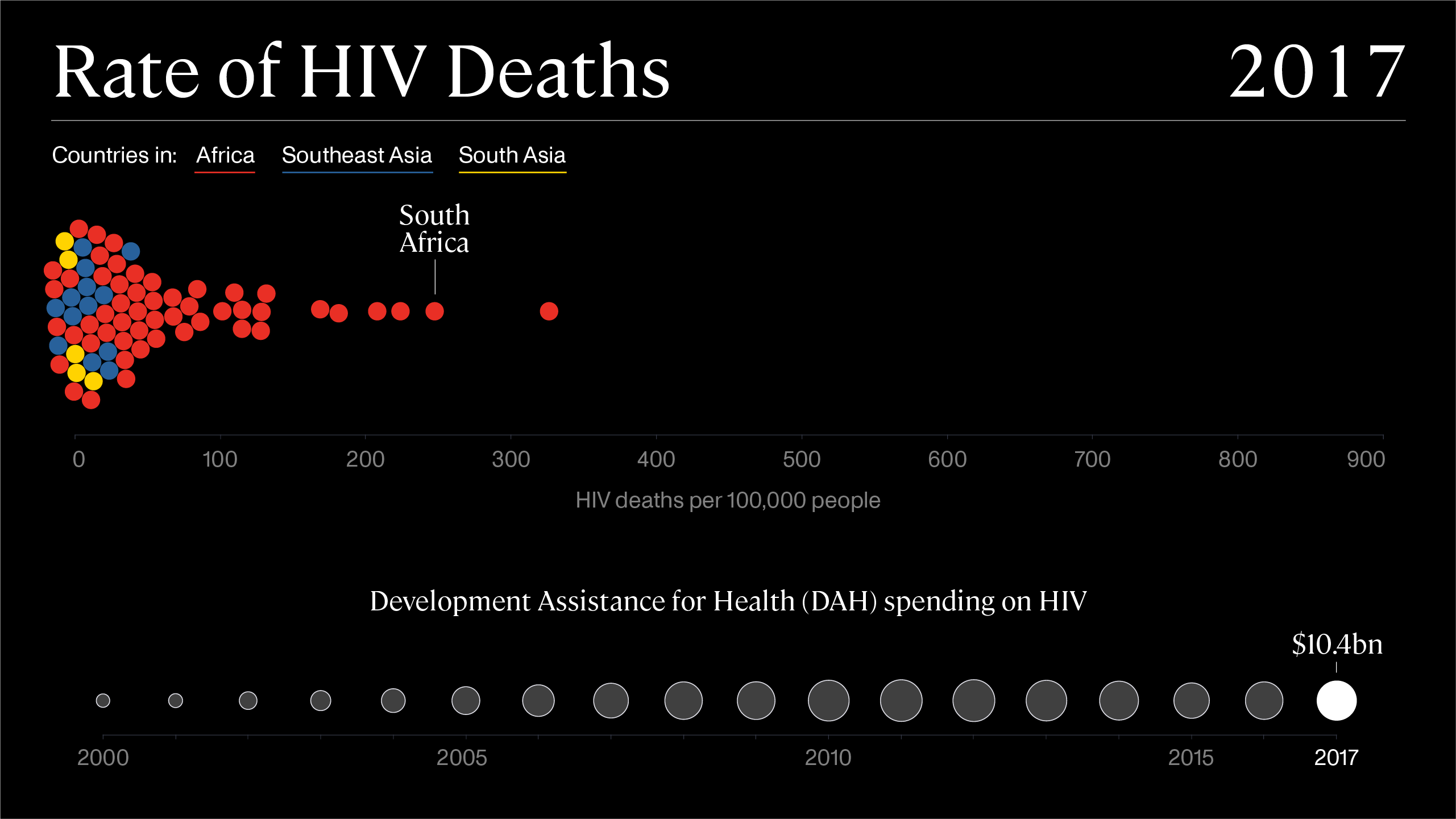
Beeswarm chart showing the rate of HIV deaths decreasing as Development Assistance for Health spending on HIV increased, from 2000–2017
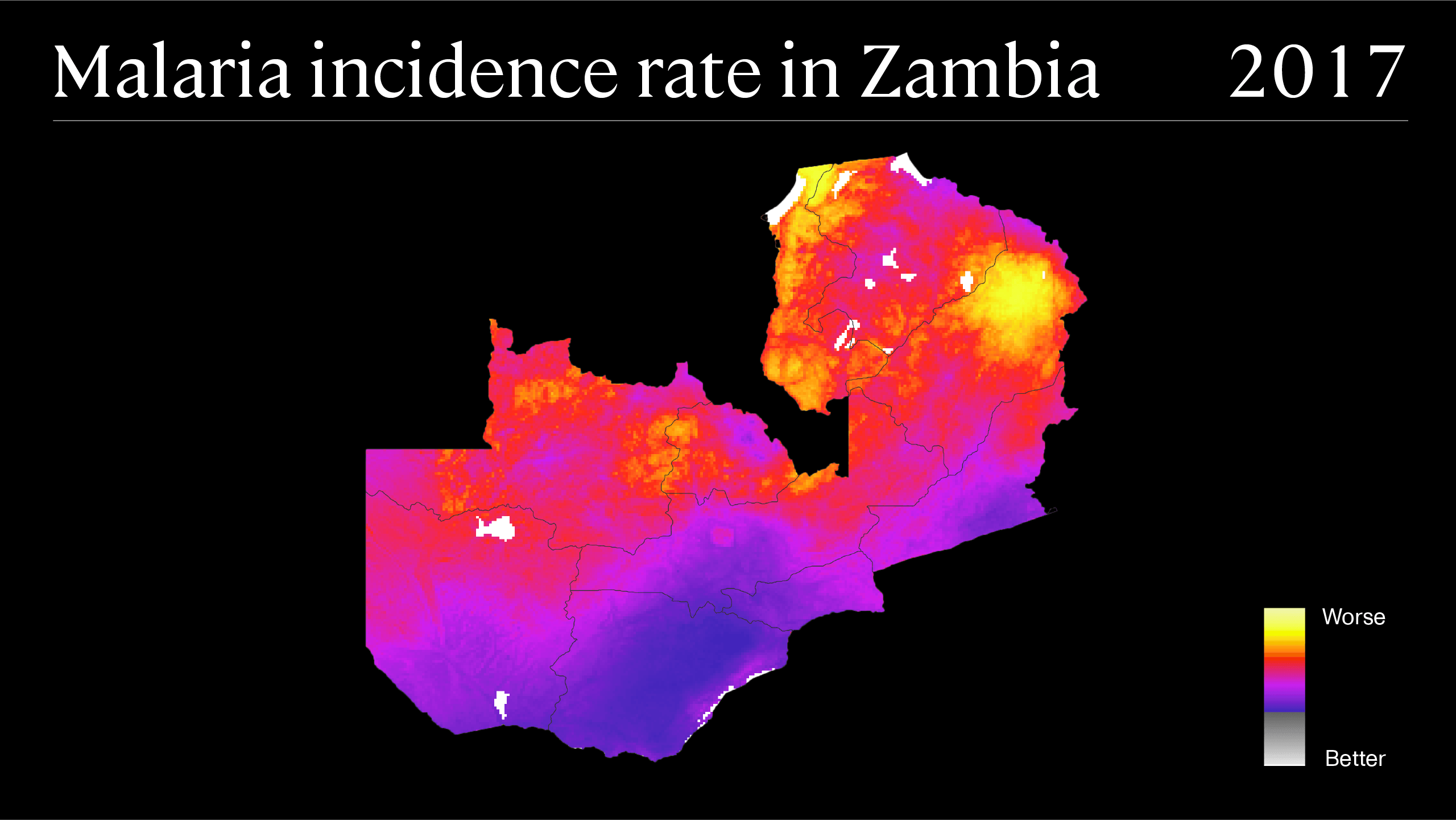 Map showing the Malaria incidence rate for Zambia in 2017
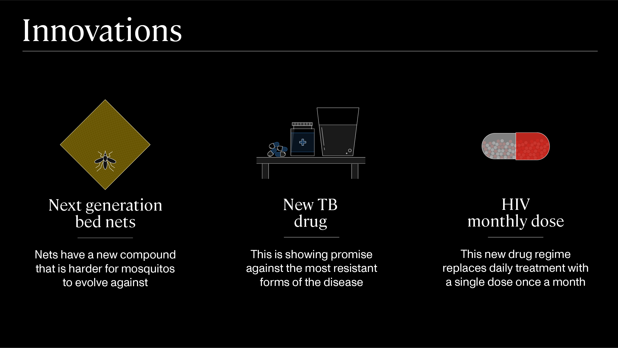 Illustrations showing the innovations in preventing malaria, TB and HIV
Formula One Car Positioning Diagram
Client: Formula One Management
Year: 2018
︎ The full project is password protected.
Please email calum.hale@gmail.com for more details.
Airport Baggage Targets Visualization
Designed at QuantumBlack
Year: 2015
Designer: Calum Hale
Creative direction: Yves Boussemart
Design © QuantumBlack Visual Analytics Ltd.
All data anonymised
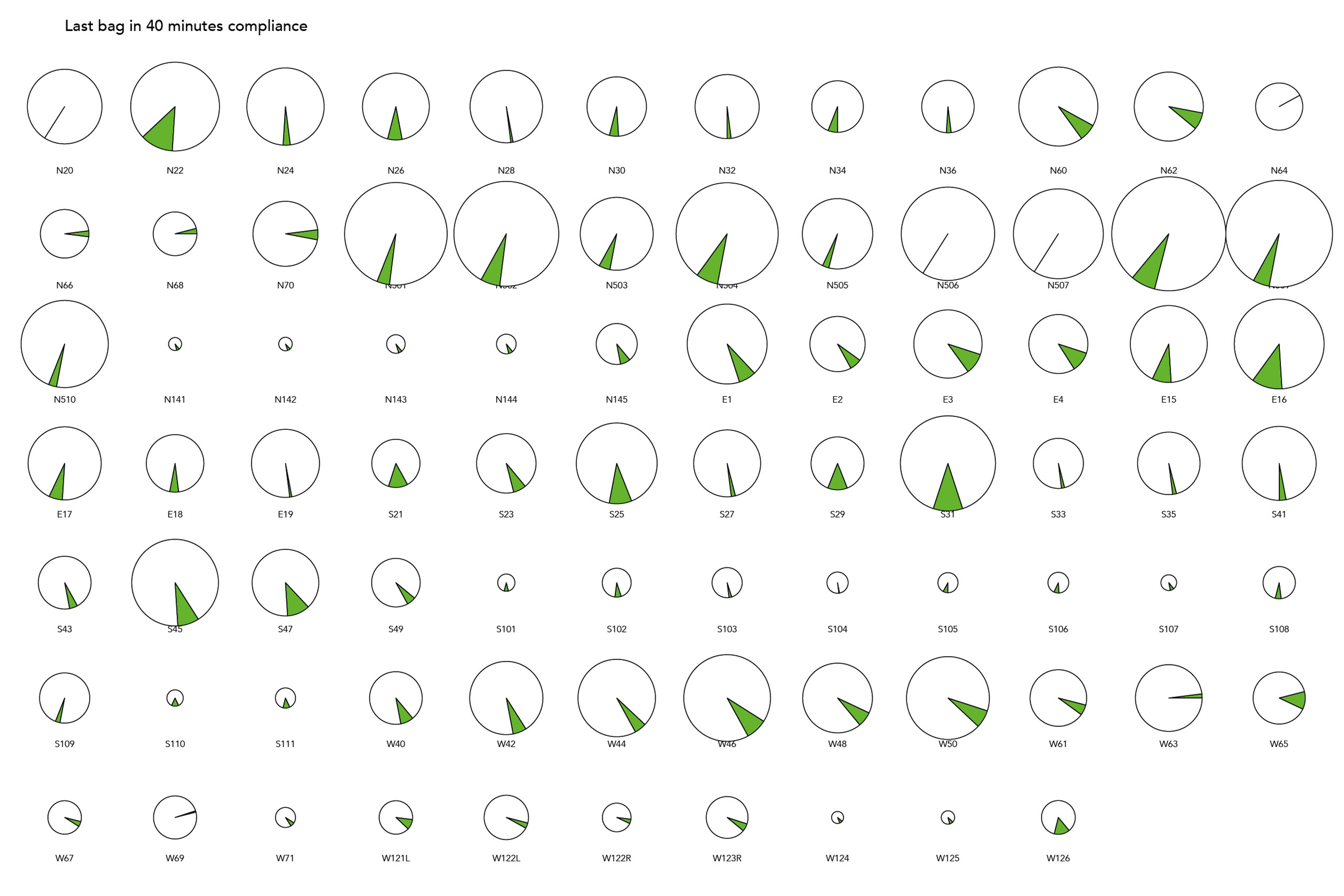
Quantumblack investigated optimising the allocation of arriving baggage from the gate to terminal for a major airport hub in Asia. I designed a way of seeing if the time for the bag to arrive at baggage reclaim was over or under target.
The size of the bubble is the number of flights per year that gate receives, the size of the circle segment is the potential target improvement, the inner ring is the first bag target, and the outer ring is the lsat bag target, with the circumference of the circle being the range from 0% to 100%.
The size of the bubble is the number of flights per year that gate receives, the size of the circle segment is the potential target improvement, the inner ring is the first bag target, and the outer ring is the lsat bag target, with the circumference of the circle being the range from 0% to 100%.
 Final airport baggage targets visualisation
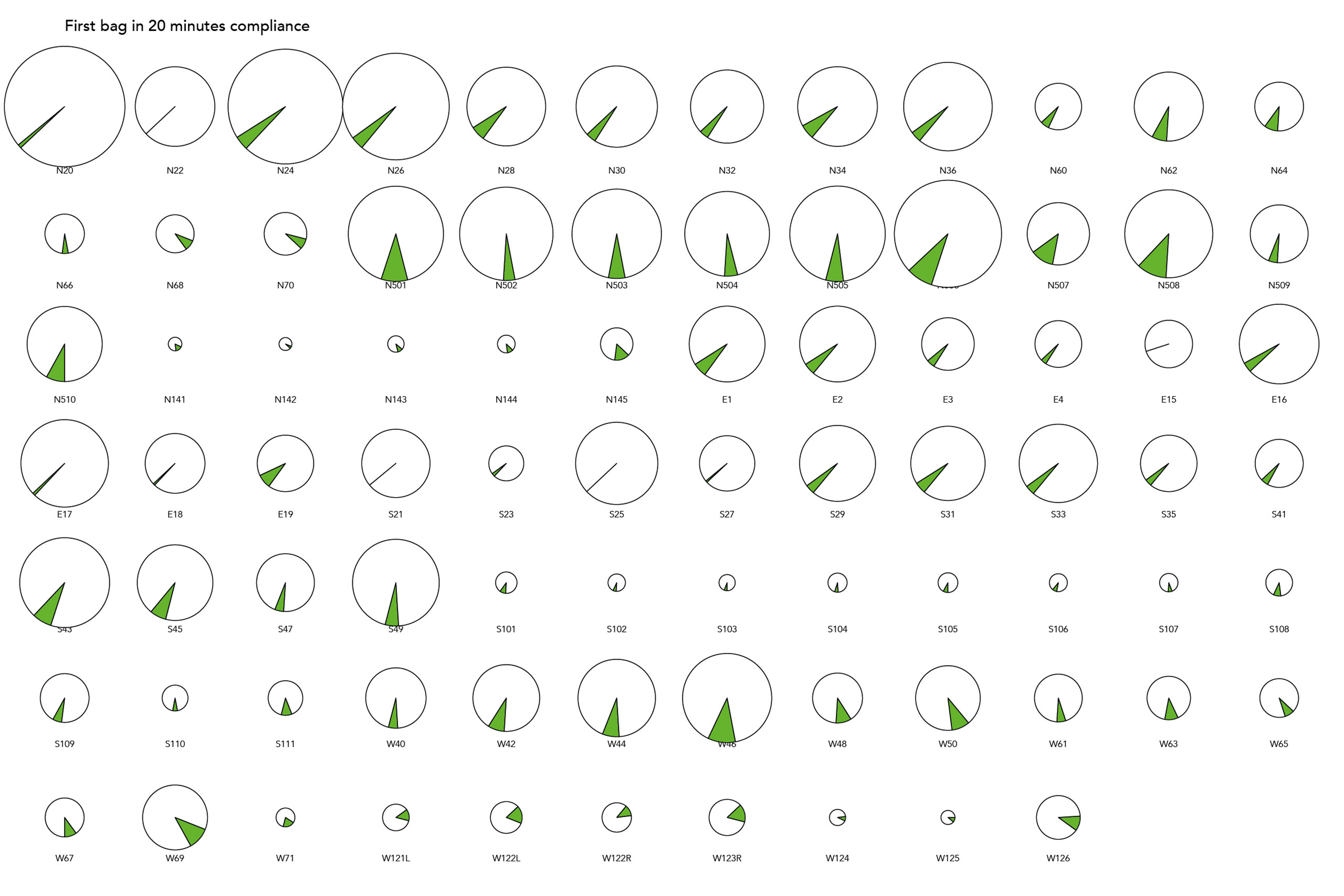
 Pie charts created by data scientists to help plot the values to be geographically placed
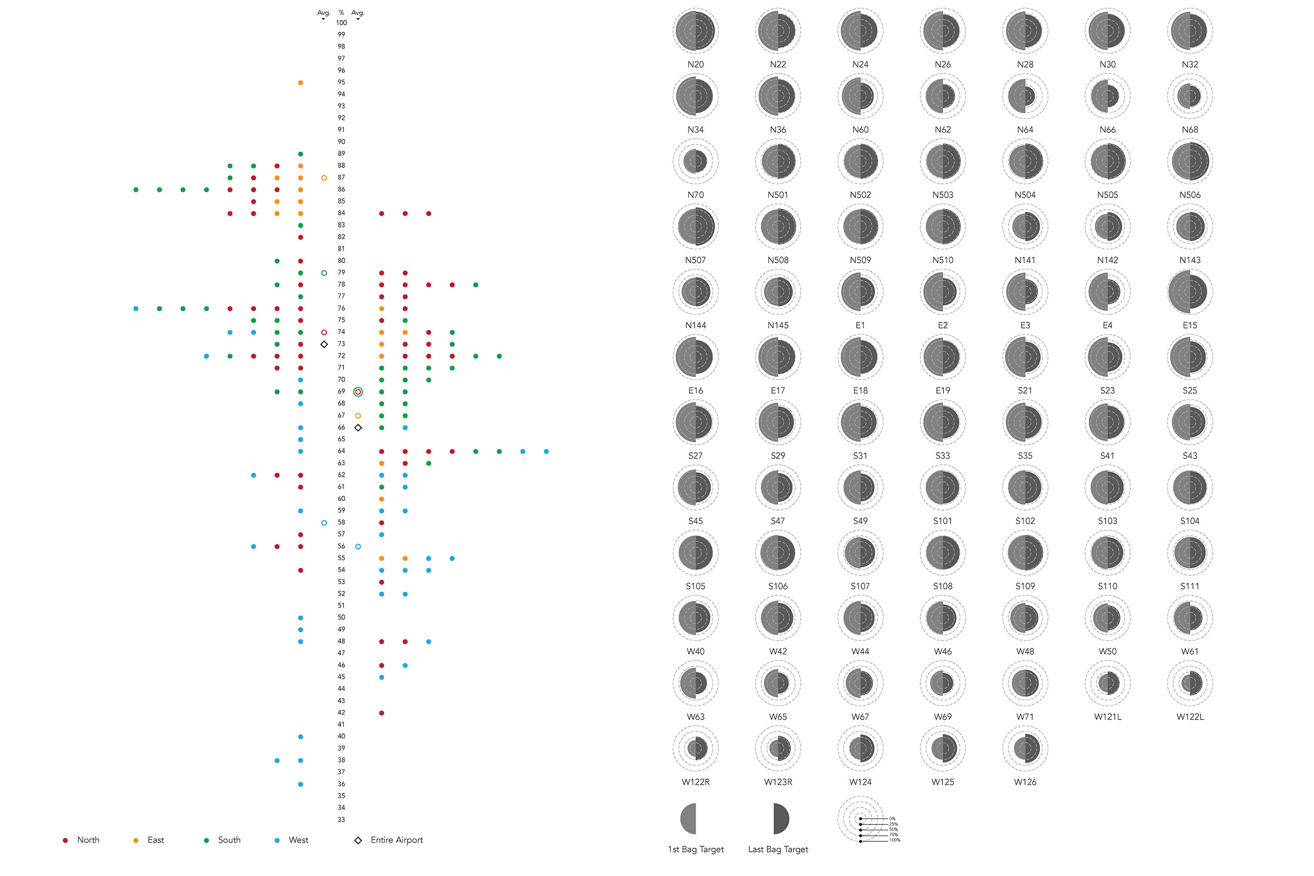 Concept designs for displaying the baggage delay information
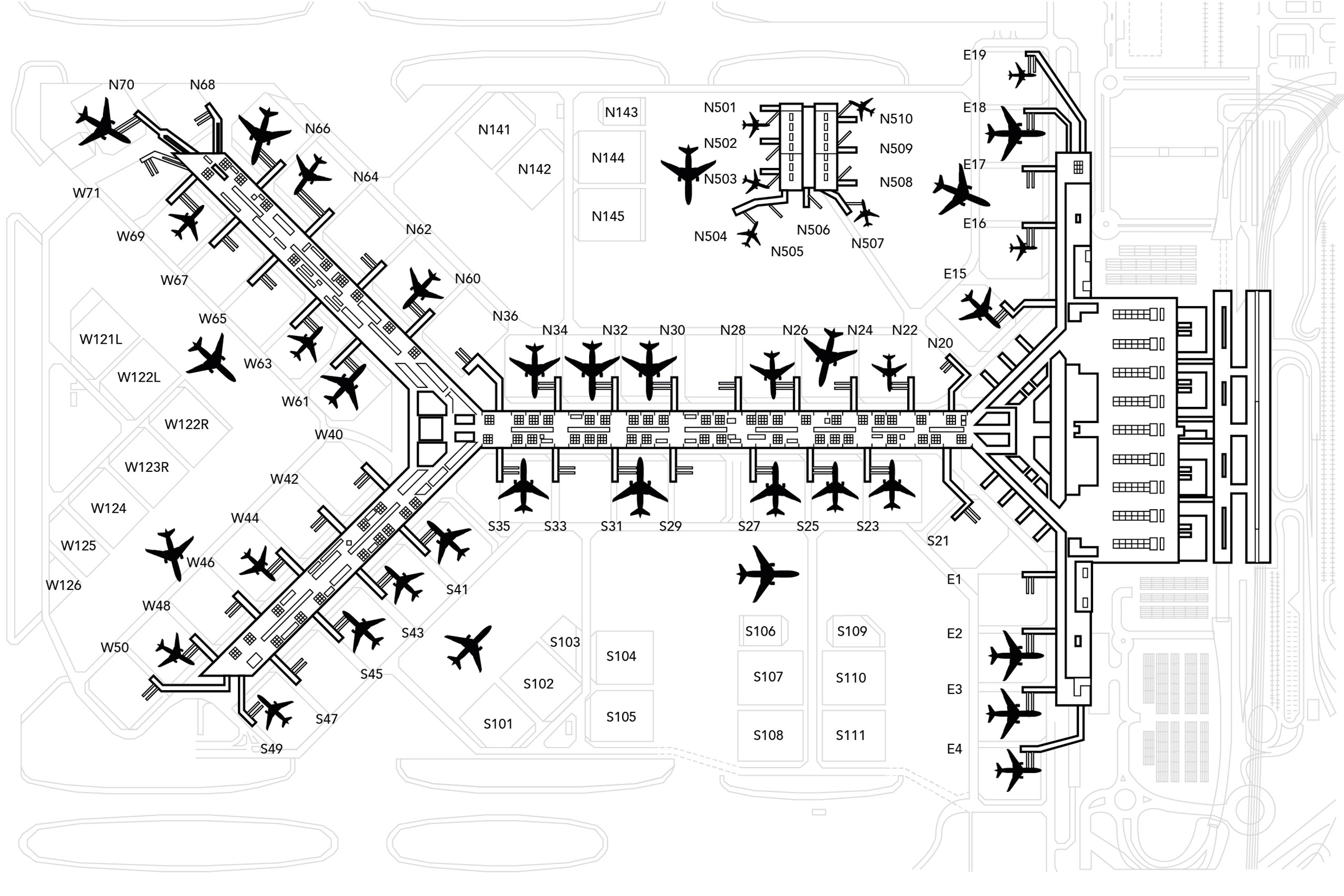 Airport schematic created for plotting data onto
Formula One 2014/15 Broadcast Information Graphics
Designed at QuantumBlack
Year: 2014
Lead Designer: Calum Hale
Creative Direction: Yves Boussemart
Design © Formula One Group & QuantumBlack Visual Analytics Ltd
QuantumBlack was commissioned to produce a series of information graphics to help Formula One viewers understand the new rules following an engine formula change.
As lead designer and domain expert, I drove the information design aspect of the television graphics, whilst complying with the 2013/14 F1 brand guidelines. QuantumBlack partnered with a leading UK visual effects house to ensure the designs were up to broadcast standard.
The new graphics package was seen by a global audience of 425m people during the 2014 season, acting as a visual aid to the commentators of global media networks throughout the races.

Broadcast infographic chart showing the gap between drivers Fernando Alonso (Ferrari) and Daniel Ricciardo (Red Bull Racing) narrowing each lap
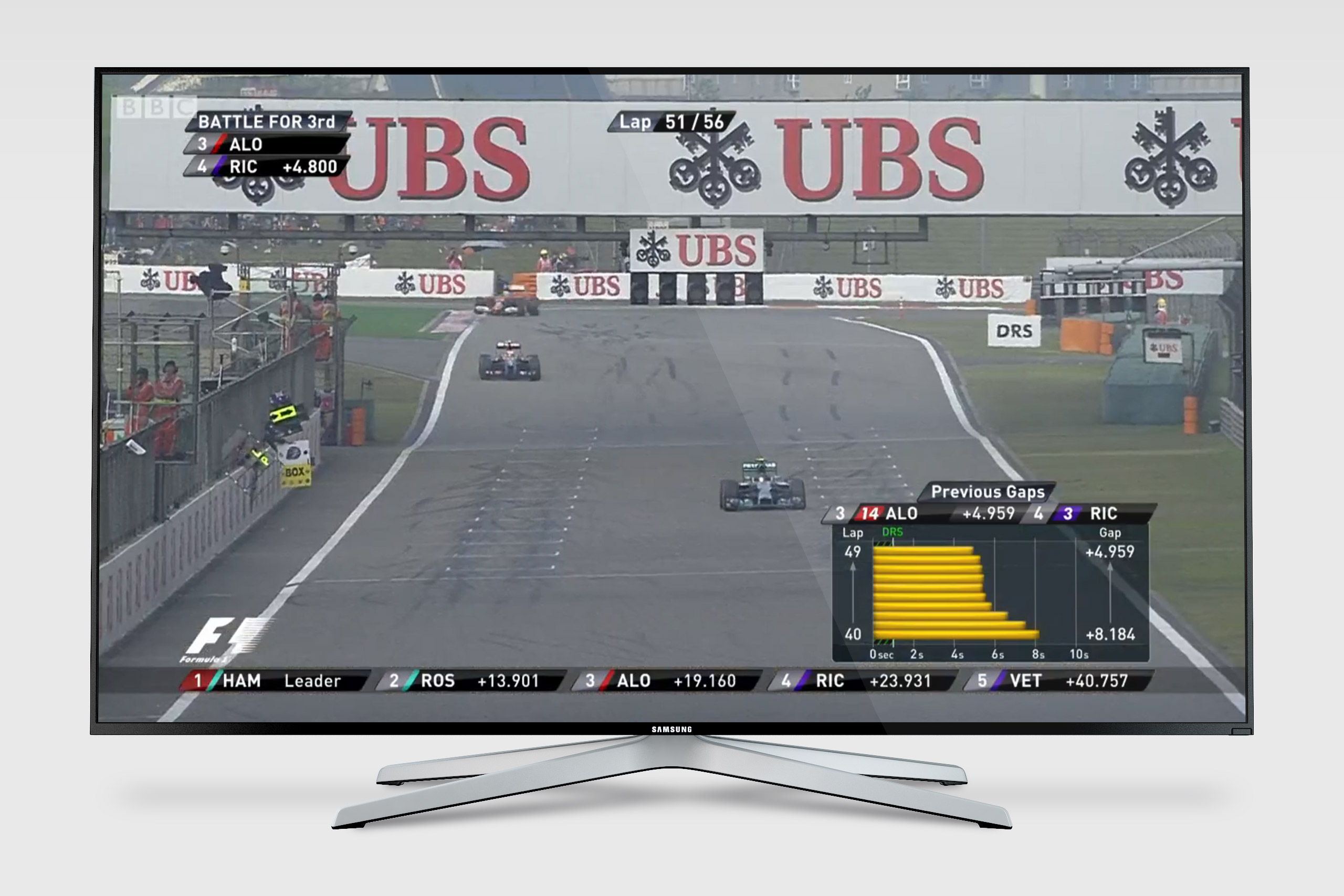 Broadcast infographic chart showing the change in gap from laps 40–49 between Alonso and Ricciardo
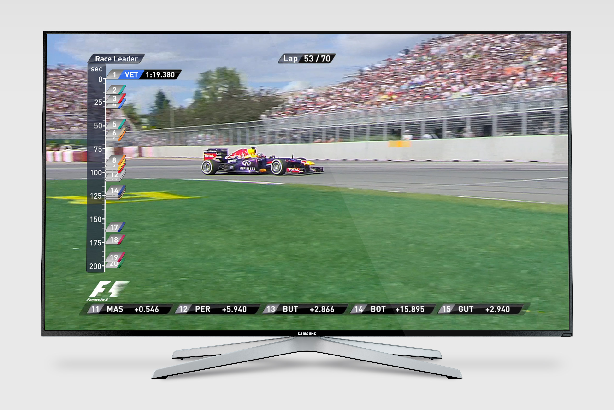 Concept graphic showing a timeline of all the drivers’ positions
 Expanded timeline concept graphic shows how the gaps between drivers change over the laps
 Concept graphic showing driver position timeline and top 12 drivers’ tyre type and number of laps used
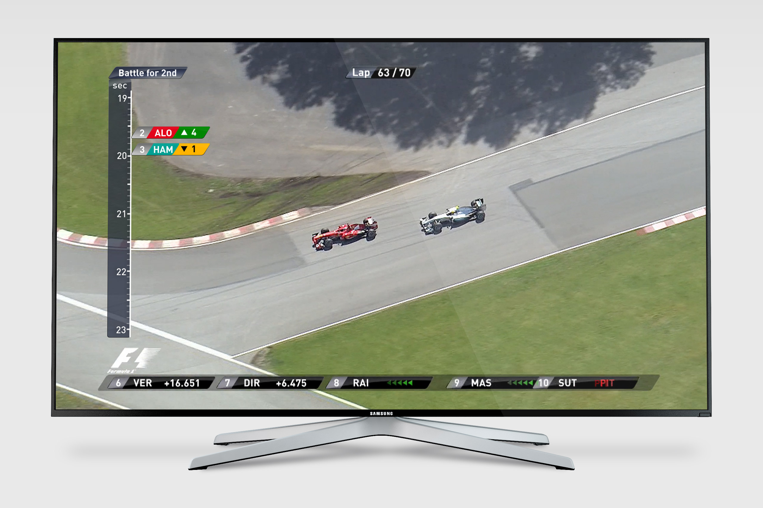 Concept graphic showing timeline graphic and position change markers
 Concept graphic displaying car metrics and details
‘Less than a Second’ in Formula 1: Poster
Commissioned by: SignalNoise (now part of the Economist)
Designed at QuantumBlack
Year: 2013
Designer: Calum Hale
Designer: Geoffroy Gaborieau
Creative Direction: Yves Boussemart
Design © QuantumBlack Visual Analytics Ltd.
QuantumBlack was commissioned to produce a data-driven artwork for an information design exhibition with the theme 'Less Than A Second'. We used our expertise in data science and design to produce an informative and dynamic Formula 1 race chart that looked at less than a second gap between drivers per lap. The exhibition was a great success and led to more work with Formula 1.
 The ‘Less than a Second’ in Formula One poster design
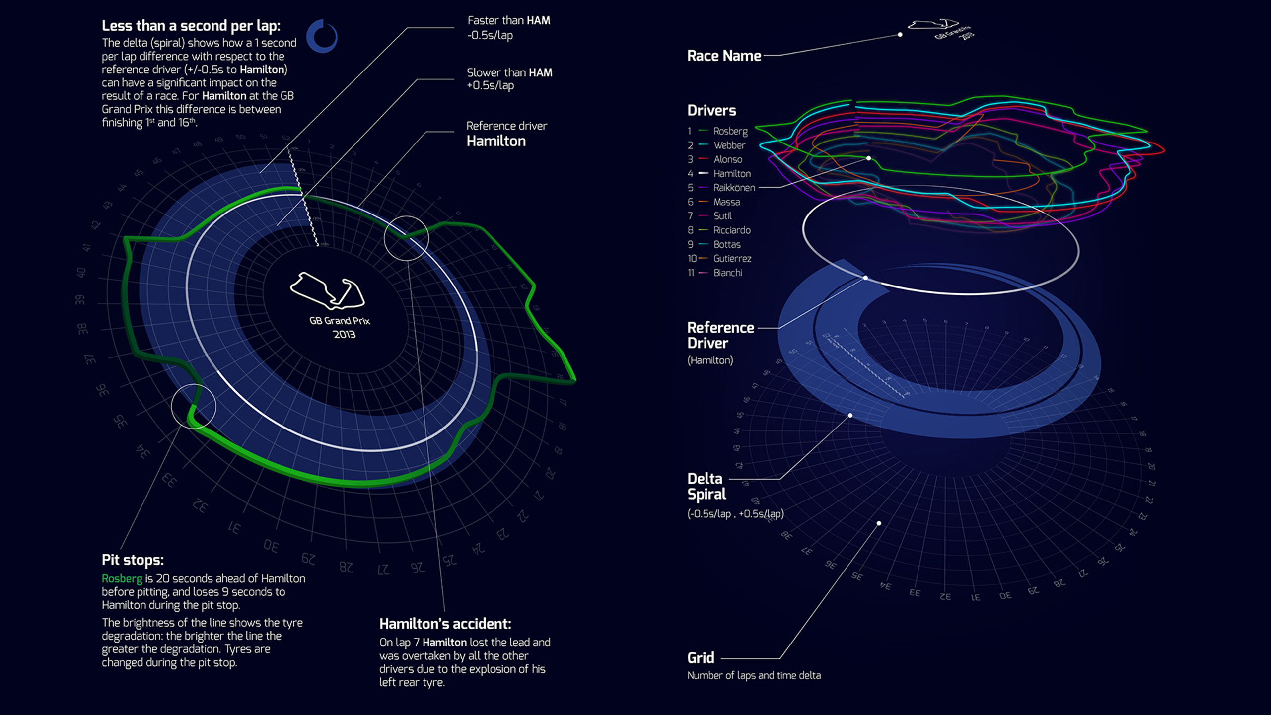 Graphic explaining the visual break-down of how to read the poster. The white reference line is Lewis Hamilton’s race at the 2013 British Grand Prix, and the the other colours show the drivers ahead and behind Hamilton during course of the race and by how much time.
 Race graphic without annotations
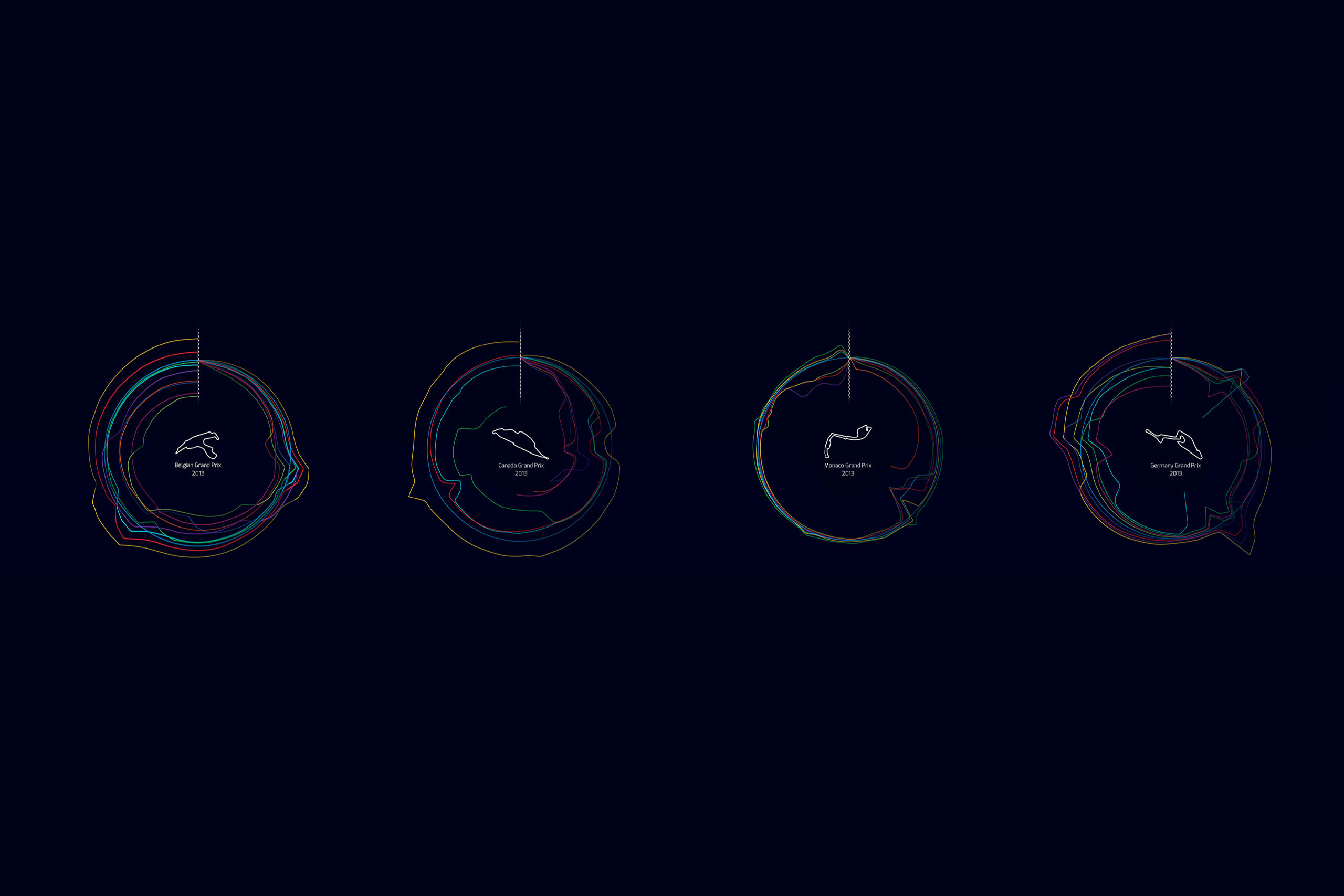 The graphic’s circular visual signature can be applied to other Formula One races. Belgium’s circuit (first graphic) has lots of opportunities to overtake, so the timing lines have lots of gaps between drivers. Whereas Monaco (third graphic) is a tight street circuit and so the lines are close together, showing close racing.
 The graphic was used to conceptualise a race scenario builder, in this example showing how weather might effect the end of the race posibilities from lap 42 onwards
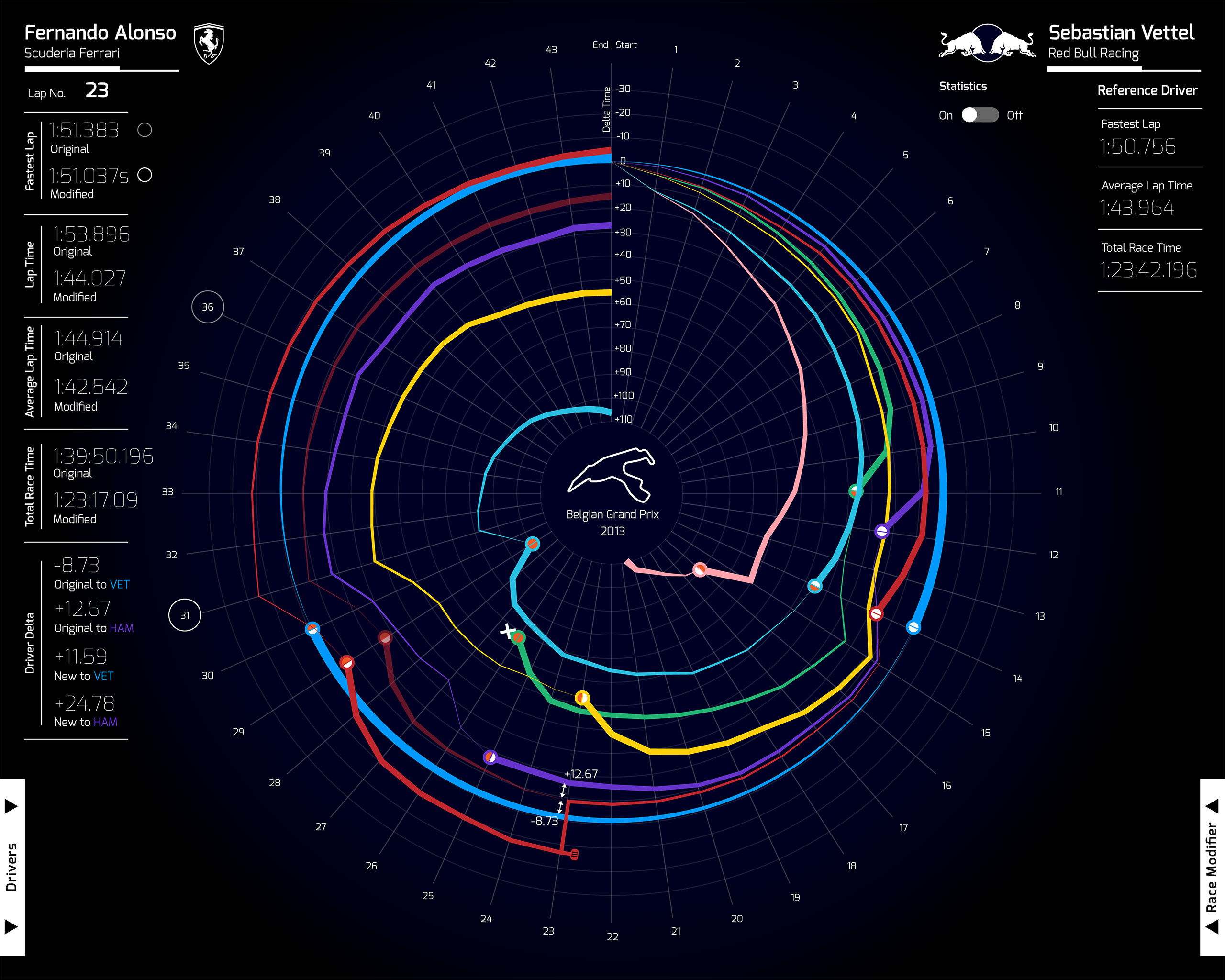 An early visual exploration for the race graphic
 A visitor to the ‘Less Than One Second’ exhibition views the F1 poster
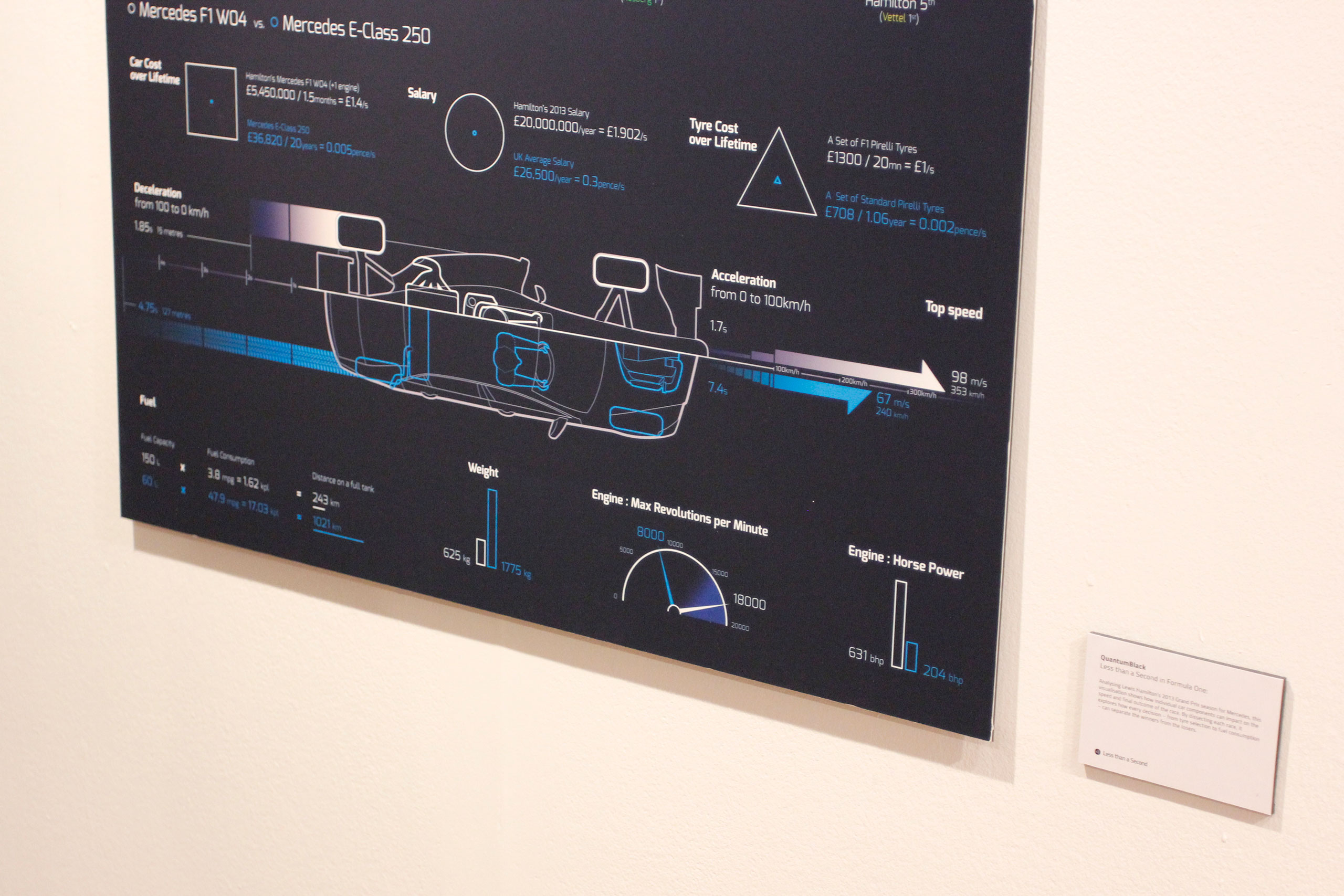 Detail view of the bottom of the poster, showing how an F1 car compares to a road car
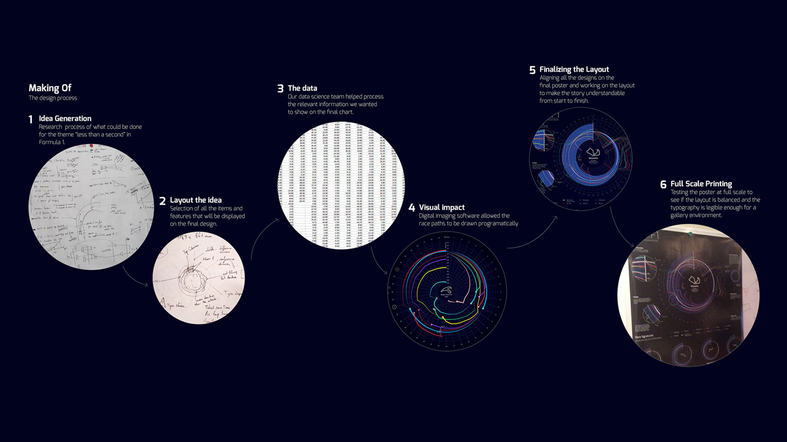 Process visual showing how the poster was made
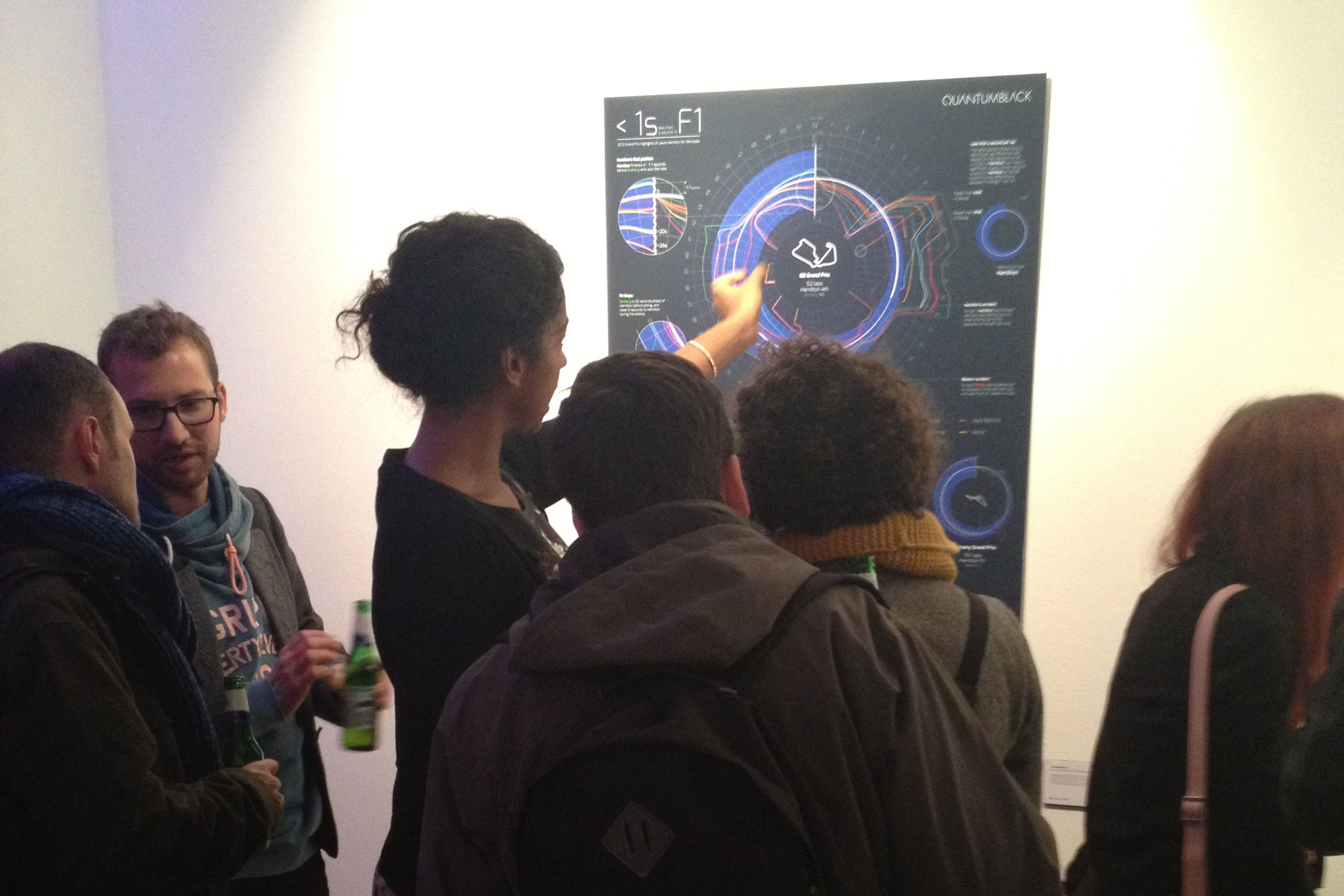 ‘Less than a Second’ exhibition opening night private view
 The Less than a Second exhibition website
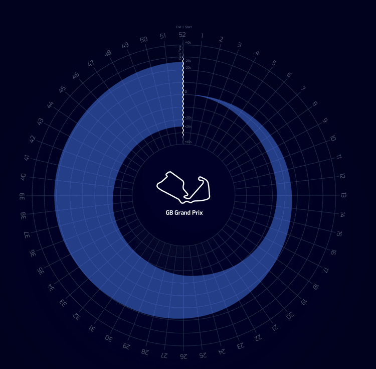 Animation showing how the race timings and gaps evolved during the race