SAS IT: Basketball Illustration
Client: SAS IT
Year: 2021
Design: Calum Hale
Art Direction: Fangyi Su
Print Production: Pumphouse Print & Signs
Studio photos © Pump House Print & Signs (FB post).
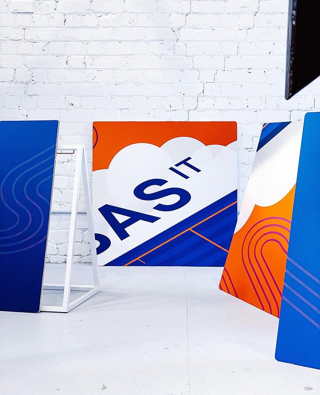
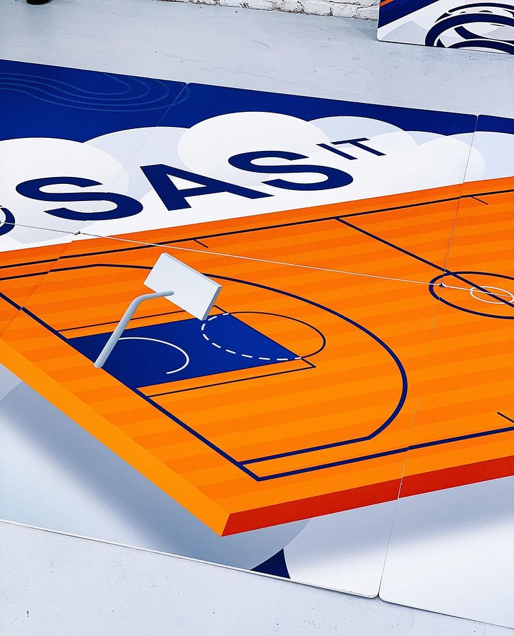
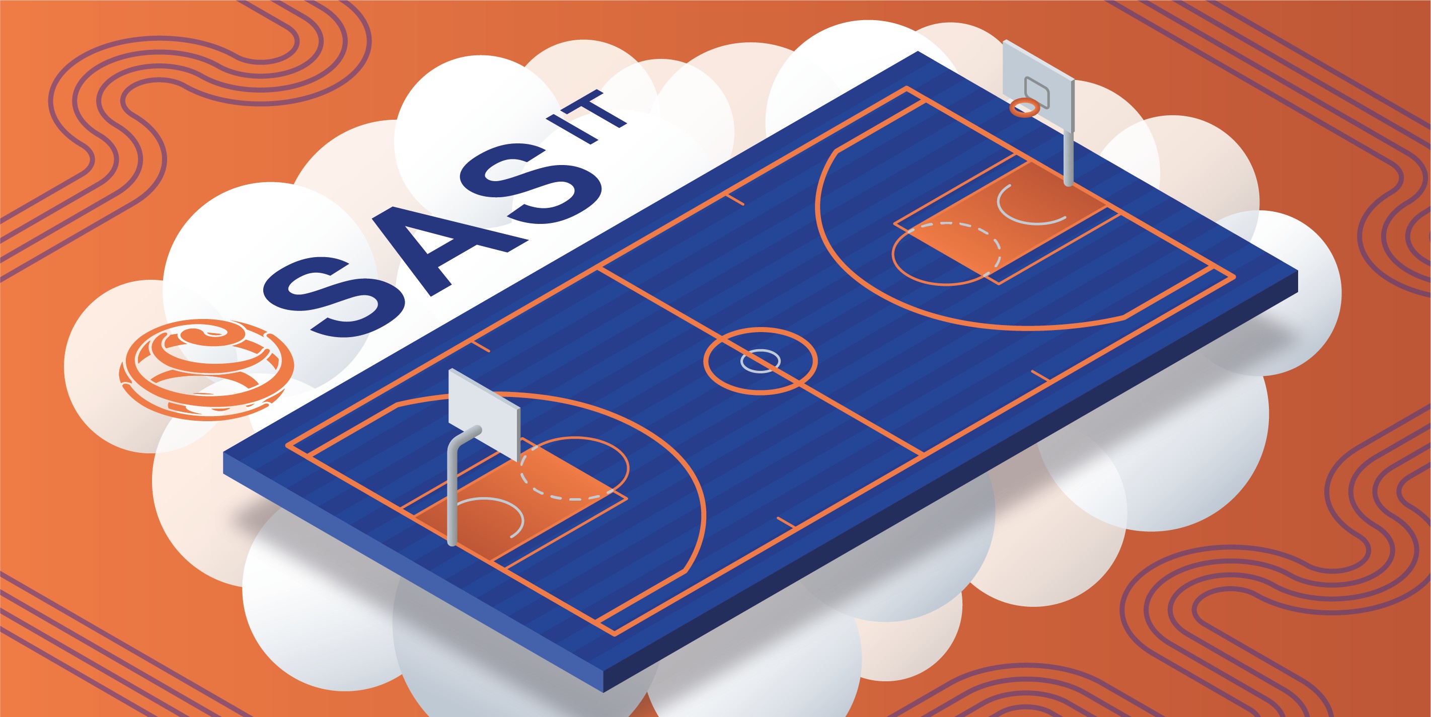
New Zealand-based SAS IT (Systems Advisory Services) needed a custom illustration for a puzzle to be completed by spectators at halftime during a sponsored basketball game.
The design had to fit their brand guidelines and follow their isometric illustration style, and also needed two colourways so that the puzzle could be reused with different variations.
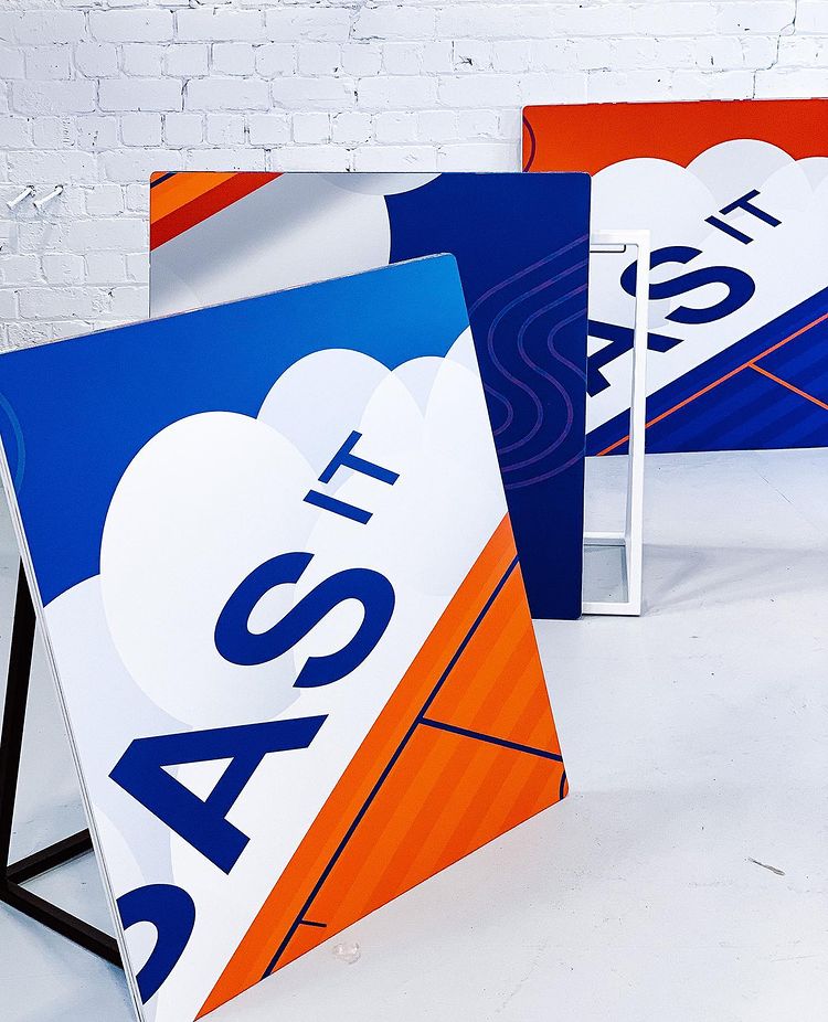
The final design used brand line patterns beneath an isometric basketball court, with the company logo floating in the branded stylistic clouds.
The design had to fit their brand guidelines and follow their isometric illustration style, and also needed two colourways so that the puzzle could be reused with different variations.
The final design used brand line patterns beneath an isometric basketball court, with the company logo floating in the branded stylistic clouds.
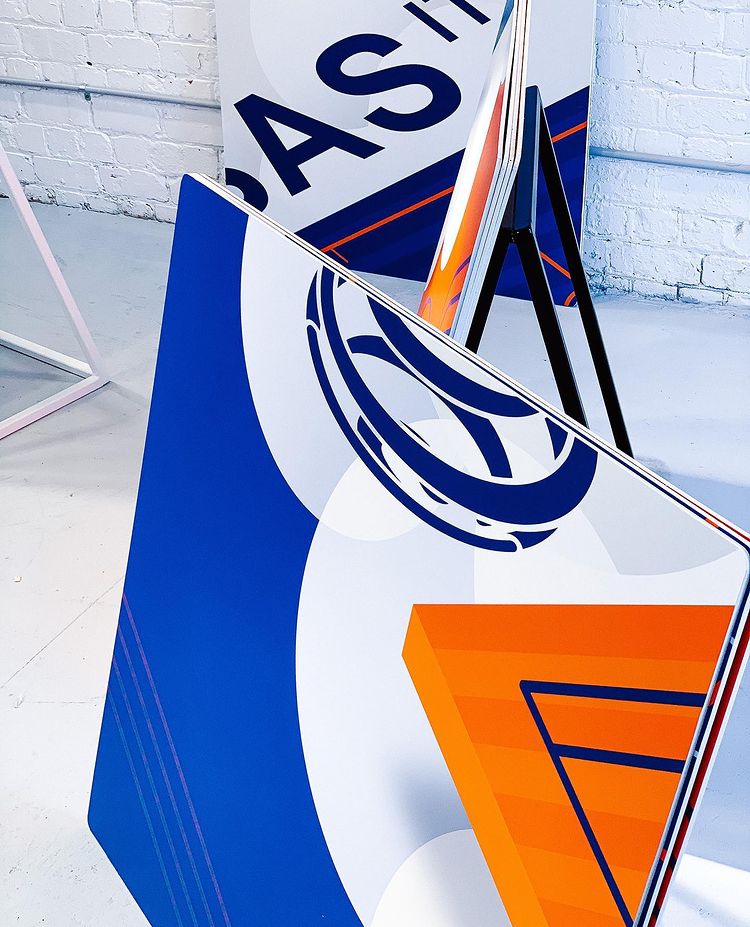


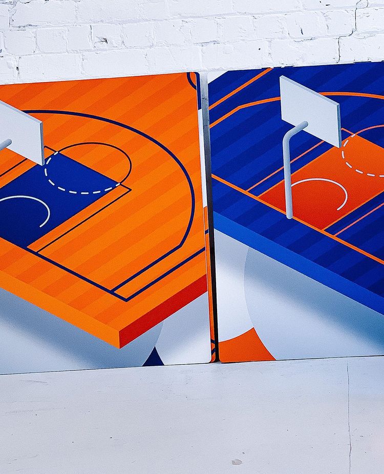
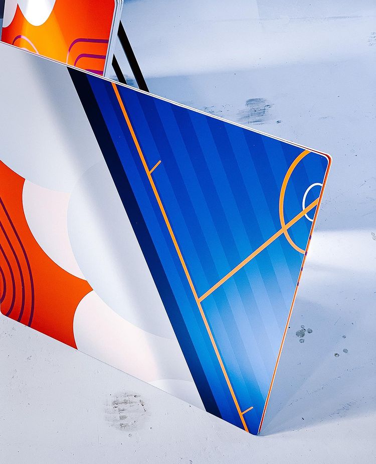
Printed artwork: 1000mm x 1000mm printed and matt-laminated graphics onto thick pvc sign board

 Final illustrations
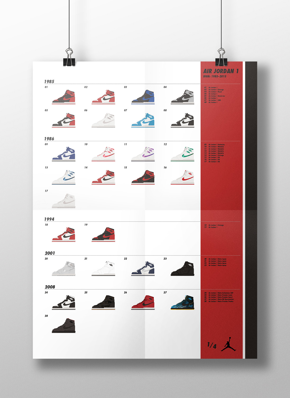
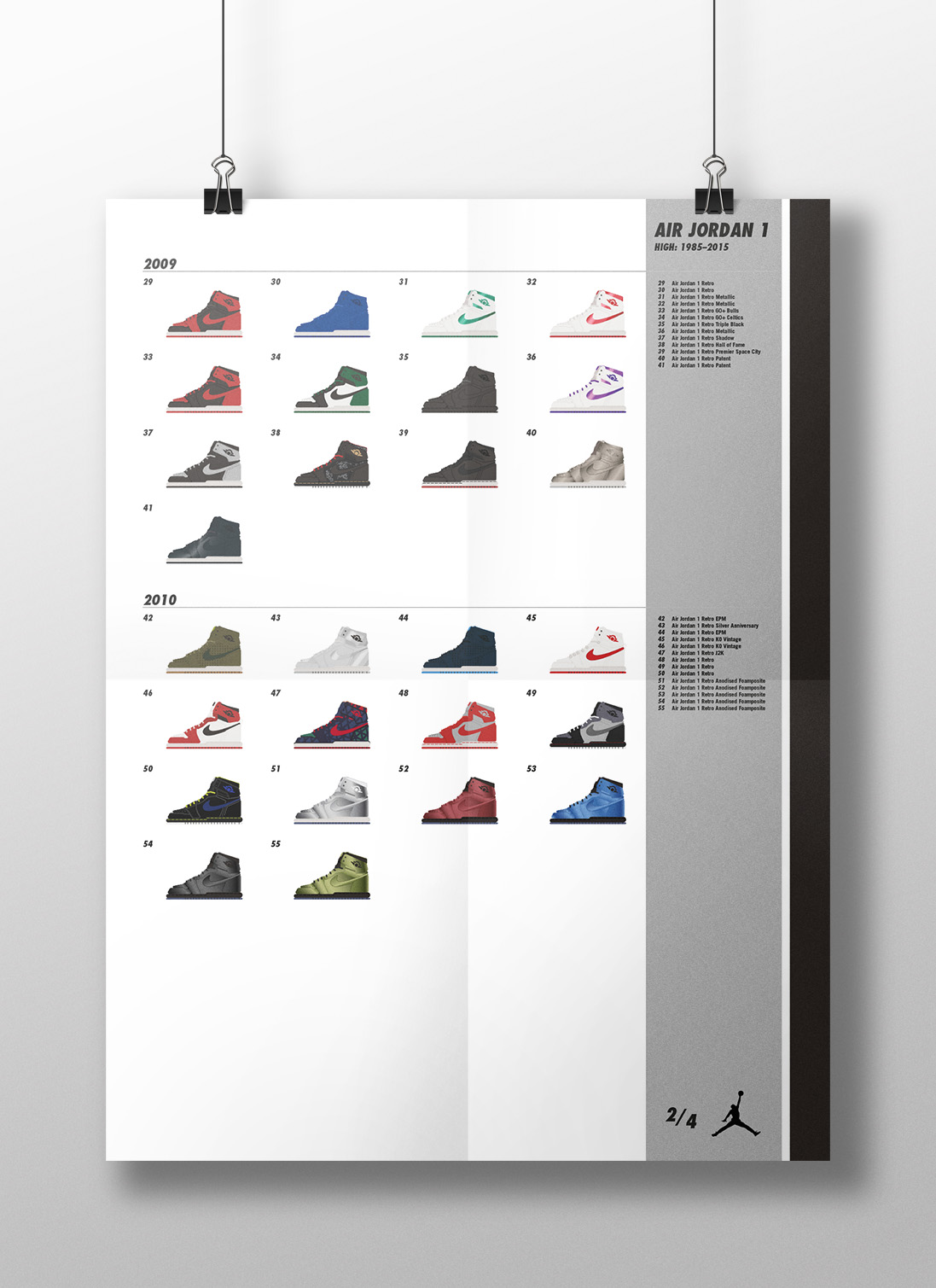
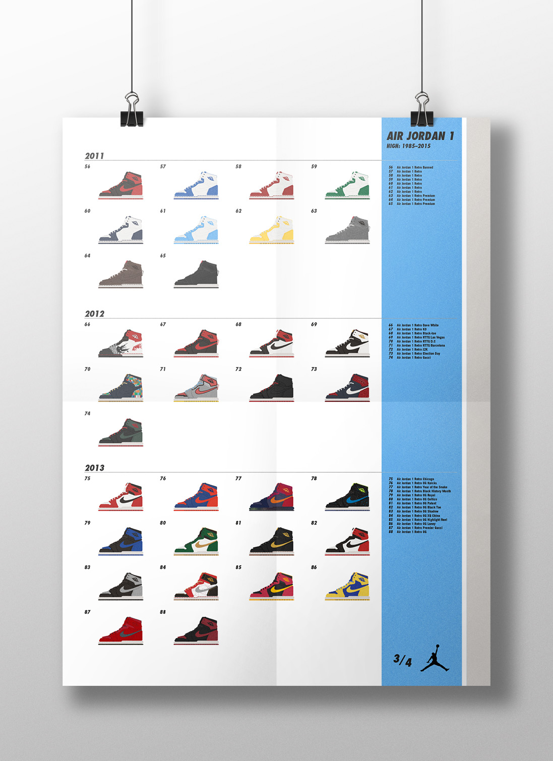
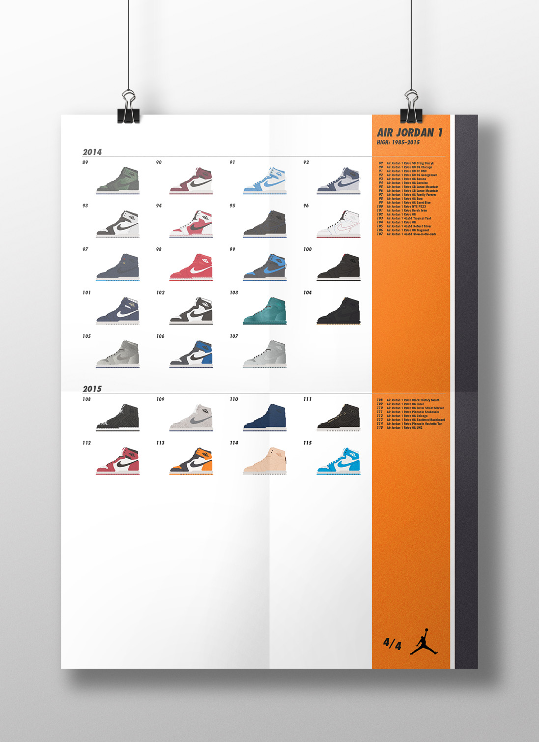
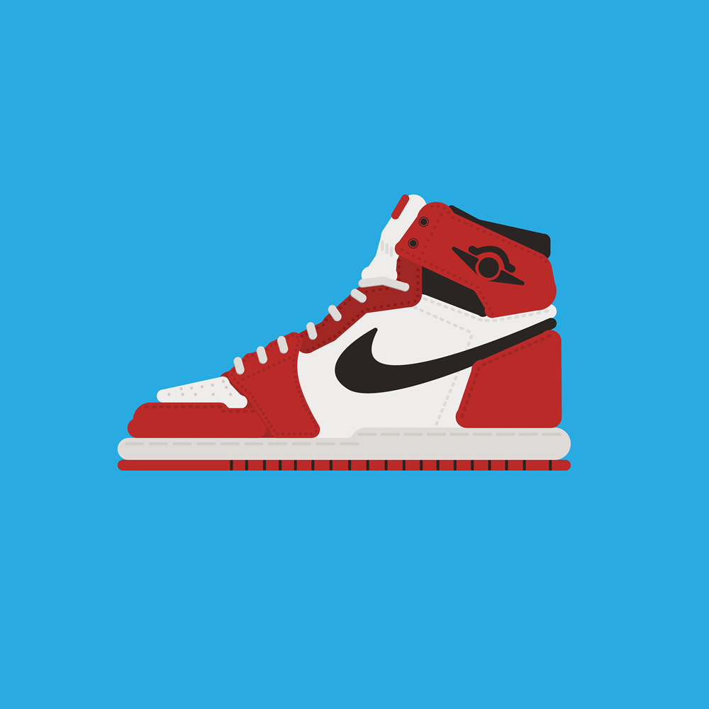
Air Jordan 1 High: 1985–2015 Illustration Project
Client: Personal project
Year: 2016
Showcased on the 2016 Information is Beautiful Awards site.
NB: This is a personal project and is in no way affiliated with or endorsed by Air Jordan Brand or Nike Inc.
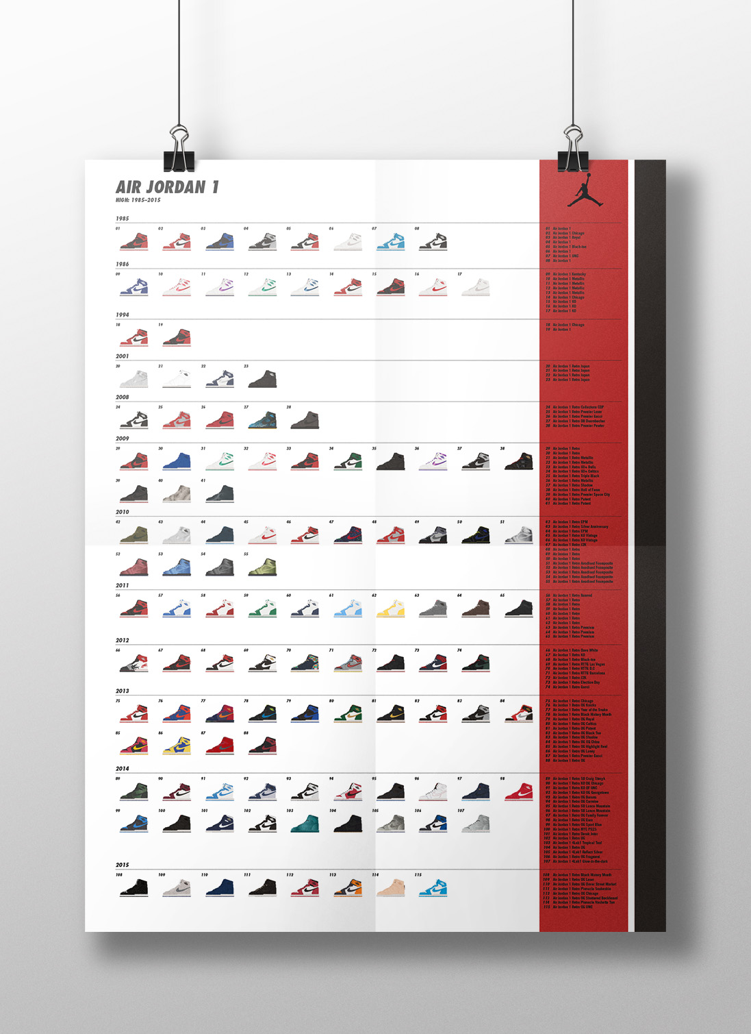
This project shows every Air Jordan 1 high-top model released from 1985–2015. After creating an illustration for my friend James Boughton, I was inspired to continue my drawings and create a series of stylised illustrations using graphic and minimalistic shapes to show every colourway of the high-top model of the shoe that has been released up to the end of 2015 (that I could find!).
The resulting outcome was a series of posters; one showing all 115 colourways in a single poster (becoming more like an infographic), and then a 4-part series showing the illustrations in larger detail. Each poster lists the shoe models in chronological release date order.
Data collected from Sole Collector.

Scott Pilgrim vs. The World: Illustrated T-Shirts
Client: Personal project
Year: 2018
NB: This is a personal project and is in no way affiliated with or endorsed by Universal Pictures
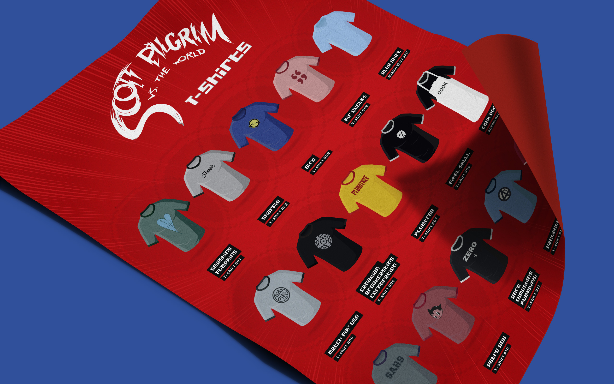
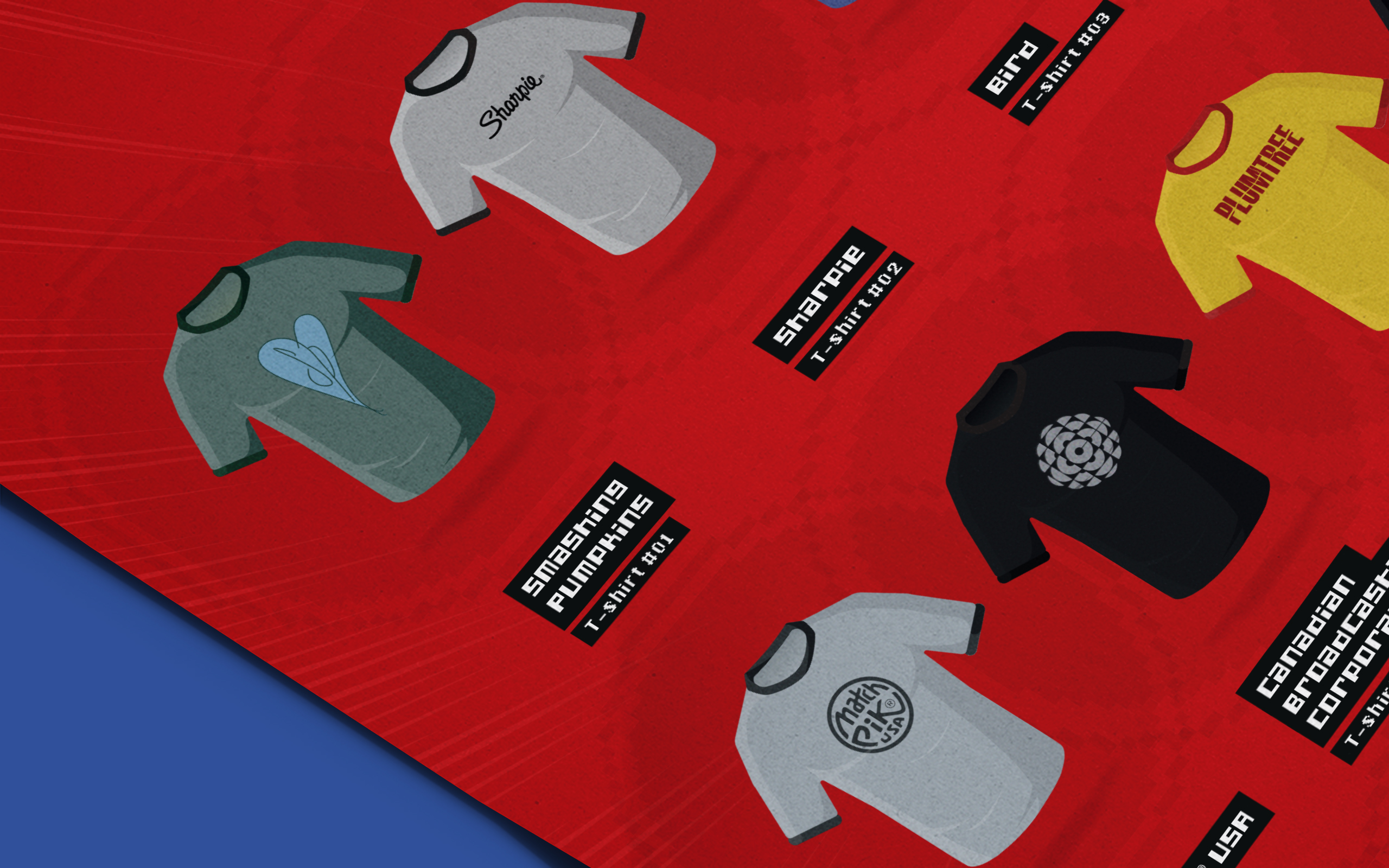
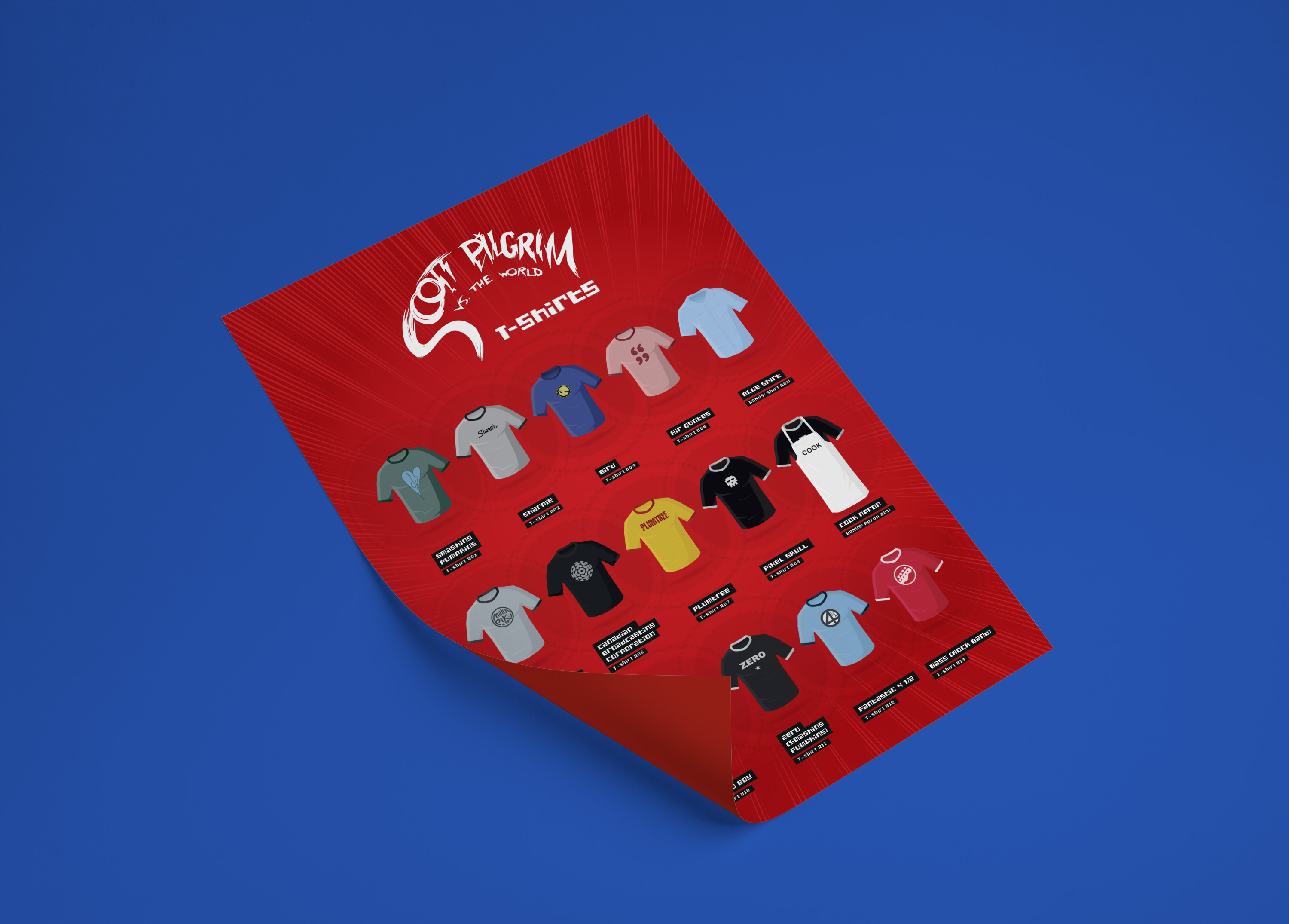
For this fun self-initiated side project I illustrated all of the t-shirts that Scott wears in Edgar Wright's 2010 film "Scott Pilgrim vs. the World". Each t-shirt is meant to look like a power-up from a video game, floating over an invisible plane with a pixellated pulsing ring in the background. This is meant to echo the video game aesthetic and references found in the film.
The pixel-style text is also meant to reflect the 8-bit gaming vibe. Each t-shirt name is set in white type on a black box, just like the film scene [and also comic panel in the graphic novel] that shows which of the things in the apartment belong to Scott or Wallace.
This project was a chance to practice my Illustrator skills and an excuse to rewatch Scott Pilgrim over and over for 'research' purposes :P The reference material came from image stills I captured from the DVD, and also this article I found on the many cool t-shirts that appear in 'Scott Pilgrim vs. the World': Scott Pilgrim T-shirts.

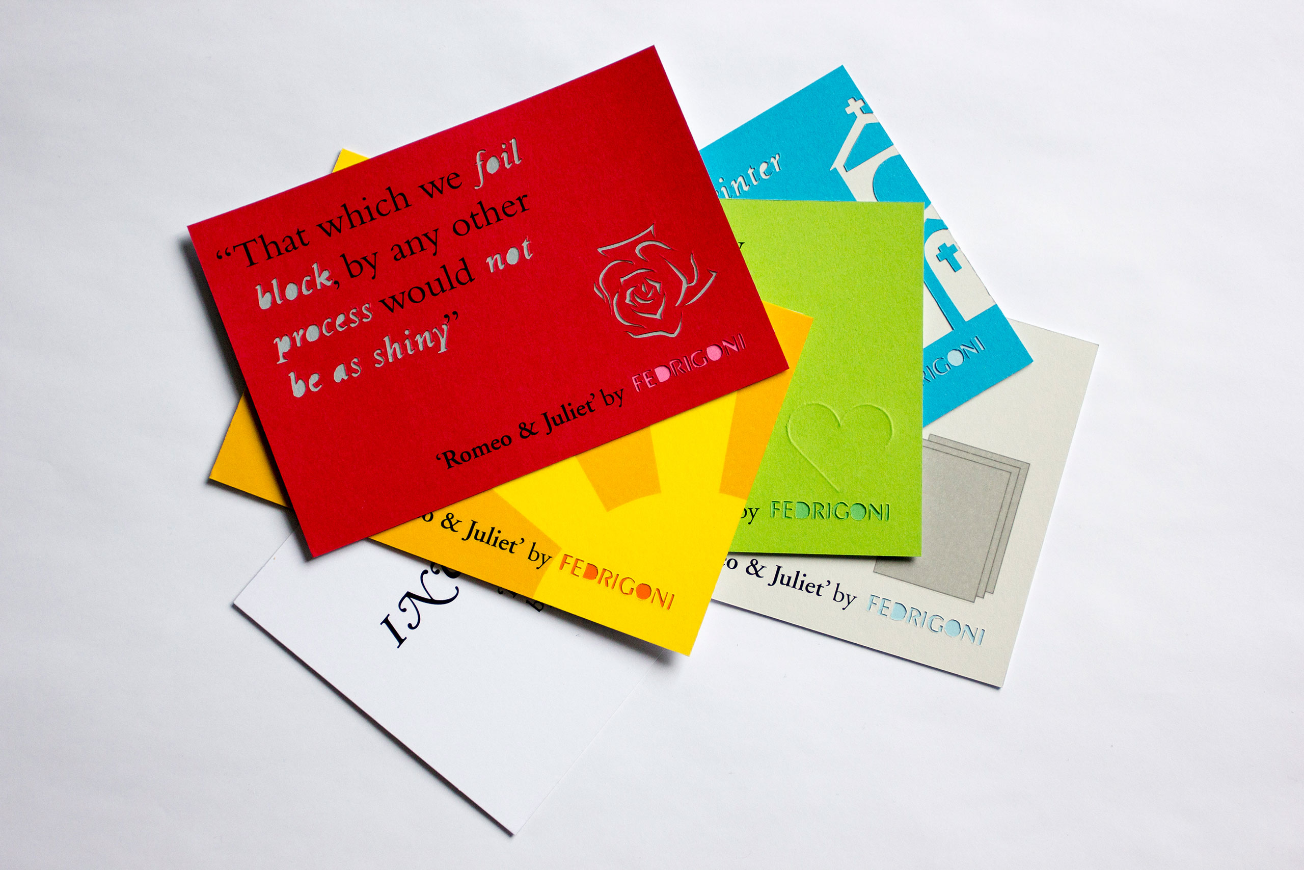
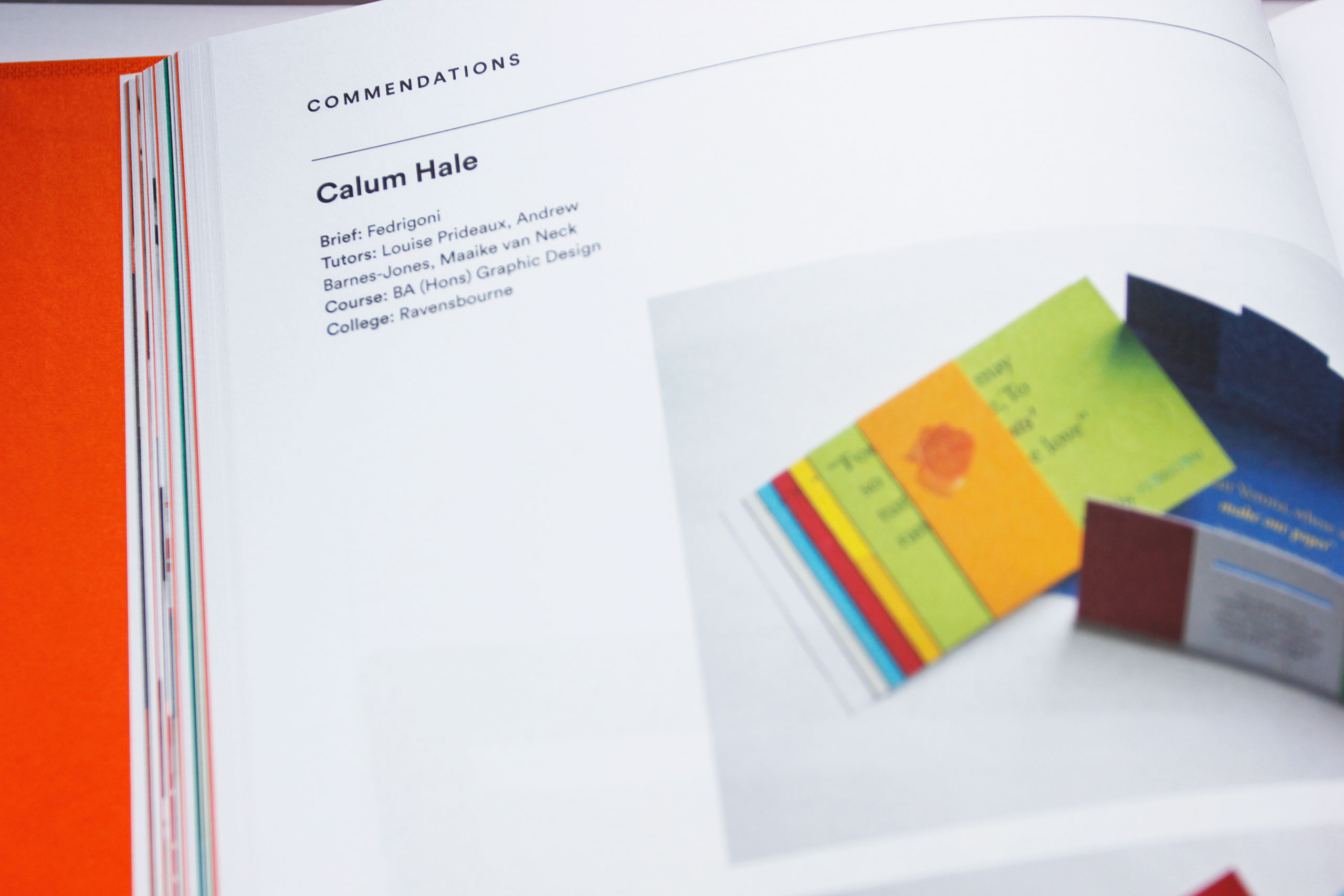
︎ YCN Student Award Winning Project ︎
For the YCN Student Awards 12/13 I entered the brief set by luxury Italian paper merchants 'Fedrigoni'. The brief was to 'inspire printers across the UK to work with the wide variety of Fedrigoni papers on offer' I had to make the sure the campaign was 'fun, memorable, tongue in cheek, and maybe even makes them laugh'.
Through my research I discovered Fedrigoni's most unique aspect was its Italian heritage in Verona, which is most famous as the location of 'Romeo & Juliet'. I retold Shakespeare's the love story through a set of postcards listing key quotations edited to re-tell situations printers find themselves in, which hopefully they would find amusing! The cards replicate print finishes with paper, including lamination, foil blocking, embossing, die-cutting and spot varnishing to show what the paper is capable of.


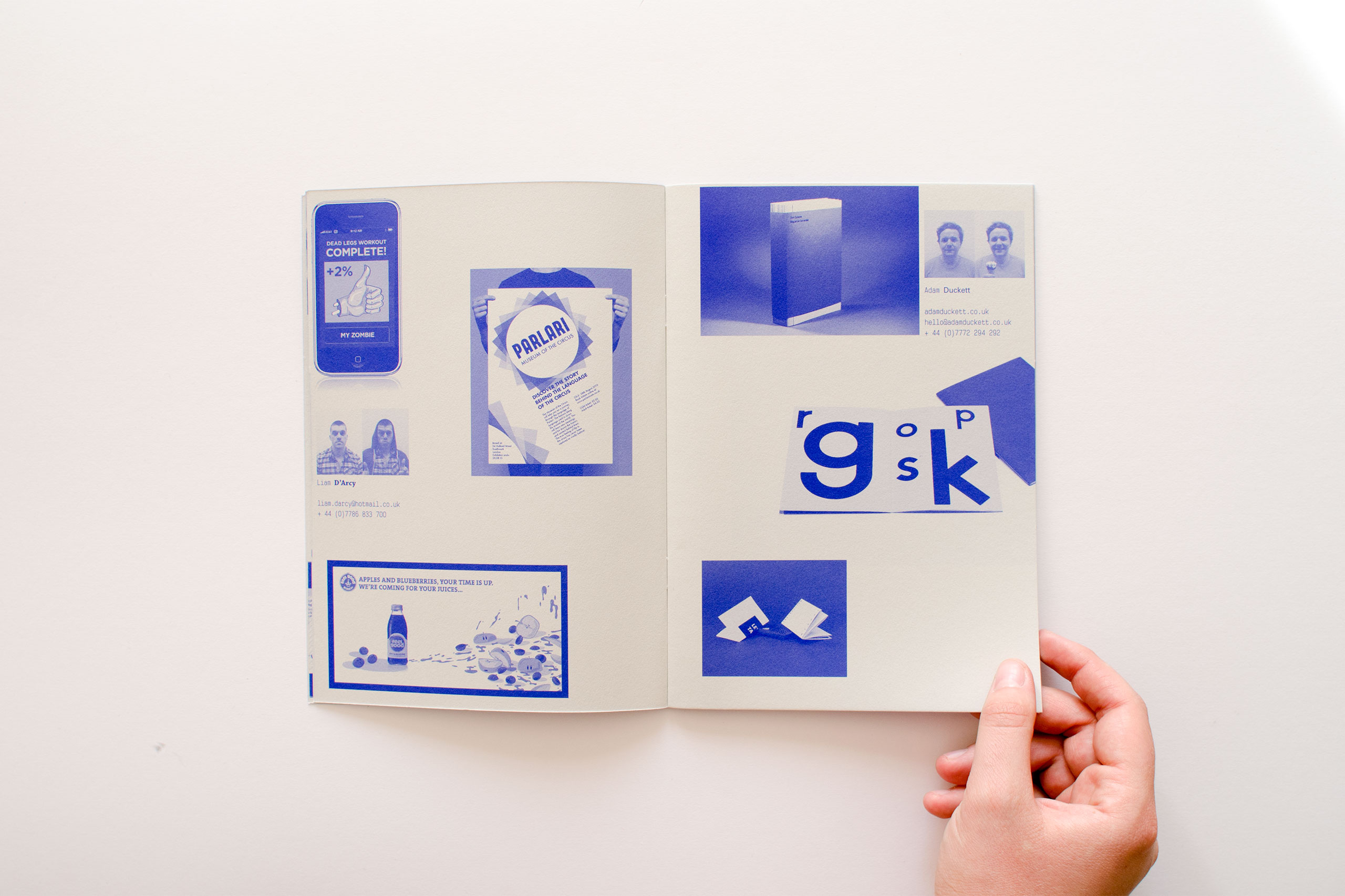
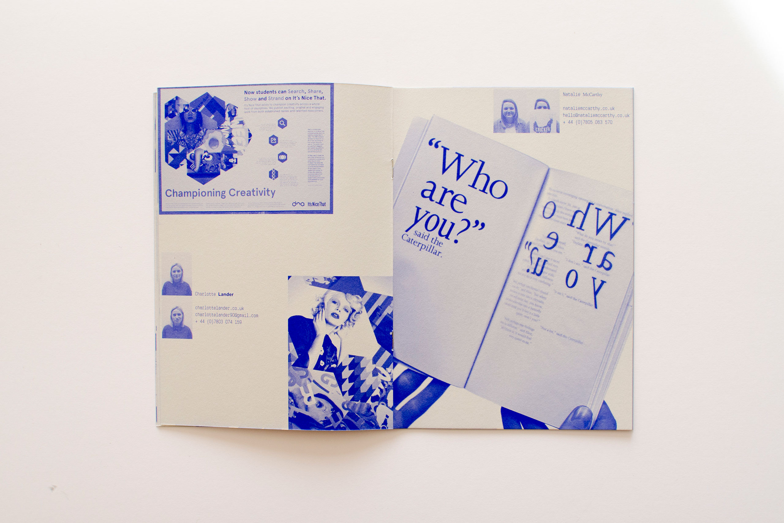
Ravensbourne Graphic Design: Degree Show Catalogue
Client: Ravensbourne Graphic Design Course
Year: 2013
Designer: Calum Hale
Designer: Sean Williamson
Designer: Natalie McCarthy
Art direction: Maaike van Neck
As part of a small team, I worked on creating a catalogue for our 2013 degree show at our university. Using the theme of '26 Characters' representing the number of individuals on the course and letters of the alphabet, we produced a look-book that gives a flavour of what graphic design students will be exhibiting at the show.