‘Less than a Second’ in Formula 1: Poster
Commissioned by: SignalNoise (now part of the Economist)
Designed at QuantumBlack
Year: 2013
Designer: Calum Hale
Designer: Geoffroy Gaborieau
Creative Direction: Yves Boussemart
Design © QuantumBlack Visual Analytics Ltd.
QuantumBlack was commissioned to produce a data-driven artwork for an information design exhibition with the theme 'Less Than A Second'. We used our expertise in data science and design to produce an informative and dynamic Formula 1 race chart that looked at less than a second gap between drivers per lap. The exhibition was a great success and led to more work with Formula 1.
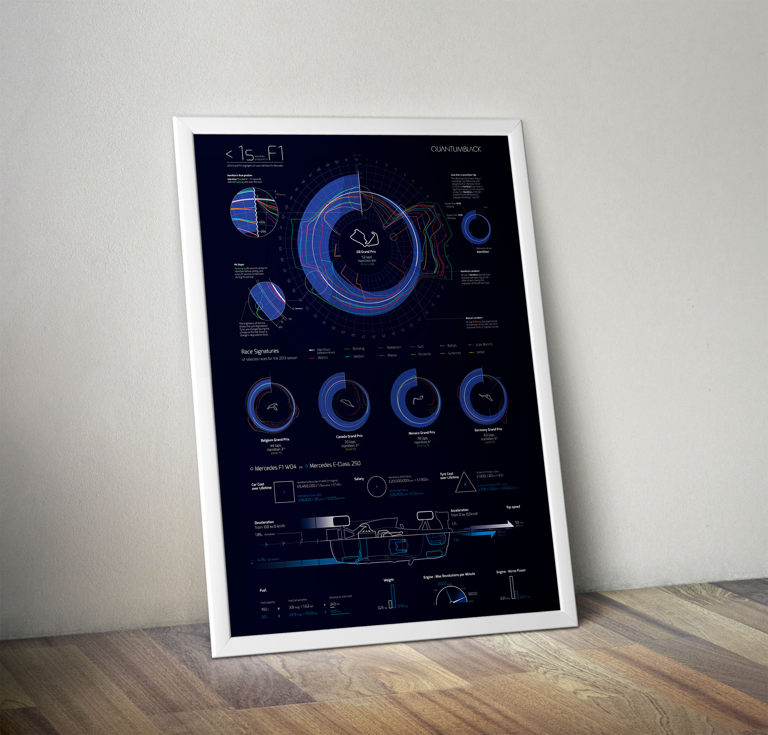 The ‘Less than a Second’ in Formula One poster design
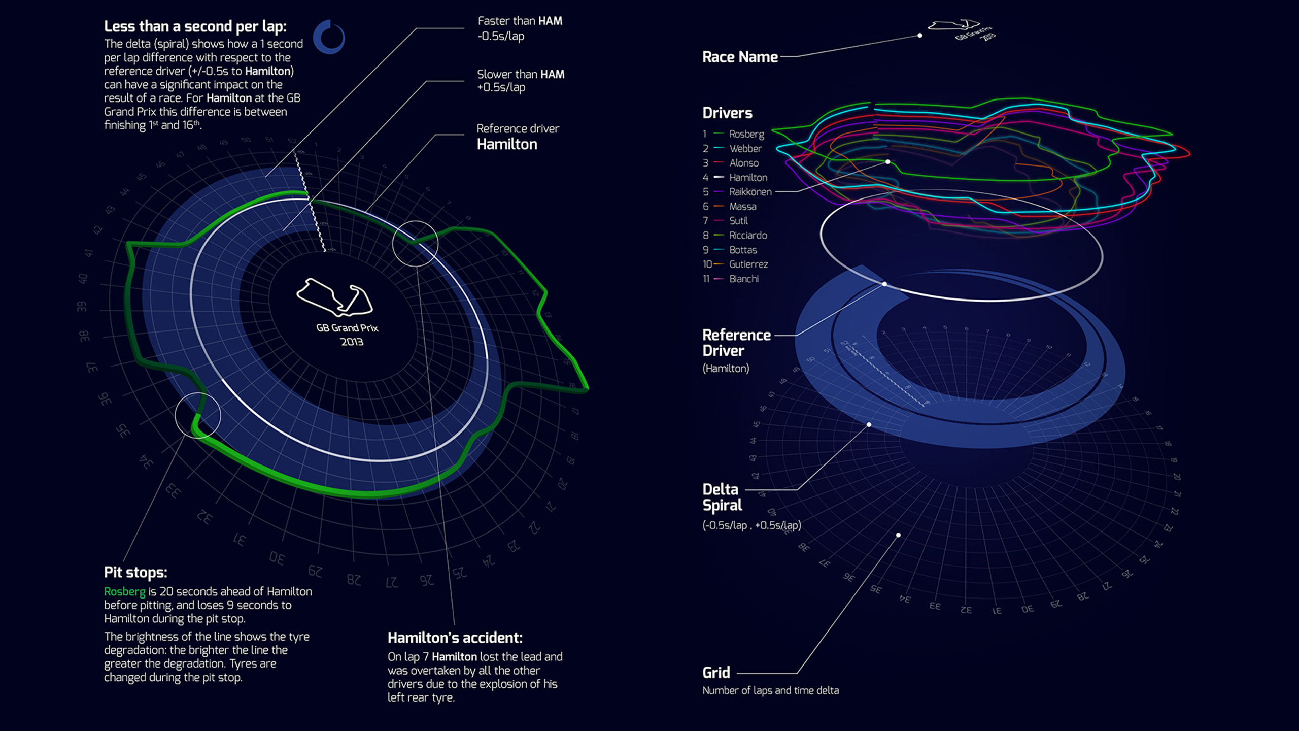 Graphic explaining the visual break-down of how to read the poster. The white reference line is Lewis Hamilton’s race at the 2013 British Grand Prix, and the the other colours show the drivers ahead and behind Hamilton during course of the race and by how much time.
 Race graphic without annotations
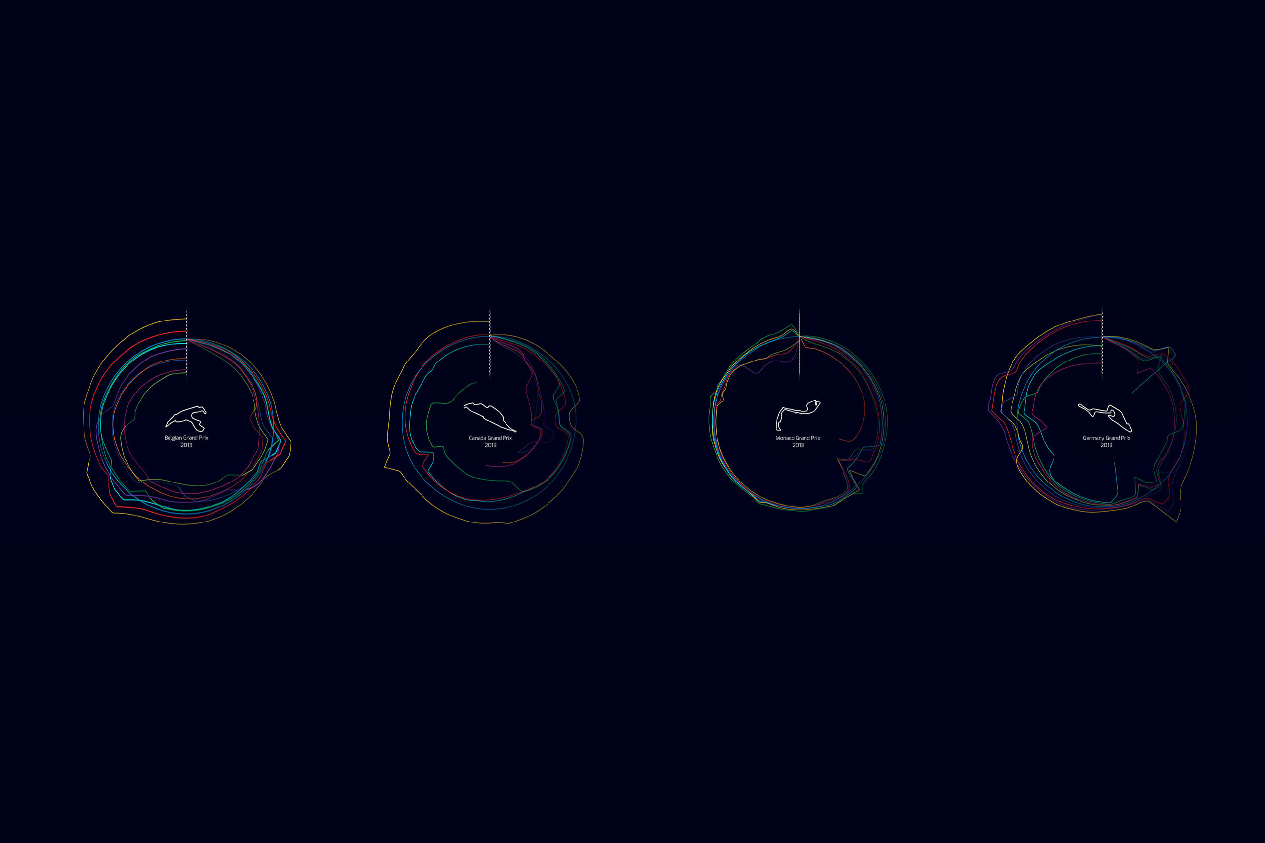 The graphic’s circular visual signature can be applied to other Formula One races. Belgium’s circuit (first graphic) has lots of opportunities to overtake, so the timing lines have lots of gaps between drivers. Whereas Monaco (third graphic) is a tight street circuit and so the lines are close together, showing close racing.
 The graphic was used to conceptualise a race scenario builder, in this example showing how weather might effect the end of the race posibilities from lap 42 onwards
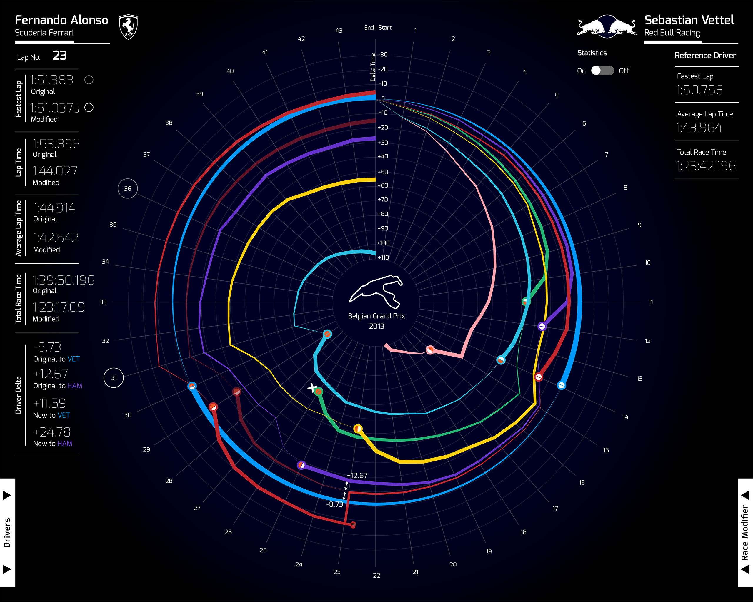 An early visual exploration for the race graphic
 A visitor to the ‘Less Than One Second’ exhibition views the F1 poster
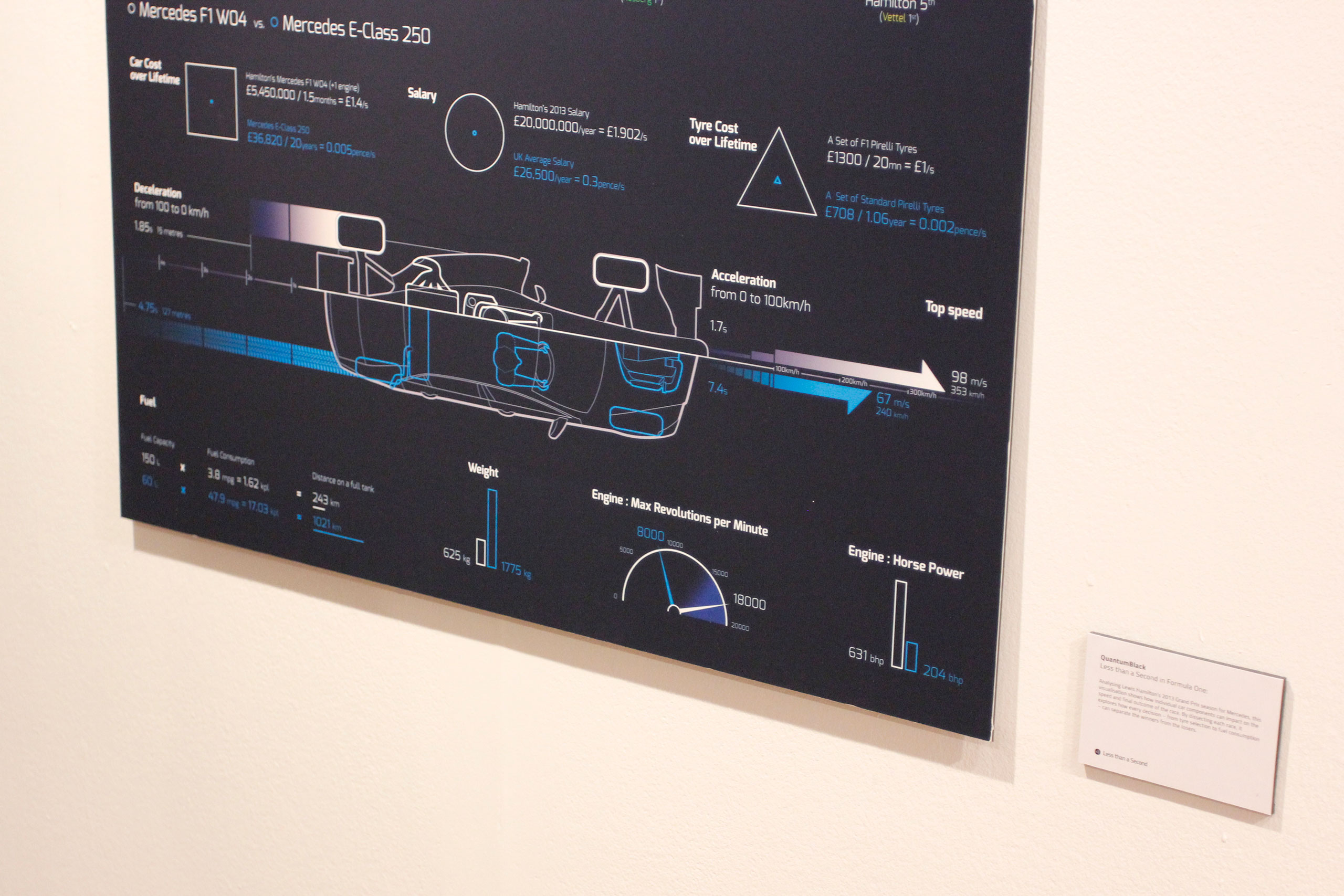 Detail view of the bottom of the poster, showing how an F1 car compares to a road car
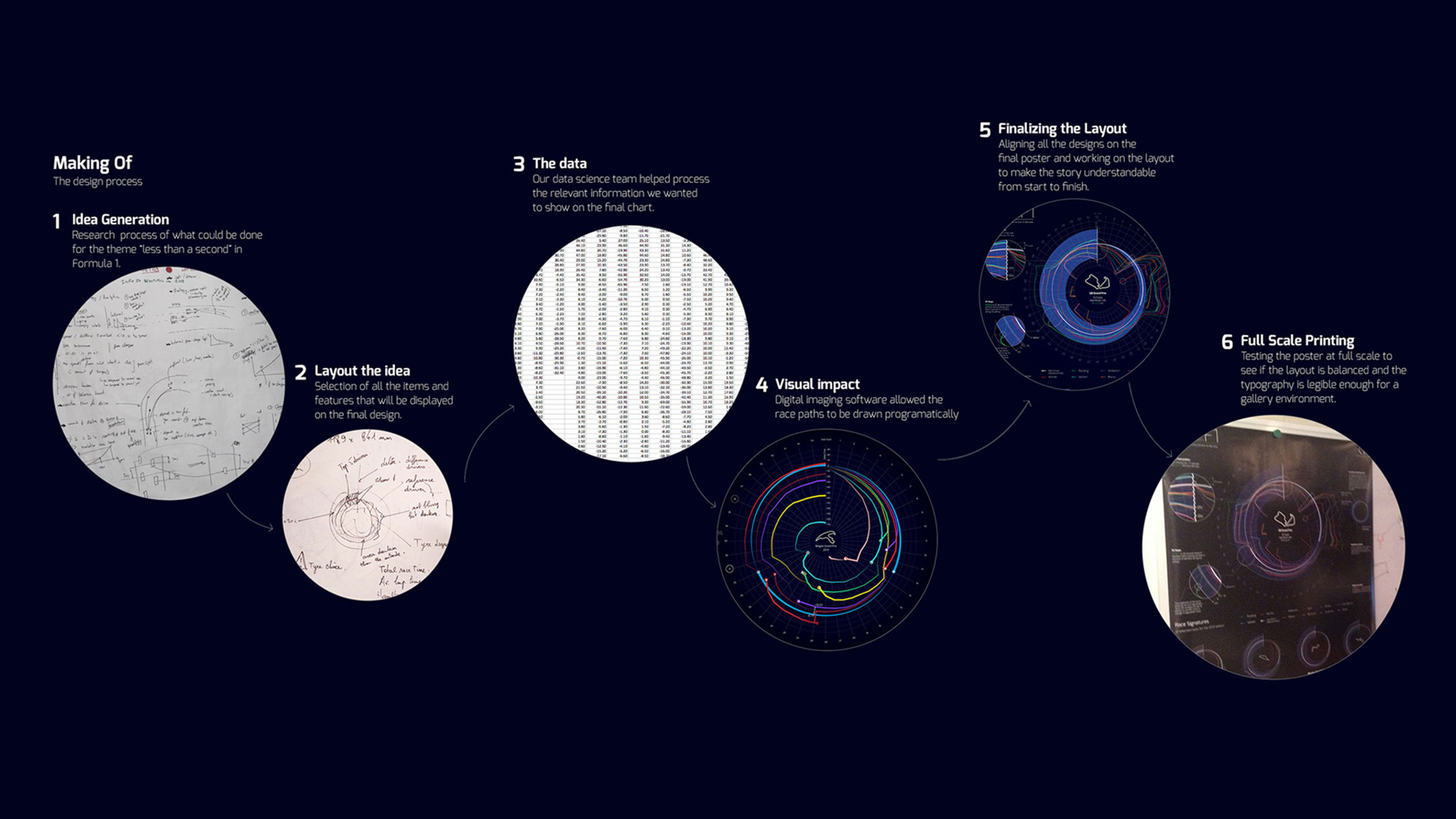 Process visual showing how the poster was made
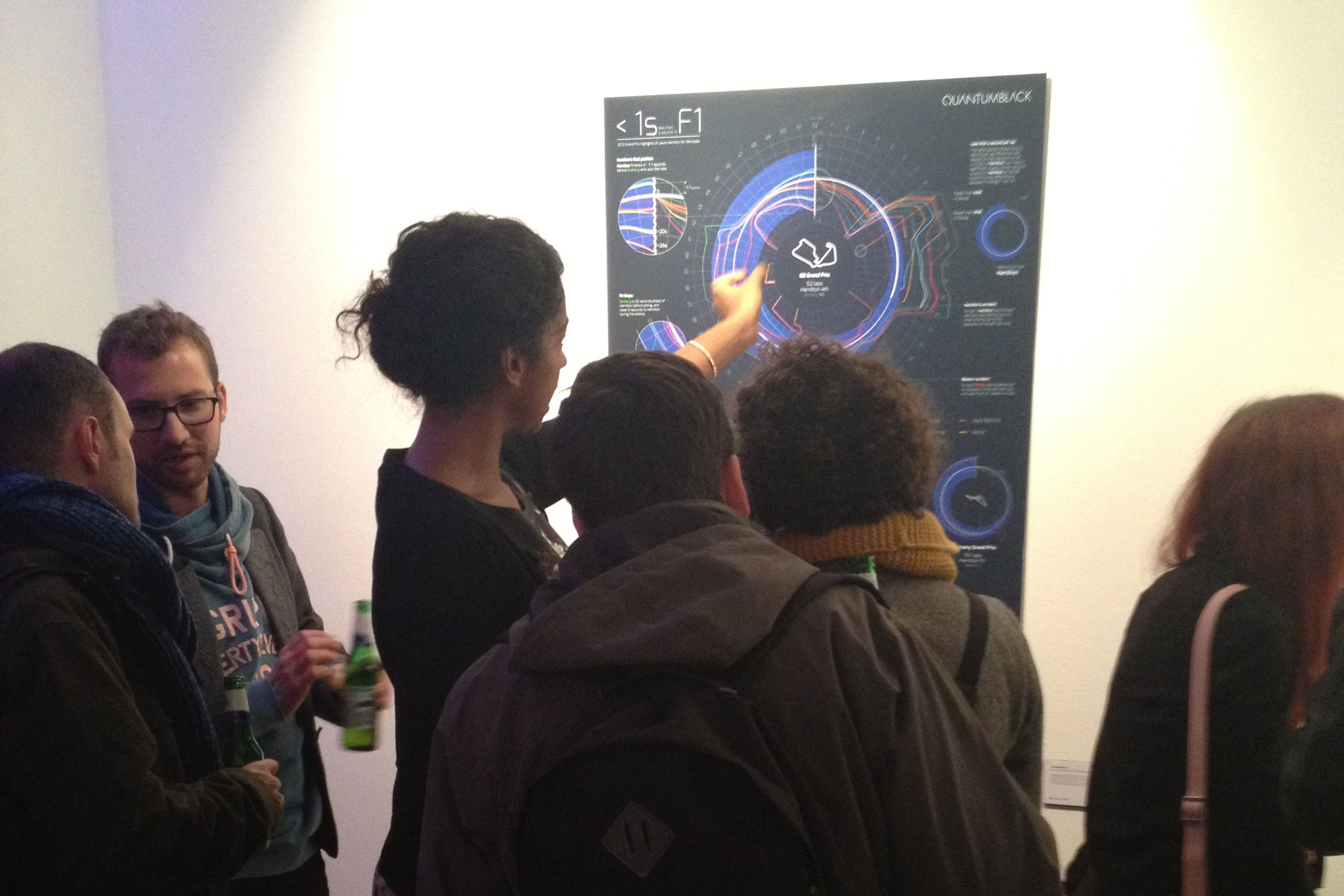 ‘Less than a Second’ exhibition opening night private view
 The Less than a Second exhibition website
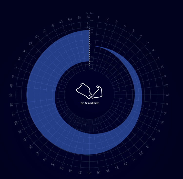 Animation showing how the race timings and gaps evolved during the race